Excel 365
How to add a vertical line to the line or bar chart
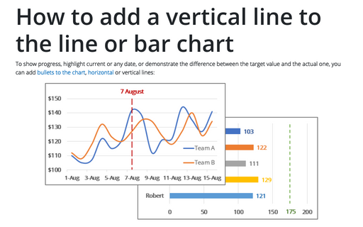
To show progress, highlight current or any date, or demonstrate the difference between the target value and the actual one, you can add bullets to the chart, horizontal or vertical lines:
How to add a vertical line to the scatter chart
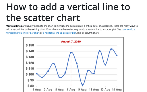
Vertical lines are usually added to the chart to highlight the current date, a critical date, or a deadline. There are many ways to add a vertical line to the existing chart. Errors bars are the easiest way to add a vertical line to a scatter plot. See how to add a vertical line to a line or bar chart or a horizontal line to a scatter plot, line, or column chart:
How to select an invisible element in the chart
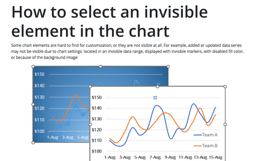
Some chart elements are hard to find for customization, or they are not visible at all. For example, added or updated data series may not be visible due to chart settings: located in an invisible data range, displayed with invisible markers, with disabled fill color, or because of the background image:
Format trendlines and Moving Average
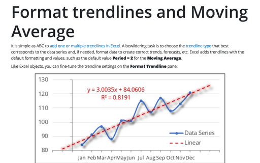
It is simple as ABC to add one or multiple trendlines in Excel. A bewildering task is to choose the trendline type that best corresponds to the data series and, if needed, format data to create correct trends, forecasts, etc. Excel adds trendlines with the default formatting and values, such as the default value Period = 2 for the Moving Average.
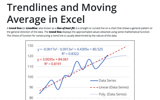
Trendlines and Moving Average in Excel
A trend line (or trendline, also known as a line of best fit) is a straight or curved line on a chart that shows a general pattern or the general direction of the data. The trend line displays the approximated values obtained using some mathematical function. The choice of function for constructing a trend line is usually determined by the nature of the data.
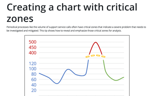
Creating a chart with critical zones
Periodical processes like the volume of support service calls often have critical zones that indicate a severe problem that needs to be investigated and mitigated. This tip shows how to reveal and emphasize those critical zones for analysis.
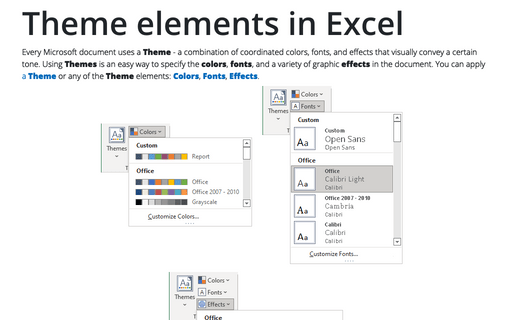
Theme elements in Excel
Every Microsoft document uses a Theme - a combination of coordinated colors, fonts, and effects that visually convey a certain tone. Using Themes is an easy way to specify the colors, fonts, and a variety of graphic effects in the document. You can apply a Theme or any of the Theme elements: Colors, Fonts, Effects.
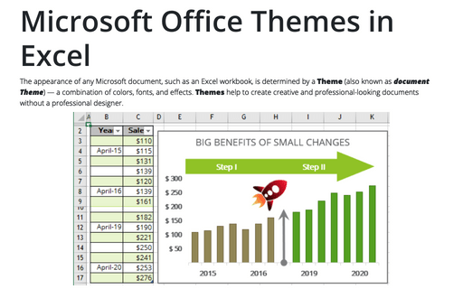
Microsoft Office Themes in Excel
The appearance of any Microsoft document, such as an Excel workbook, is determined by a Theme (also known as document Theme) — a combination of colors, fonts, and effects. Themes help to create creative and professional-looking documents without a professional designer.
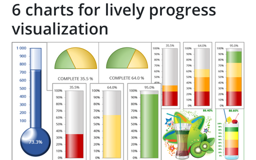
6 charts for lively progress visualization
There are several different charts in Excel that can help you to create a perfect progress illustration.
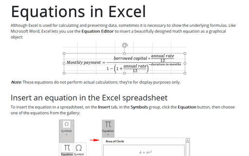
Equations in Excel
Although Excel is used for calculating and presenting data, sometimes it is necessary to show the underlying formulas. Like Microsoft Word, Excel lets you use the Equation Editor to insert a beautifully designed math equation as a graphical object:
