How to add a vertical line to the line or bar chart
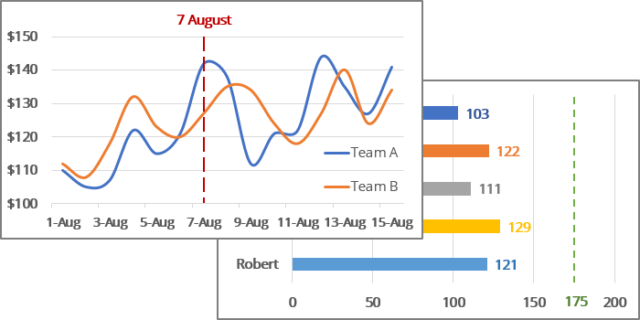
See also how to add a vertical line to the scatter chart.
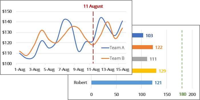
To add a vertical line to your line or bar chart, do the following:
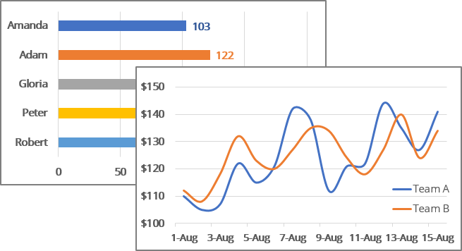
I. Add new data for the vertical line
1. Add the date with the current date to your data.
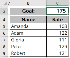
For example, the cell contains the data that should be displayed as the vertical line:
- For the bar chart, cell $C$2 contains the goal value:
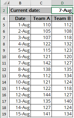
- For the line chart, cell $D$2 contains the date:
2. To add a new data series to your chart, do one of the following:
- On the Chart Design tab, in the Data group, choose Select Data:

- Right-click on the chart area and choose Select Data... in the popup menu:
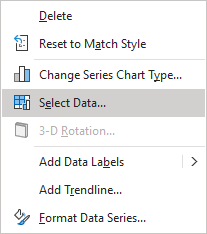
In the Select Data Source dialog box:
2.1. Under Legend Entries (Series), click the Add button:
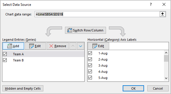
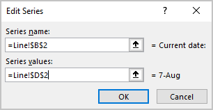
2.2. In the Edit Series dialog box, type:
- In the Series values box, type or choose the cell with the current date ($C$2 for the bar chart, $D$2 for the bar chart):
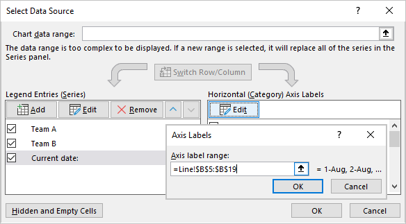
2.3. Additionally (for the line chart), select the new data series under Legend Entries (Series).
Then under Horizontal (Category) Axis Labels, click the Edit button and type or choose the same values as for the main data series:
2.4. Click the OK button twice to close dialog boxes.
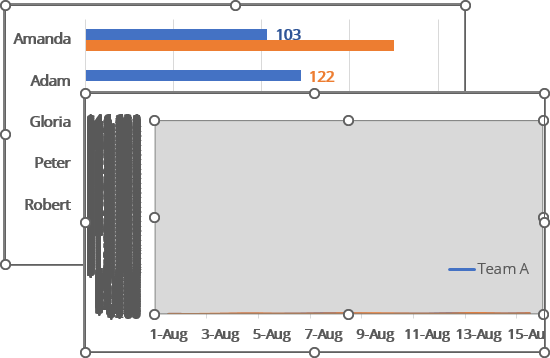
Excel rebuilds the chart - don't worry about messy visualization. You will fix it later:
II. Change the series chart type
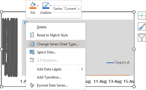
3. Right-click on the new data series and choose Change Series Chart Type... in the popup menu:
Notes:
- Don't confuse it with the Change Chart Type... If you see Change Chart Type... instead of Change Series Chart Type..., you don't select the data series.
It is important! You need to change the chart type for the selected data series, not the whole chart.
- If you don't see the newly added data series (as shown in the line chart in the example above), do one of the following:
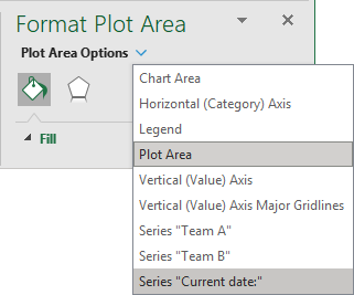
- Click the arrow next to Format Plot Area (or any other item) and choose the Series {data series name} in the dropdown list:
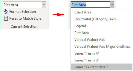
- On the Chart Format tab, in the Current Selection group, click the arrow of the Chart Elements dropdown list, then select Series {data series name} for the “Current date” data series:
In the Change Chart Type dialog box, for the selected data series, choose the Scatter type and select the Secondary Axis checkbox (if it doesn't select automatically):
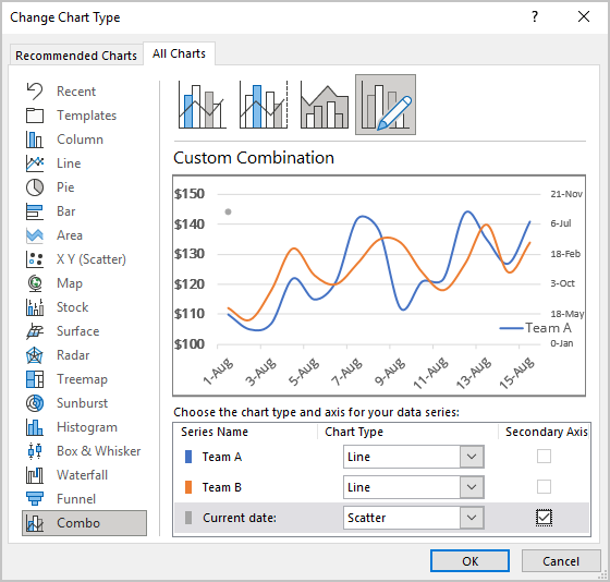
Note: You can see the previous formatting for the vertical axis after selecting the Secondary Axis for the new data series. The horizontal axis formatting will fix itself after customizing the secondary vertical axis (see below).
- Click the arrow next to Format Plot Area (or any other item) and choose the Series {data series name} in the dropdown list:
III. Correct the new data series
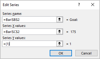
4. Open the Select Data Source dialog box again (see step 2), select the new data series, then under Legend Entries (Series), click the Edit button.
In the Edit Series dialog box, type:
- In the Series X values box - the cell with the appropriate data ($C$2 for the bar chart, $D$2 for the line chart):
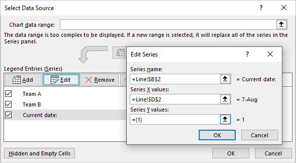
- In the Series Y values box - constant value (1):
IV. Correct the secondary vertical axis
5. Right-click on the secondary vertical axis and choose Format Axis... in the popup menu:
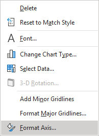
On the Format Axis pane, on the Axis Options tab, in the Axis Options group, in the Bounds section:
- In the Minimum field, type 0,
- In the Maximum field, type 1:
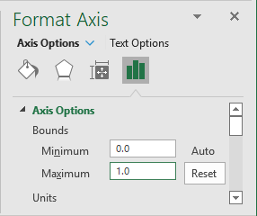
Note: You can also type minimum as 1, maximum as 2, or even minimum as 0 and maximum as 2. The difference will be visible when creating an Error bar (see below) and adding a vertical line label (see how to add the vertical line label).
V. Add the vertical line
6. On the chart, select the new data series, then do one of the following:
- Click on the Chart Elements button, select the Error Bars list, then choose
More Options...:
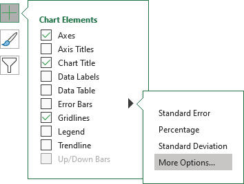
- On the Chart Design tab, in the Chart Layouts group, click the
Add Chart Element dropdown list:

In the Add Chart Element dropdown list, choose the Error Bars list, then click More Error Bars Options...:
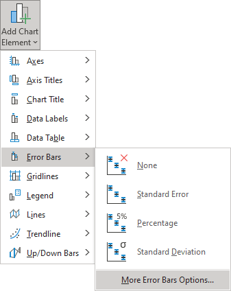
See more about other options in Adding Error bars.
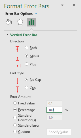
On the Format Error Bars pane:
- In the Direction section, select:
- Both, if you selected the Minimum and Maximum for the secondary axis as 0 and 2,
- Minus, if you selected the Minimum and Maximum for the secondary axis as 0 and 1,
- Plus, if you selected the Minimum and Maximum for the secondary axis as 1 and 2,
- In the End Style section, select No Cap,
- In the Error Amount section, choose the Percentage option and type 100 % in the appropriate field:
VI. Customize the chart
7. Select and delete the Horizontal Error bars (X Error Bars).
8. Add the vertical line label and hide the secondary vertical axis.
You can then make any other adjustments to get the expected look.
If you change the date, the chart will be changed too:
