Shape in Excel 365
How to draw flowchart and swimlane flow chart in Excel
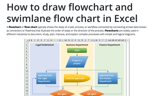
A flowchart or flow chart typically shows the steps of a task, process, or workflow connected
by connecting arrows (also known as connectors or flowlines) that illustrate the order of steps or the
direction of the process. Flowcharts are widely used in different industries to document, study,
plan, improve, and explain complex processes with simple and logical diagrams.
How to change flowchart connector or flowline
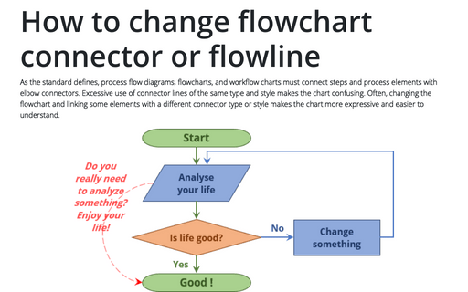
As the standard defines, process flow diagrams, flowcharts, and workflow charts must connect steps and process elements with elbow connectors. Excessive use of connector lines of the same type and style makes the chart confusing. Often, changing the flowchart and linking some elements with a different connector type or style makes the chart more expressive and easier to understand.
How to add text to the flowchart connector or flowline
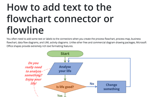
You often need to add some text or labels to the connectors when you create the process flowchart, process map, business flowchart, data flow diagrams, and UML activity diagrams. Unlike other free and commercial diagram drawing packages, Microsoft Office shapes provide extremely rich text formatting features.
Creating a twin or double thermometer chart
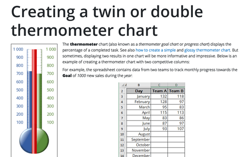
The thermometer chart (also known as a thermometer goal chart or progress chart) displays the percentage of a completed task. See also how to create a simple and glossy thermometer chart. But sometimes, displaying two results in one chart will be more informative and impressive. Below is an example of creating a thermometer chart with two competitive columns:
Creating a glossy thermometer chart
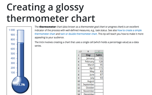
The thermometer chart (also known as a thermometer goal chart or progress chart) is an excellent indicator of the process with well-defined measures, e.g., task status. See also how to create a simple thermometer chart and twin or double thermometer chart. This tip will teach you how to make it more appealing to your audience.
How to create a funny dog breeds lifespan chart in Excel
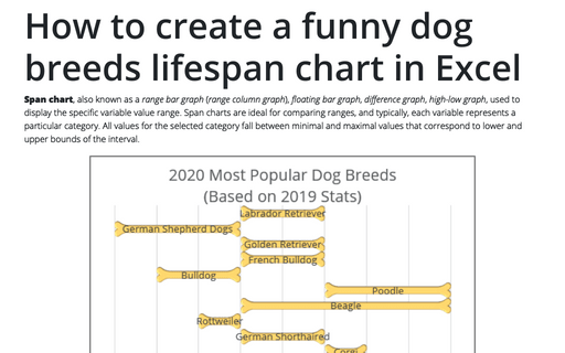
Span chart, also known as a range bar graph (range column graph), floating bar graph, difference graph, high-low graph, used to display the specific variable value range. Span charts are ideal for comparing ranges, and typically, each variable represents a particular category. All values for the selected category fall between minimal and maximal values that correspond to lower and upper bounds of the interval.
Tally chart in Excel
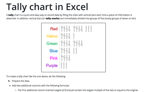
A tally chart is a quick and easy way to record data by filling the chart with vertical bars each time a piece of information is observed. In addition, vertical bars (or tally marks) are immediately divided into groups of five (rarely groups of seven or ten).
Creating pictogram chart with colorful filling
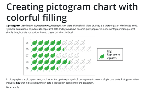
A pictogram (also known as pictorgamme, pictograph, icon chart, pictorial unit chart, or picto) is a chart or graph which uses icons, symbols, illustrations, or pictures to represent data. Pictograms have become quite popular in modern infographics to present simple facts, but it is not obvious how to create this chart in Excel.
Preventing objects from being printed or why objects aren't printing
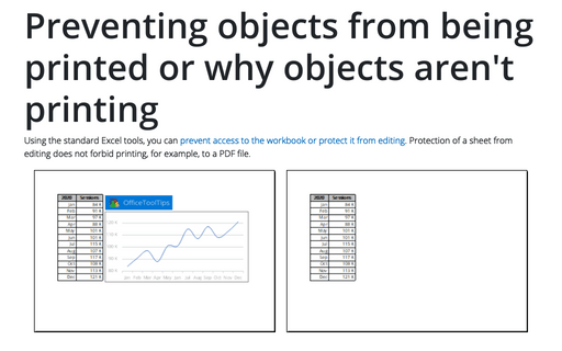
Using the standard Excel tools, you can prevent access to the workbook or protect it from editing. Protection of a sheet from editing does not forbid printing, for example, to a PDF file.
How to freeze charts, shapes, text boxes, and other objects in Excel
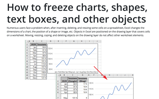
Numerous users face a problem when, after inserting, deleting, and resizing some cells on a spreadsheet, Excel changes the dimensions of a chart, the position of a shape or image, etc. Objects in Excel are positioned on the drawing layer that covers cells on a worksheet.
