Creating a glossy thermometer chart
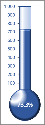
The trick involves creating a chart that uses a single cell (which holds a percentage value) as a data series.
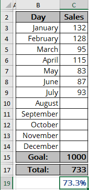
For example, a spreadsheet is set up to track monthly progress toward a Goal: 1000 new sales in a year. Cell C15 contains the goal value, and cell C17 contains a simple sum formula:
= SUM (C3:C14)
Cell C19 contains a formula that calculates the percent of the Goal:
= C17 / C15.
As you enter new data in column C, the formulas display the current results.
To create a chart like the one above, do the following:
Create a simple chart
1. Select cell C19 if you want to create a percentage axis, or select cell C17 if you want to create a volume axis (in this example, C17).
See how to create a chart with a percentage axis for more details.
Note: To simplify your work, leave the blank cells around cell C17. Without this blank row, Excel uses the entire data block for the chart, not just a single cell. Because C17 is isolated from the other data, the Chart Wizard uses only a single cell.
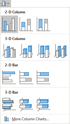
2. On the Insert tab, in the Charts group, click the Insert Bar or Column Chart button:

Choose Clustered Column:
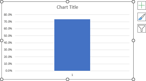
Excel creates a simple column chart with one column:
Format the chart
3. Remove unnecessary chart elements such as the horizontal (Category) axis and chart title.
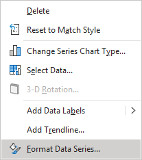
4. To make the column occupy the entire width of the plot area, right-click on the column and choose Format Data Series... in the popup menu (or double-click on the column):
On the Format Data Series pane, on the Series Options tab, in the Gap Width field, type or choose the appropriate value:
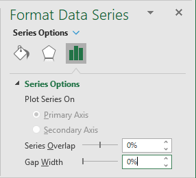
For this example, set the Gap Width to 0.
Format the axis
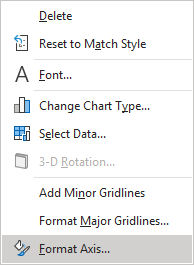
5. Right-click on the vertical axis and choose Format Axis... in the popup menu (or double-click on the axis):
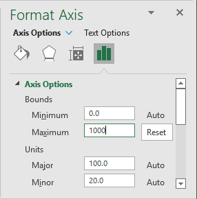
On the Format Axis task pane, on the Axis Options tab, under Bounds:
- In the Minimum field, set 0,
- In the Maximum field, set:
- 1 as a 100% if you use a percentage axis,
- The Goal value (for this example, 1000):
You can also hide the zero point in the axis (see How to hide points on the chart axis) and the axis line.
Add the shape
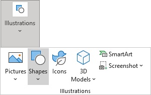
6. On the Insert tab, in the Illustrations group, select Shapes:
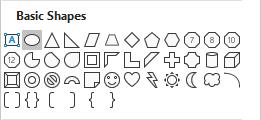
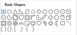
7. On the Shapes list, in the Basic Shapes group, choose Oval or Chord:
8. Format the shape and insert the data label (see How to insert cell content to the shape).
See also how to freeze the chart and shape on the spreadsheet.
You can then make any other adjustments to get the look you desire.
See also this tip in French: Comment créer un graphique de thermomètre brillant.
