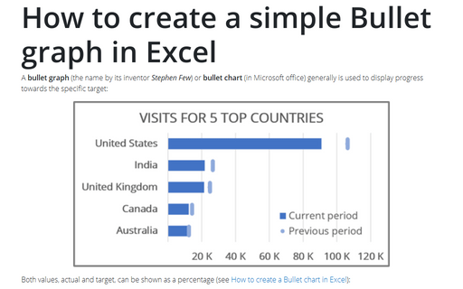
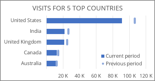
How to create a simple Bullet graph in Excel
Both values, actual and target, can be shown as a percentage (see How to create a Bullet chart in Excel):

To create a bullet chart in Excel, do the following:
1. Create a bar chart.
1.1. Select the data.
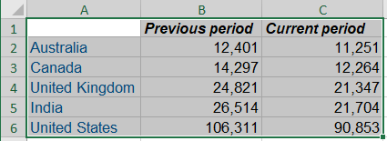
For example, the total visits for the previous month (the target) vs the visits for the current month:
1.2. On the Insert tab, in the Charts group, click the Insert Column or Bar Chart button:

From the Insert Column or Bar Chart dropdown list, select Clustered Bar (or Clustered Column):
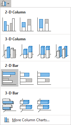
For example:
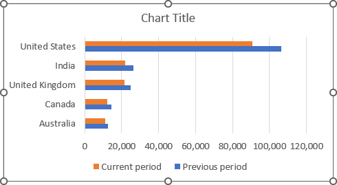
1.3. Select the chart, then do one of the following:
- On the Chart Design tab, in the Type group, click the Change Chart Type button:

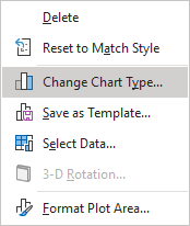
- Right-click on the selection and select Change Chart Type... in the popup menu:
1.4. In the Change Chart Type dialog box:
- Select the Combo tab,
- Check the Secondary Axis checkbox for the Previous period data series and select the Scatter type for this data series,
- Re-select for the Current period data series the Clustered bar chart type (Excel changes it after choosing the Combo tab):
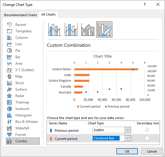
- Click OK.
1.5. Do one of the following:
- On the Chart Design tab, in the Data group, choose Select Data:

- Right-click the chart area and choose Select Data... in the popup menu:
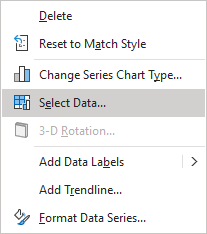
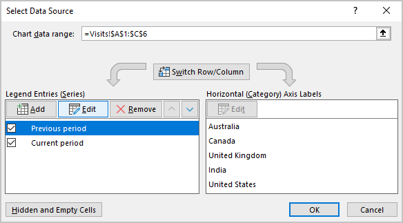
1.6. In the Select Data Source dialog box:
- Select the Previous period data series (the target),
- Under Legend Entries (Series), click the Edit button:
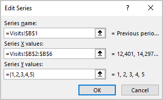
1.7. In the Edit Series dialog box:
- In the Series X values field, type or select cells with the correct values for this data series,
- In the Series Y values field, type = {1,2,3,4,5} (constant values):
- Click OK twice to close dialog boxes.
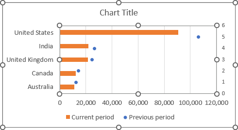
2. Change the Secondary Axis:
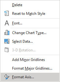
2.1. Right-click the secondary horizontal axis and choose Format Axis... in the popup menu:
2.2. On the Format Axis pane, on the Axis Options tab, in the Axis Options section:
- In the Bounds Minimum field, type 0.5 to positioning the target points in the middle of each bar:
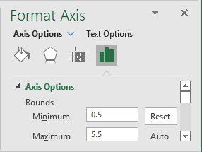
- Ensure that Excel calculates the Bounds Maximum as 5.5:
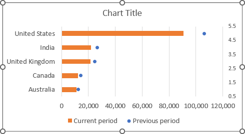
2.3. Remove the secondary axis.
3. Create the target markers:
3.1. Select the Previous period data series (the target).
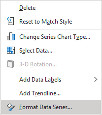
3.2. Right-click on the data series and choose Format Data Series... in the popup menu:
3.3. On the Format Data Series pane, on the Fill & Line tab, under Marker:
- In the Marker Options section, select the Built-in option, the appropriate Type and Size:
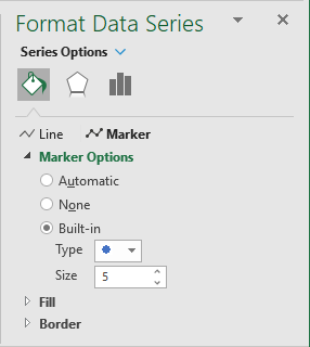
Note: If you create a column chart, it is enough to select the rectangular marker, and the size about 20. After that, you can skip other customization for the target markers.
- In the Fill section, select the Solid fill option and the color you prefer:
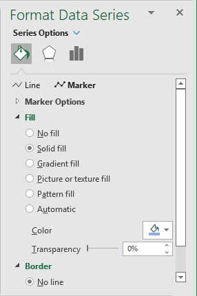
- In the Border section, select the No line option.
Excel shows the target data series as markers you selected:
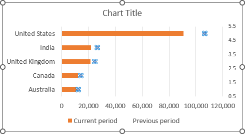
3.4. To create the target markers more visible, select this data series, then do one of the following:
- On the Chart Design tab, in the Chart Layouts group, click the Add Chart Element drop-down list:

In the Add Chart Element dropdown list, choose the Error Bars list, then click More Error Bars Options...:
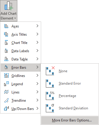
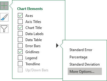
- Click on the Chart Elements button, select the Error Bars list, then choose More Options...:
3.5. On the Format Error Bars pane:
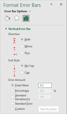
- On the Error Bars Options tab, in the Vertical Error Bar section:
- In the Direction group, select Both,
- In the End Style group, select No Cap,
- In the Error Amount group, select the Fixed value option and then type the value you want:
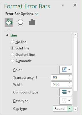
- On the Fill & Line tab:
- Select the Solid line option, choose the Color and Width as you have chosen for target markers,
- Choose the Round item from the Cap type drop-down list:
You can then make any other adjustments to get the look you desire.
