Excel 2010
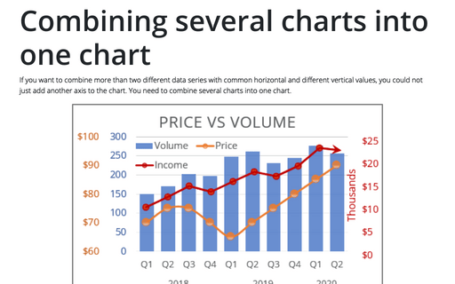
Combining several charts into one chart
If you want to combine more than two different data series with common horizontal and different vertical
values, you could not just add another axis to the chart. You need to combine several charts into one chart.
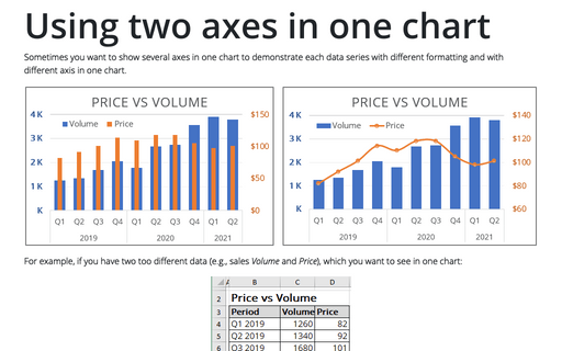
Using two axes in one chart
Sometimes you want to show several axes in one chart in order to demonstrate each data series with different
formatting and with different axis in one chart.
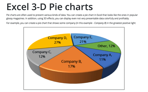
Excel 3-D Pie charts
This tip is about how to create a pie chart such as in popular glossy magazines.
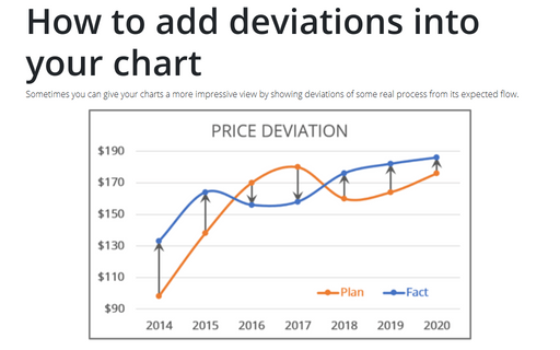
How to add deviations into your chart
Sometimes you can give your charts more impressive view by showing deviations of some real process from its
expected flow.
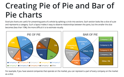
Creating Pie of Pie and Bar of Pie charts
If you have several parts of something whole, you can demonstrate each item in one pie chart. But, when
several parts each amount to less than 10 percent of the pie, it becomes hard to distinguish the slices.
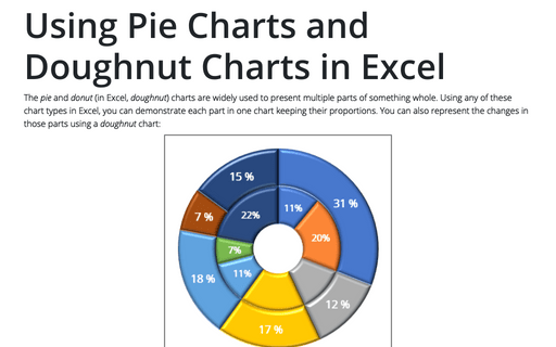
Using Pie Charts and Doughnut Charts in Excel
If you have several parts of something one, you can demonstrate each item in one pie chart. But sometimes
you want to demonstrate the changes of those parts and doughnut chart will help you to do this.
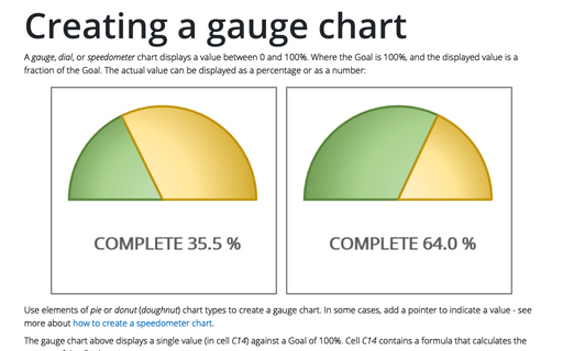
Creating a gauge chart
This chart resembles a speedometer gauge and displays a value between 0 and 100%.
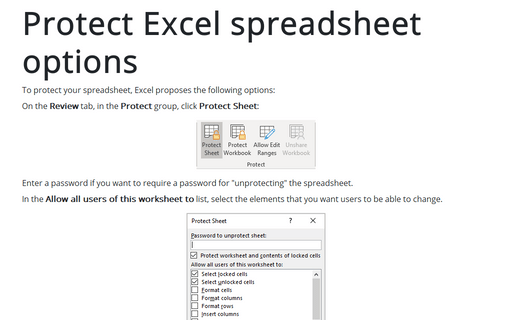
Protect Excel spreadsheet options
To protect your spreadsheet, Excel proposes the following options:
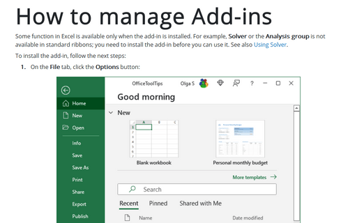
How to manage Add-ins
Some function in Excel is available only when the add-in is installed. For example, Solver or the
Analysis group is not available in standard ribbons, you need to install the add-in before you can
use it. See also Using Solver.
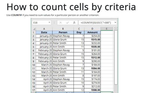
How to count cells by criteria
Use COUNTIF if you need to sum values for a particular person or other criterion.
