How to add deviations into your chart
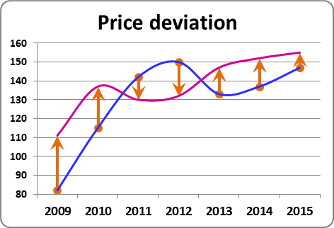
To create a chart with deviations, do the following:
1. Select the data range (in this example B4:D11):
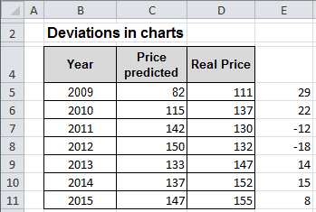
2. On the Insert tab, in the Charts group, choose the Line button:

Choose Line: 
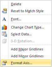
3. Right-click one of the years along the category axis. In the popup menu select Format Axis...:
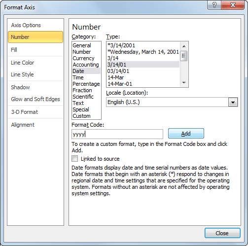
In the Format Axis dialog box, choose the Number tab, change the field Format Code (in example to show only month and year) and click the Add button:
4. Right-click in the chart line. In the popup menu select Format Data Series...
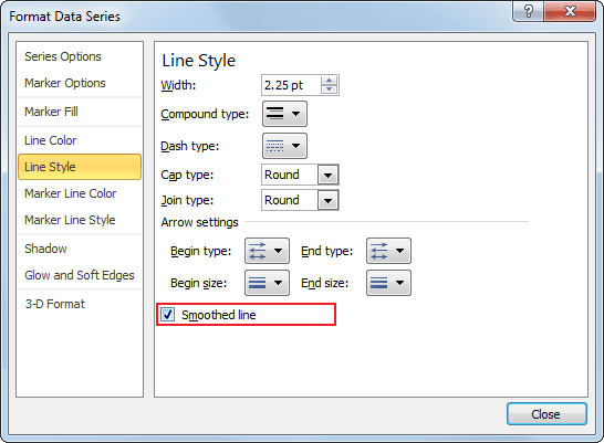
5. In the Format Data Series dialog box, on the Line Style tab, click the Smoothed line checkbox:
6. To add deviations, do the following:
6.1. Select the line in which you want to add deviations.
6.2. On the Layout tab, in the Analysis group, choose Error Bars list:

6.3. Excel propose several error bars, also you can use More Error Bars Options...:
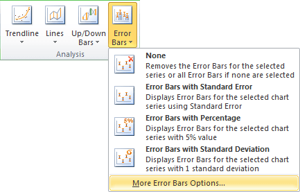
6.4. In the Format Error Bars dialog box, on the Vertical Error Bars tab, choose:
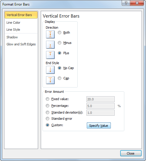
- In the Display group:
- the Plus option - to show the actual data point value plus a specific error amount;
- the No Cap option - to display error bars without end caps.
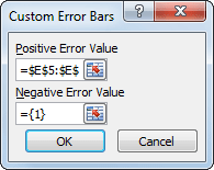
- In the Error Amount group, the Custom: option, and then click the Specify Value to use values in a worksheet range that you specify as error amounts (in this example E5:E12):
6.5. In the Format Error Bars dialog box, on the Line Style tab, change the Width of line, and select arrow settings:
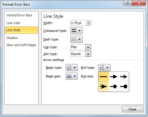
You can then make any other adjustments to get the look you desire.
