Tally chart in Excel
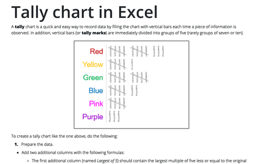
A tally chart is a quick and easy way to record data by filling the chart with vertical bars each time a piece of information is observed. In addition, vertical bars (or tally marks) are immediately divided into groups of five (rarely groups of seven or ten).
Customize the Ribbon in Outlook
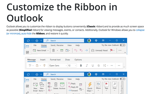
Outlook allows you to customize the ribbon to display buttons conveniently (Classic ribbon) and to provide as much screen space as possible (Simplified ribbon) for viewing messages, events, or contacts. Additionally, Outlook for Windows allows you to collapse (or minimize), auto-hide the Ribbon, and restore it quickly.
How to create one chat of split bars or small multiple bars in Excel
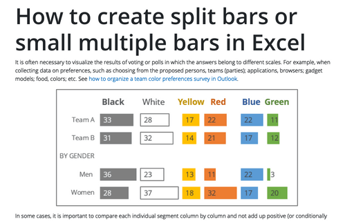
It is often necessary to visualize the results of voting or polls in which the answers belong to different scales. For example, when collecting data on preferences, such as choosing from the proposed persons, teams (parties); applications, browsers; gadget models; food, colors; etc. See how to organize a team color preferences survey in Outlook.
Creating a Candlestick Stock chart
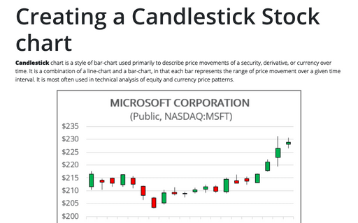
Candlestick chart is a style of bar-chart used primarily to describe price movements of a security, derivative, or currency over time. It is a combination of a line-chart and a bar-chart, in that each bar represents the range of price movement over a given time interval. It is most often used in technical analysis of equity and currency price patterns.
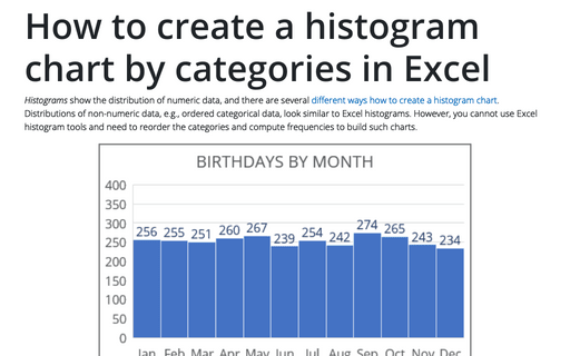
How to create a histogram chart by categories in Excel
Histograms show the distribution of numeric data, and there are several different ways how to create a histogram chart. Distributions of non-numeric data, e.g., ordered categorical data, look similar to
Excel histograms. However, you cannot use Excel histogram tools and need to reorder the categories and compute frequencies to build such charts.
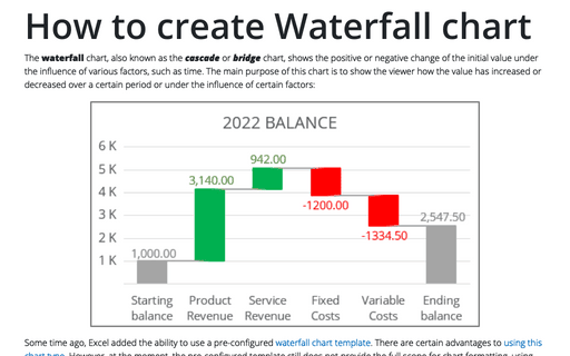
How to create Waterfall chart
The waterfall chart, also known as the cascade or bridge chart, shows the positive or negative change of the initial value under the influence of various factors, such as time. The main purpose of this chart is to show the viewer how the value has increased or decreased over a certain period or under the influence of certain factors:
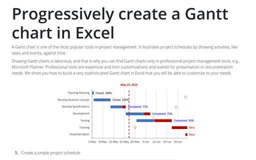
Progressively create a Gantt chart in Excel
A Gantt chart is one of the most popular tools in project management. It illustrates project schedules
by showing activities, like tasks and events, against time.
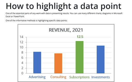
How to highlight a data point
One of the essential parts of any work with data is presenting results. You can use many different
charts, diagrams in Microsoft Excel or PowerPoint.
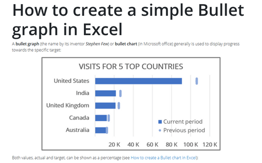
How to create a simple Bullet graph in Excel
A bullet graph (the name by its inventor Stephen Few) or bullet chart (in Microsoft office) generally is used to display progress towards the specific target:
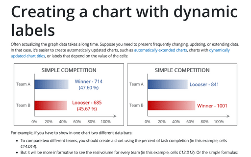
Creating a chart with dynamic labels
Often actualizing the graph data takes a long time. Suppose you need to present frequently changing, updating, or extending data. In that case, it's easier to create automatically updated charts, such as automatically extended charts, charts with dynamically updated chart titles, or labels that depend on the value of the cells:
