Tally chart in Excel
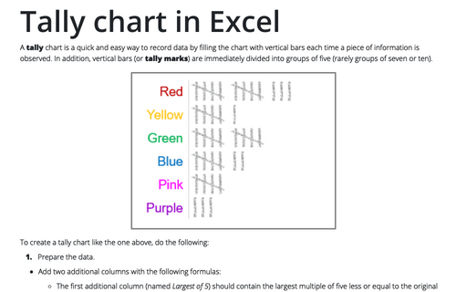
Such a chart or diagram is convenient because you don't need to correct the data on counting or tallying ongoing results - it is enough to supplement the data with new information.
In Excel, you can create such a chart to present your data more impressively:
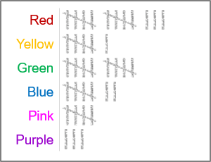
To create a tally chart like the one above, do the following:
1. Prepare the data.
- Add two additional columns with the following formulas:
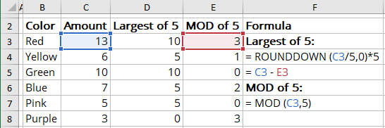
- The first additional column (named Largest of 5) should contain the largest multiple of five less or equal to the original number:
- = ROUNDDOWN (<data cell> / 5, 0) * 5,
The ROUNDDOWN () function rounds a number down: ROUNDDOWN (number, num_digits), where num_digits is the number of digits to which you want to round the number.
See more about rounding in Excel.
- = <data cell> - <mod of 5>
The <mod of 5> is a value from the second additional column.
- = ROUNDDOWN (<data cell> / 5, 0) * 5,
- The second column (named MOD of 5) should contain the remainder of the original number divided by five - the remainder of modulo of five:
= MOD (<data cell>, 5)
The MOD () function returns the remainder after the number is divided by divisor: MOD (number, divisor).
For example, the favorite colors of children in year 5:
- The first additional column (named Largest of 5) should contain the largest multiple of five less or equal to the original number:
- Create or download pictures for the one and five pictogram items:
 and
and

2. Select the data for a new chart.
For this example, cells B3:B8, D3:E8.
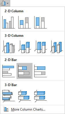
3. On the Insert tab, in the Charts group, click the Insert Bar or Column Chart button:

From the Insert Bar or Column Chart dropdown list, select Stacked Bar:
See more about chart types for pictograms.
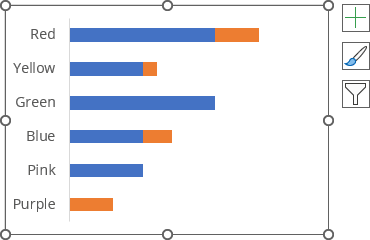
4. Customize the chart as you prefer.
E.g., reorganize the vertical labels, remove chart title and legend:
5. Select the data series, then do one of the following:
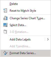
- Right-click on the data series and choose Format Data Series... in the popup menu:
- On the Chart Format tab, in the Current Selection group, click the Format Selection icon:

- Double-click on the selection.
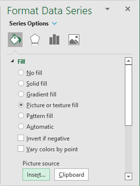
6. On the Format Data Series pane, on the Series Options tab, in the Fill & Line group, in the Fill section:
- Choose the Picture or texture fill option,
- Under Picture source, click the Insert... button:
In the Insert Pictures dialog box, choose the picture location, select the picture file, and then click Open or Insert:

- Select the Stack and Scale with option adjusts the scale of the stacked pictures using the Units/Picture field:
- Type or select 5 for the first data series,
- Type or select 1 for the second data series:
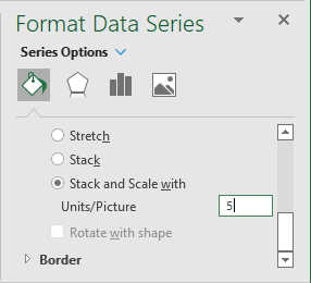
Make any other adjustments to get the look you desire:
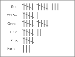
See also how to draw a chart with chalk effect and customize the axis labels.
