Customize the horizontal axis labels
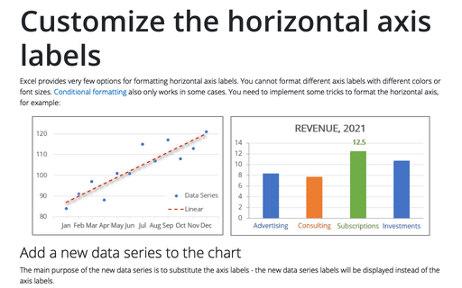
Excel provides very few options for formatting horizontal axis labels. You cannot format different axis labels with different colors or font sizes. Conditional formatting also only works in some cases. You need to implement some tricks to format the horizontal axis, for example:
Customize the vertical axis labels
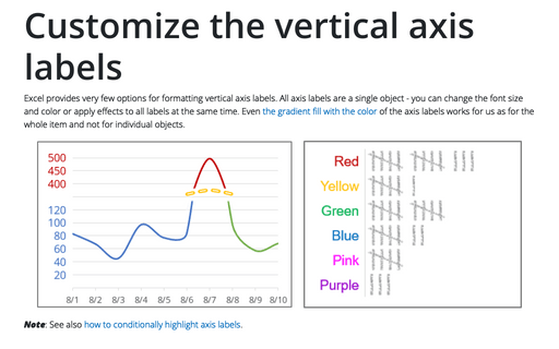
Excel provides very few options for formatting vertical axis labels. All axis labels are a single object - you can change the font size and color or apply effects to all labels at the same time. Even the gradient fill with the color of the axis labels works for us as for the whole item and not for individual objects.
How to add an axis pointer
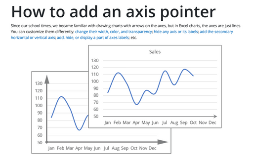
Since our school times, we became familiar with drawing charts with arrows on the axes, but in Excel charts, the axes are just lines. You can customize them differently: change their width, color, and transparency; hide any axis or its labels; add the secondary horizontal or vertical axis; add, hide, or display a part of axes labels; etc.
Conditional formatting for chart axes
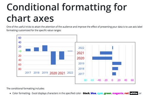
One of the useful tricks to attain the attention of the audience and improve the effect of presenting your data is to use axis label formatting customized for the specific value ranges:
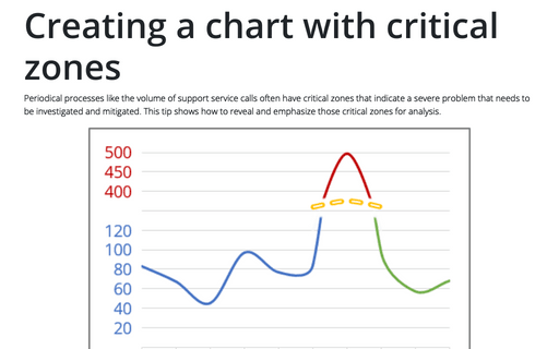
Creating a chart with critical zones
Periodical processes like the volume of support service calls often have critical zones that indicate a severe problem that needs to be investigated and mitigated. This tip shows how to reveal and emphasize those critical zones for analysis.
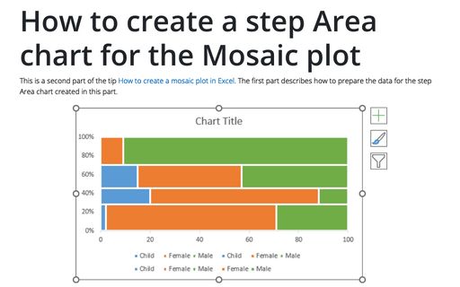
How to create a step Area chart for the Mosaic plot in Excel
This is a second part of the tip How to create a Mosaic plot in Excel. The first part describes how to prepare the data for the step Area chart created in this part.
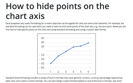
How to hide points on the chart axis
Excel proposes very useful formatting for numeric data that can be applied for cells and some chart elements. For example, the standard formatting can be used when you need or want to omit some points of the chart axis, e.g., the zero point. Below you will find how to hide specific points on the chart axis using standard formatting and using a custom label format:
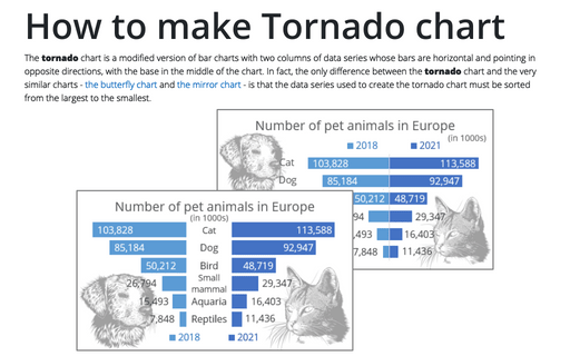
How to make Tornado chart in Excel
The tornado chart is a modified version of bar charts with two columns of data series whose bars are horizontal and pointing in opposite directions, with the base in the middle of the chart. In fact, the only difference between the tornado chart and the very similar charts - the butterfly chart and the mirror chart - is that the data series used to create the tornado chart must be sorted from the largest to the smallest.
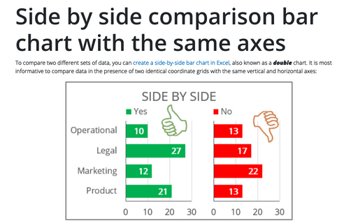
Side by side comparison bar chart with the same axes
To compare two different sets of data, you can create a side-by-side bar chart in Excel, also known as a double chart. It is most informative to compare data in the presence of two identical coordinate grids with the same vertical and horizontal axes:
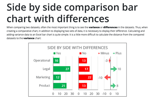
Side by side comparison bar chart with differences
When comparing two datasets, often the most important thing is to see the variance or differences in the datasets. Thus, when creating a comparative chart, in addition to displaying two sets of data, it is necessary to display their difference. Calculating and adding variance data to an Excel bar chart is quite simple. It is a little more difficult to calculate the distance from the compared datasets to the variance chart:
