Creating pictogram chart with colorful filling
In pictographs, the pictogram item, such as an icon, picture, or symbol, can represent one or multiple data units. Pictograms often include a key that indicates how much data is included in each item of the pictogram.
For example:
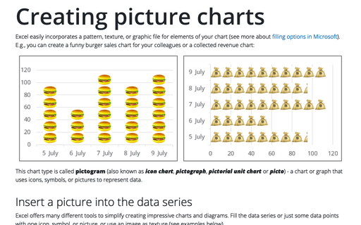
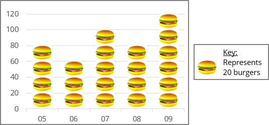
- In the picture chart, the image represents 20 units, the key = 20 (see more about picture chart):
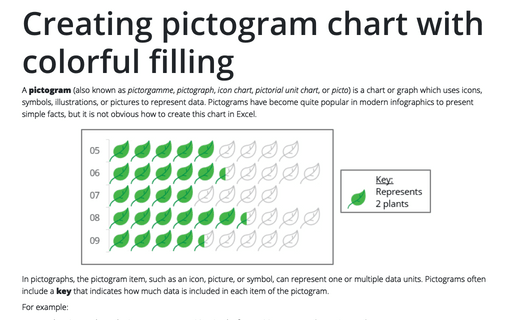
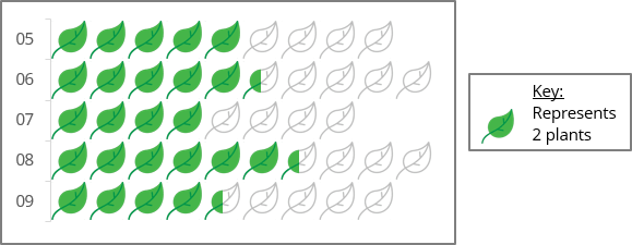
- In the pictogram below, the key = 2 units: one leaf represents two data units, and the half-filled leaf represents one data unit:
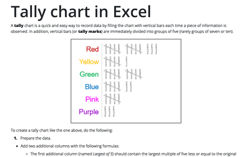
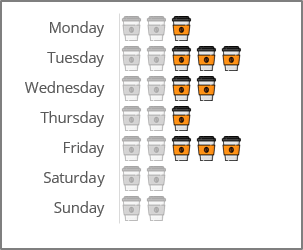
- The icon chart displays one picture per unit: two cups of coffee per day is normal - pay attention to the extra coffee you drink:
To create a pictogram, you can use one of two different approaches:
- Approach A: Each picture represents the exact value of the data units - there are no partially filled pictures on the chart. Before creating a chart, you need to round the data to the nearest key value. All data were rounded up to 20 units for the first example above.
Note: You can add data labels to see the data without rounding.
- Approach B: All pictures have the same size, but part of the icon can be used to display the corresponding part of this amount, as shown in the second example above.
Create a pictogram chart
To create a pictogram chart in Excel, do the following:
1. Create a column or bar chart: on the Insert tab, in the Charts group, click the Insert Bar or Column Chart button:

Choose the chart you prefer. See more about chart types for pictograms below.
2. Select the data series, then do one of the following:
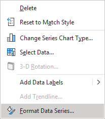
- Right-click on the data series and choose Format Data Series... in the popup menu:
- On the Chart Format tab, in the Current Selection group, click the Format Selection icon:

- Double-click on the selection.
3. On the Format Data Series pane, on the Series Options tab, in the Fill & Line group, in the Fill section:
- Choose the Picture or texture fill option,
- Under Picture source, click the Insert... button:
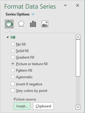
In the Insert Pictures dialog box, choose the picture location, select the picture file, and then click Open or Insert:

- Select one of the following options:
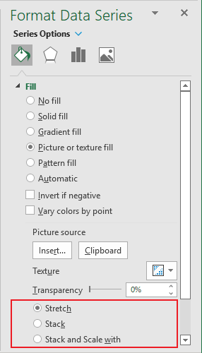
- Select the Stack option to format the picture to repeat the width of the data area. You will see as many pictures as Excel can put to the data area independently of the data series value.
- Select the Stack and Scale with option adjusts the scale of the stacked pictures using the Units/Picture field. E.g.:
- One picture per two units:
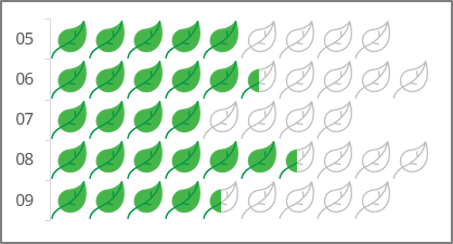
- One picture per one unit:
- One picture per two units:
Chart types for the pictogram with more than one data series
You can use one of the following chart types to create a colorful effect in an Excel chart:
- A stacked bar, 100% stacked bar, stacked column, or 100% stacked column chart.
- A clustered bar or clustered column chart.
Stacked bar or column charts
These chart types can be used only with Approach A. Each data series has the width of one or multiple pictogram items, i.e., the data values rounded to the pictogram key. Thus, the second data series always starts from the whole picture.
Usually, in such charts:
- The first data series represents the number of completed tasks, filled items, calculated units, counted marks, etc.,
- The second data series displays the number of remaining items to complete, fill, calculate, count, etc.
See below for more about adding a colorful effect.
Clustered bar or column charts
The main idea behind using these types of charts is to overlay the first data series on top of the second one:
- The first data series, like for stacked bar or column charts, represents the number of completed tasks, filled items, calculated units, counted marks, etc.,
- The second data series contains the total number of items.
To create a clustered bar or column chart with an overlay effect, do the following:
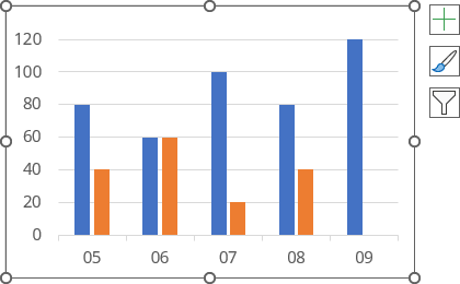
1. Create a clustered bar or column chart as usual.
For example:
2. Right-click any data series and choose Format Data Series... in the popup menu:

3. On the Format Data Series pane, in the Series Options group, in the Series Options section:
- In the Series Overlap field, type or select 100%:
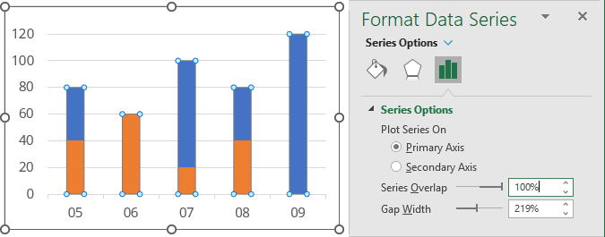
- Optionally, choose the value to create columns or bars wider or narrower in the Gap Width field.
Add the colorful effect
Do one of the following to add a colorful effect:
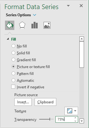
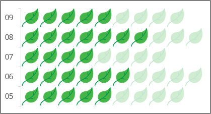
- Use the same picture, icon, image, or symbol for different data series but with different transparency.
To change the transparency of the data series picture, do the following:
1. Open the Format Data Series pane (see point 2).
2. On the Format Data Series pane, on the Series Options tab, in the Fill & Line group, in the Fill section, choose the appropriate value in the Transparency field:

For example:
- Use two different pictures with the same dimensions for the different data series:

- Use two variants of the same picture, icon, image, or symbol for different data series but with different picture effects. To apply picture effects, do the following:
1. Paste the picture you used for the first data series into the Excel spreadsheet.
2. Right-click on the picture and select Format Picture... in the popup menu (or double-click the picture):
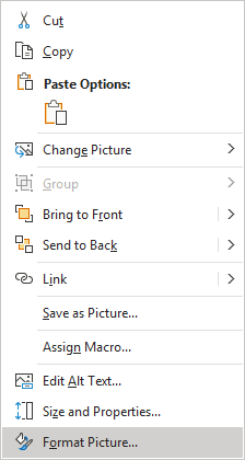
3. On the Format Picture pane, in the Picture group:
- In the Picture Color section, from the Presets list, choose Saturation: 0%:
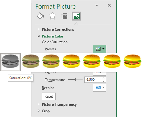
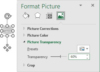
- Optionally, in the Picture Transparency section, choose the appropriate value in the Transparency field or use a slicer:
For example:
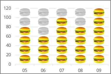
- In the Picture Color section, from the Presets list, choose Saturation: 0%:
See also how to remove the picture from the chart.
