How to create one chat of split bars or small multiple bars in Excel
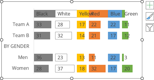
In some cases, it is important to compare each individual segment column by column and not add up positive (or conditionally positive) and negative (or conditionally negative) results:
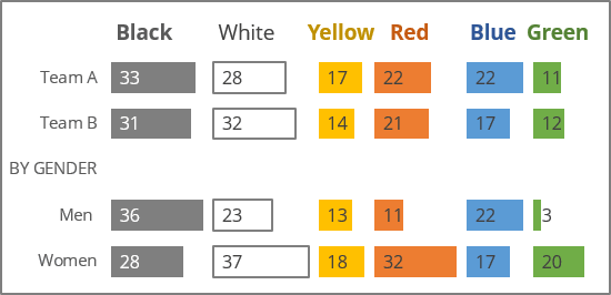
The trick of such charts is to supplement each data segment of a regular 100% stacked bar chart with intermediate data (gaps) so that each data segment plus the gaps make up 100%. This will align all columns of each segment to the left, giving the illusion of separate columns of bar charts.
In Excel, you can easily create small multiple bars or small multiples, also known as split bars, merged bar chart, or faceted bar chart like the one above, by doing the following:
1. Modify the chart data
For example, the chart will be created based on the results of a survey on color preferences in the enterprise (see how to organize such a survey in Outlook):
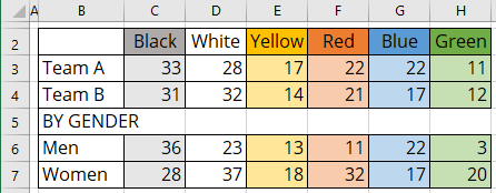
1.1. Optionally, add anywhere the cell with data for width between columns (in this example, B7 = 5). You can use some constants in formulas instead of the value from this cell.
1.2. For each column except the last one, add a new column for gaps (for this example, gap1 - gap5):

1.3. In the first gap column, in the additional row, add the formula to calculate the maximum of all values of the previous column - calculate the width of the first column.
In this example, D8: = MAX (C3:C7).
1.4. For all cells of the gap column, add the formula to calculate the difference between the calculated maximum plus the gap width (set in step 1.1. or a constant) and the value of this row - calculate the gap width.
In this example, D3: = $D$8 + $C$8 - C3, D4: = $D$8 + $C$8 - C4, etc.:

1.5. Repeat steps 1.3.-1.4. for all other gap columns.
In this example:
- F8: = MAX (E3:E7), ..., L8: = MAX (K3:K7),
- F3: = F$8 + $C$8 - E3, ..., L3: = L$8 + $C$8 - K3:

2. Create a stacked chart
2.1. Select the data range (in this example, B2:M7).
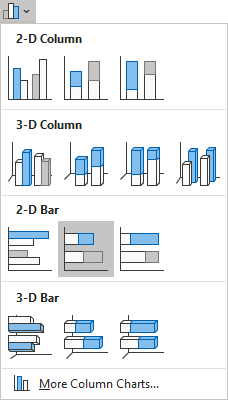
2.2. On the Insert tab, in the Charts group, click the Insert Column or Bar Chart button:

From the Insert Column or Bar Chart dropdown list, under 2-D Bar, select Stacked Bar:
Excel creates a simple stacked bar chart:
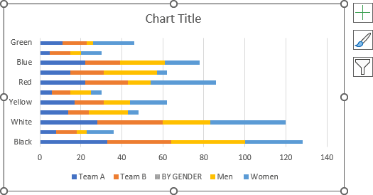
2.3. Switch rows and columns by doing one of the following:
- On the Chart Design tab, in the Data group, click the Switch Row/Column button:

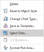
- Right-click on the chart plot area and choose Select Data... in the popup menu:
In the Select Data Source dialog box, click the Switch Row/Column button:
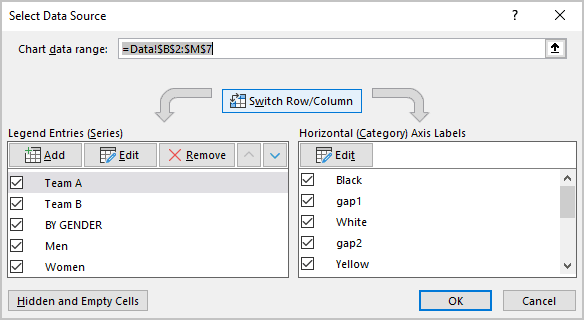
Excel changes the chart:
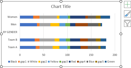
3. Format the chart
3.1. Change the order in which data is displayed on a vertical scale, see how to change axis labels order in a bar chart.
3.2. Optionally, hide the horizontal axis, remove the legend, type the chart title, or remove it.
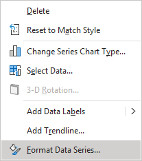
3.3. Right-click on the first data series and choose Format Data Series... in the popup menu:
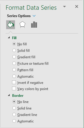
3.4. On the Format Data Series pane, on the Fill & Line tab:
- For every data series, select the appropriate filling option (see more about filling options in Microsoft).
- For the gap data series:
- In the Fill section, select the No fill option,
- In the Border section, select the No line option:
3.5. Repeat the previous steps to fill the data columns and hide all the gaps columns:
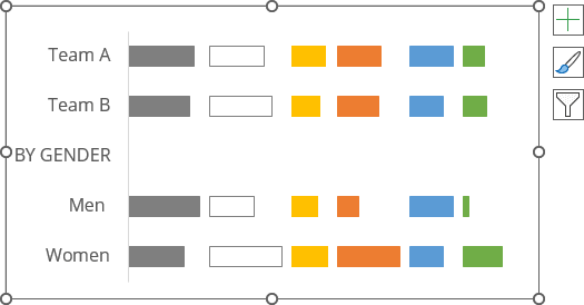
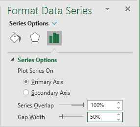
3.6. Optionally, on the Format Data Series pane, on the Series Options tab, in the Gap Width field, choose the value you like.
For example, 50%:
4. Add data labels
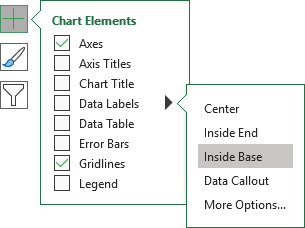
To add data labels to the chart, do one of the following:
- Click on the Chart Elements button, select the Data Labels list, then select the position of the labels:
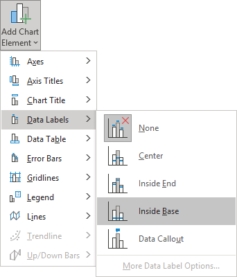
- On the Chart Design tab, in the Chart Layouts group, click the Add Chart Element button:

From the Add Chart Element dropdown list, choose Data Labels, then select the place for the labels:
Remove unnecessary labels:
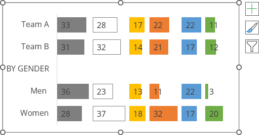
5. Optionally, add column headers
5.1. Add a new row to the data.
For this example, row 3.
5.2. Add new data for headers to every data column (not for gaps) to display the column width:
C3: = D9 + $C$9, E3: = F9 + $C$9, etc.:

5.3. Select the chart to see the data range on the spreadsheet, then move the mouse to see the resizing cursor:

5.4. Drag and move the cursor to include data you need to the chart data range:

Excel renews the chart data:
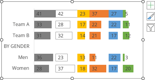
6. Optionally, format column headers
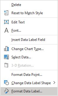
6.1. To format data labels, right-click on each of them, then select Format Data Label... in the popup menu:
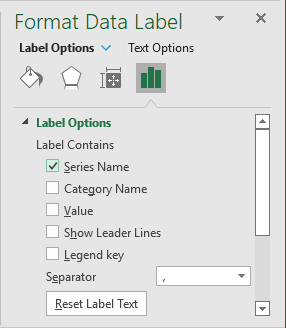
6.2. On the Format Data Label pane, on the Label Options section, in the Label Contains group:
- Check the Series Name option,
- Unselect all other options:
6.3. Select each data point of headers, then on the Format Data Point pane, on the Fill & Line tab, in the Fill group, select No fill:
Make any other adjustments you prefer.
