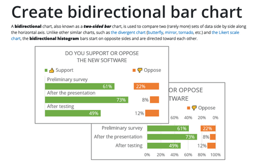
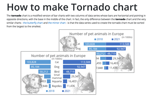
Create bidirectional bar chart in Excel
This type of chart is often used to display the results of votes or polls if there are only two meaningful answer options:
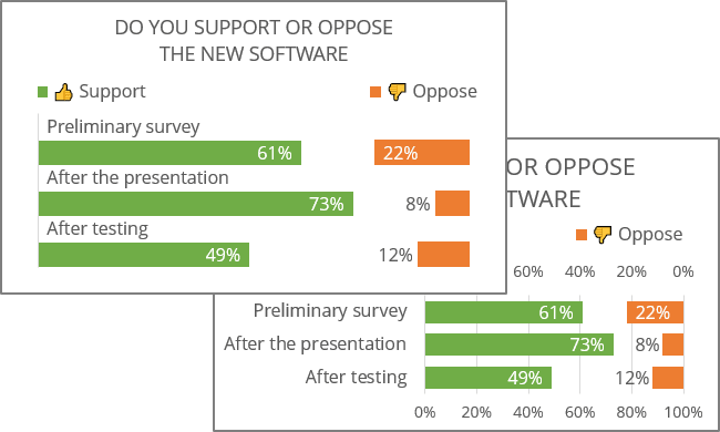
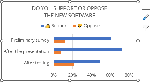
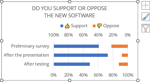
For example, the bidirectional bar chart is created based on the results of surveys conducted in a company on the introduction of new software before and after the presentation, as well as after testing:
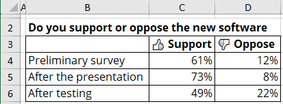
To create a bidirectional bar chart like the one above, do the following:
1. Create a regular bar chart
1.1. Select the data range (in this example, B3:D6).
1.2. On the Insert tab, in the Charts group, click the Insert Column or Bar Chart button:

From the Insert Column or Bar Chart dropdown list, under 2-D Bar, choose Clustered Bar:
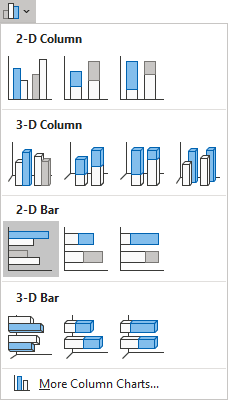
Excel creates a simple clustered bar chart:
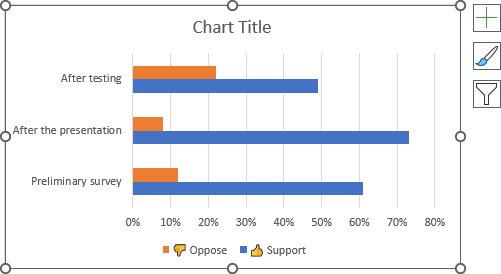
1.3. Optionally, change the order of the vertical axis labels:
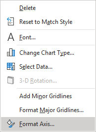
1.3.1. Right-click on the vertical axis and select Format Axis... in the popup menu:
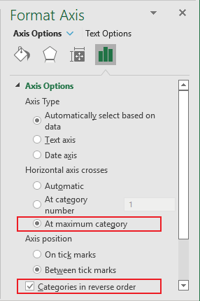
1.3.2. On the Format Axis pane, on the Axis Options tab, in the Axis Options group:
- Select the At maximum category option,
- Check the Categories in reverse order check box:
1.4. Optionally, format the chart to move the legend, type a title, etc.
For example:
2. Add the secondary horizontal axis
To display the second data series on the opposite side, select it, then do the following:
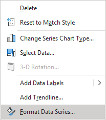
2.1. Right-click on the selection and choose Format Data Series... in the popup menu:
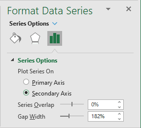
2.2. On the Format Data Series pane, on the Series Options tab, in the Series Options group, under Plot Series On, select the Secondary Axis option:
3. Format the primary horizontal axis
3.1. Right-click on the primary horizontal axis and choose Format Axis... in the popup menu.
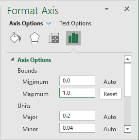
3.2. On the Format Axis pane, on the Axis Options tab, in the Axis Options section:
- In the Minimum field, make sure the value is 0,
- In the Maximum field, type the value 1 (100%):
4. Format the secondary horizontal axis
4.1. Right-click on the secondary horizontal axis and choose Format Axis... in the popup menu.
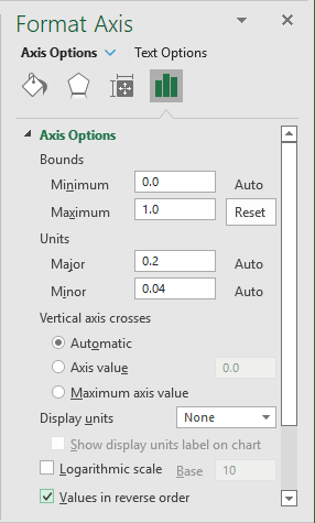
4.2. On the Format Axis pane, on the Axis Options tab, in the Axis Options group:
- In the Minimum field, make sure the value is 0,
- In the Maximum field, type the value 1 (100%),
- Check the Values in reverse order check box:
Excel recreates the chart:
5. Add data labels
To add data labels to the chart, select the chart, then do one of the following:
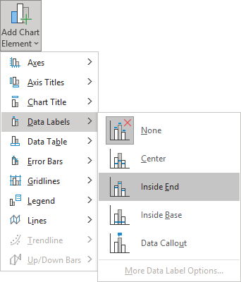
- On the Chart Design tab, in the Chart Layouts group, click the Add Chart Element button:

From the Add Chart Element dropdown list, choose Data Labels, then select the place for the labels:
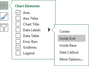
- Click on the Chart Elements button, select the Data Labels list, then select the position of the labels:
6. Format the chart
Option 1: Modify the data series
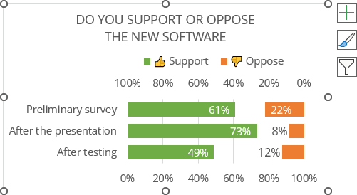
6.1. Right-click on the data series, then select Format Data Series... in the popup menu (see step 2.1.).
6.2. On the Format Data Series pane, on the Series Options tab, in the Series Options group, type or select the appropriate value (50%) in the Gap Width field:
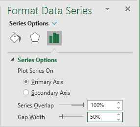
See how to create the rounded data series or how to change the bar shapes.
Option 2: Move vertical axis labels under the data series
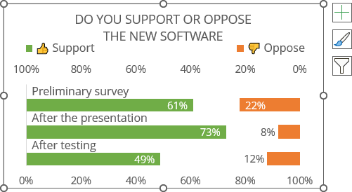
Add new data series to the chart
6.3. Do one of the following:
- On the Chart Design tab, in the Data group, click the Select Data button:

- Right-click on the chart plot area and choose Select Data... in the popup menu:
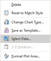
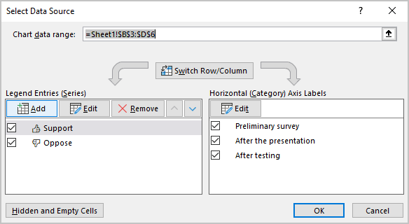
6.4. In the Select Data Source dialog box, under Legend Entries (Series), click the Add button:
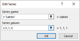
6.4.1. In the Edit Series dialog box:
- Optionally, in the Series name field, type the name you prefer,
- In the Series values field, type as many numbers as many labels you want to add to the chart (in this example, three labels that should fill all 100% = {1,1,1}):
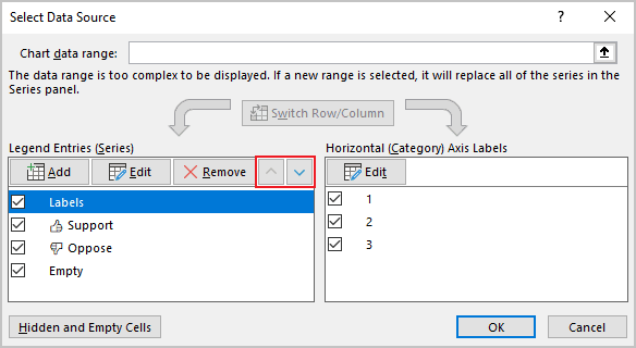
6.4.2. Repeat the previous steps to add the second new data series with Series values = {0,0,0}.
6.4.3. In the Select Data Source dialog box, reorder the data series using the Move Up and Move Down buttons to see the first created data series in the first place:
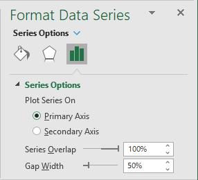
6.5. Right-click on the first created data series (see step 6.4.1.), then select Format Data Series... in the popup menu (see step 2.1.). On the Format Data Series pane, select the Primary Axis options:
Excel adds new data series to the chart:
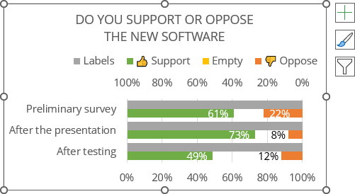
Add labels to the new data series
6.6. Select the new data series, add data labels (see step 5.), and choose the Inside Base option.
6.7. Right-click on the added data labels, then choose Format Data Labels... in the popup menu:
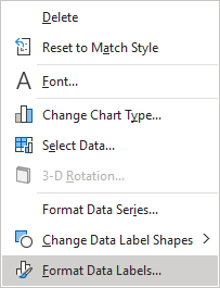
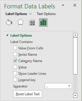
6.8. On the Format Data Labels pane, on the Label Options tab, in the Label Options section:
- Check the Category Name checkbox,
- Unselect any other checkboxes:
Format the new data series
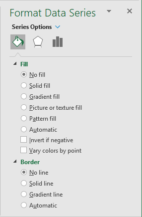
6.9. Right-click on the new data series, then select Format Data Series... in the popup menu (see step 2.1.). On the Format Data Series pane, on the Fill & Line tab:
- In the Fill section, select the No fill option,
- In the Border section, select the No line option:
6.10. Hide the vertical axis, and remove unnecessary items from the legend:

Make any other adjustments you desire.
