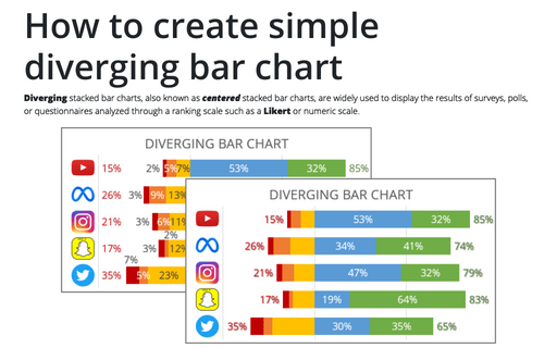
How to create simple diverging bar chart
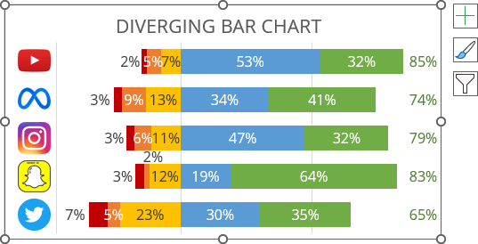
They allow comparison of respondents' responses when they are separated by different categories. In a diverging chart, the bars of one category are displayed from right to left (usually, negative values), while the bars of another category are displayed in reverse (usually, positive values):
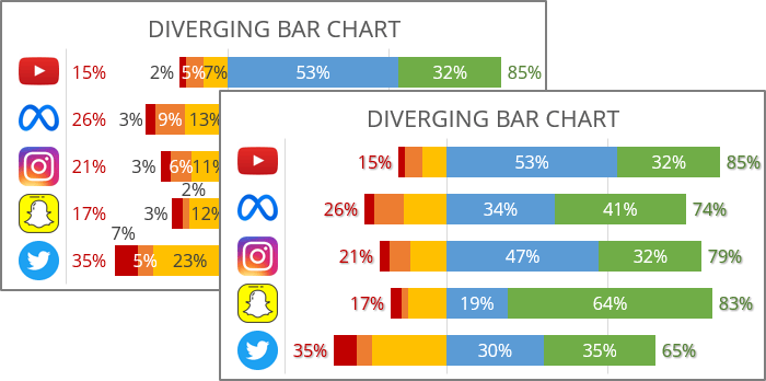
Opposite sides may show more than just positive or negative values. The divergence point, where the stacked horizontal bar chart aligns, may separate some ranked responses as more important than others.
The following describes the simplest option for constructing a divergent chart, allowing you to maximize Excel's capabilities.
Notes:
- See also how to create a bidirectional bar chart in Excel.
- If you have only two datasets, you can create a simpler but equally impressive butterfly, mirror, or tornado chart.
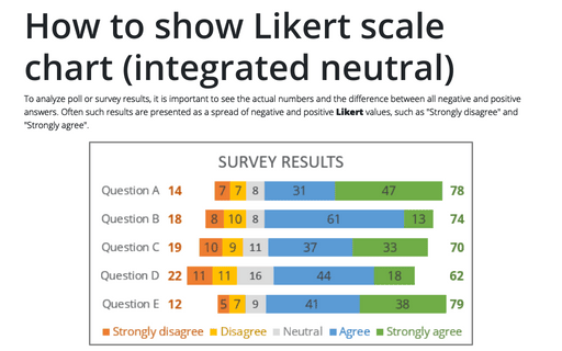
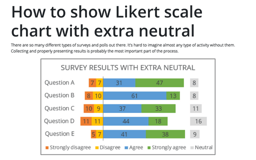
- If you have some kind of neutral response, see how to create a diverging chart with extra neutral or diverging chart integrated neutral.
For example, the diverging chart will be created for the following survey results:
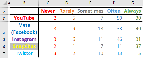
To create a diverting bar chart in Excel, do the following:
1. Modify the chart data
1.1. Modify all the negative (or conditionally negative) values by adding a minus symbol (see how to quickly transform your data without using formulas).
1.2. Reordering columns with negative values in reverse order:
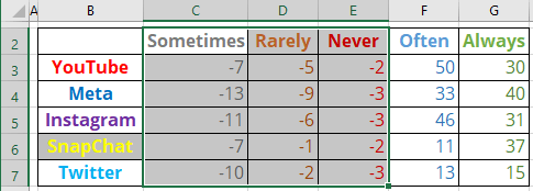
2. Add new data (optional)
To calculate the percentage of each data point, use the following formula:
Percent = ABS (<cell value>) / SUM (ABS (<values of this product>)),
The ABS (<number>) function returns the absolute value of a <number>.
So, H3: = ABS (E3) / SUM (ABS (C3:G3)), J3: = ABS (D3) / SUM (ABS (C3:G3)), etc.:

Note: You can leave the actual values - just remove the negative sign.
3. Create a diverging chart
3.1. Select the data range (in this example, B2:G7).
3.2. On the Insert tab, in the Charts group, click the Insert Column or Bar Chart button:

From the Insert Column or Bar Chart dropdown list, under 2-D Bar, select 100% Stacked Bar:
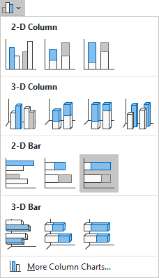
Excel creates a simple 100% stacked bar chart:
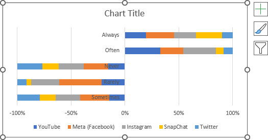
3.3. Switch rows and columns by doing one of the following:
- On the Chart Design tab, in the Data group, click the Switch Row/Column button:

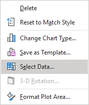
- Right-click on the chart plot area and choose Select Data... in the popup menu:
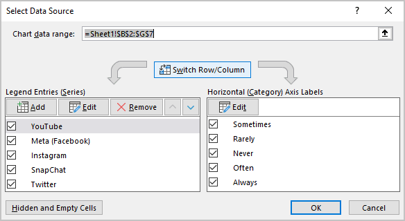
In the Select Data Source dialog box, click the Switch Row/Column button:
Excel changes the chart:
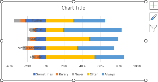
4. Format the axes
4.1. To change the order in which data is displayed on a vertical scale, see how to change axis labels order in a bar chart.
4.2. To position the vertical axis labels to the minimal position instead of the zero, do the following:
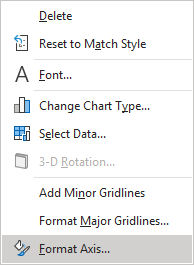
Right-click on the horizontal axis (attention! To position the vertical axis, it should be customized on the Format Horizontal Axis pane), then click the Format Axis... in the popup menu:
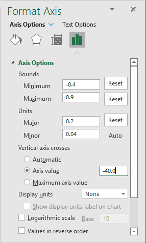
In the Format Axis pane, on the Axis Options tab, in the Axis Options section, in the Vertical axis crosses group, select the Axis value option, then type the minimal value in the appropriate text field.
In this example, -40:
5. Format the chart
5.1. Fill the data series as you prefer (see more about filling options in Microsoft).
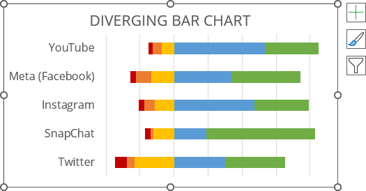
5.2. Optionally, hide the horizontal axis, type the chart title, and remove the legend.
For example:
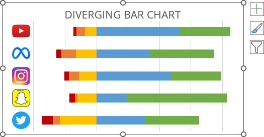
5.3. Optionally, insert logos instead of company names (see how to add pictures to a vertical chart axis):
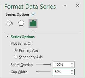
5.4. To change the bar width, do the following:
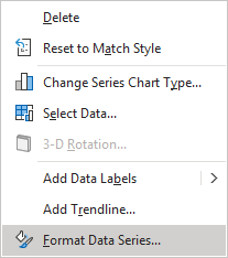
Right-click on any data series and choose Format Data Series... in the popup menu:
On the Format Data Series pane, on the Series Options tab, change the Gap Width setting:
6. Add data labels
To add data labels to the chart, do one of the following:
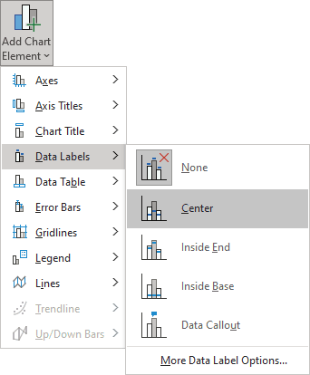
- On the Chart Design tab, in the Chart Layouts group, click the Add Chart Element button:

From the Add Chart Element dropdown list, choose Data Labels, then select the place for the labels:
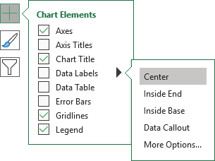
- Click on the Chart Elements button, select the Data Labels list, then select the position of the labels:
7. Format data labels
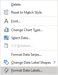
7.1. To format data labels, right-click on any of them for each data series, then select Format Data Labels... in the popup menu:
7.2. On the Format Data Labels pane, in the Label Options section, under Label Contains:
- Check the Value From Cells option,
- Choose the appropriate cells in the Data Label Range dialog box:
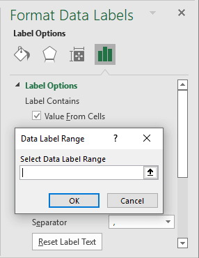
- Unselect all other checkboxes.
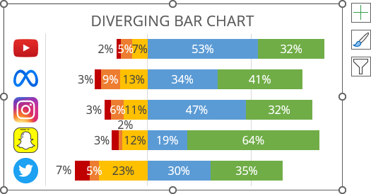
7.3. Position some labels as you prefer or modify their filling options.
For example:
8. Add totals
In many cases, the total number of positive and negative values is more important than the individual values. To add the totals, do the following:
8.1. Add a new column to the data with the following formula:
Total (percent) = SUM (<values>) / SUM (ABS (<values of this brand>)),
where, <values> are positive values.
The ABS (<number>) function returns the absolute value of a <number>. The absolute value of a <number> is its value without its sign.
So, D4: = - SUM (ABS (C3:D3)) / SUM (ABS (C3:F3)), F4: = SUM (ABS (E3:F4)) / SUM (ABS (C3:F3)), etc.:

Note: You can add labels as sums of corresponding values instead of percentages. You can also add labels for negative values.
8.2. Add a new data series to the chart as scatters with totals.
See how to add such data series to the bar chart for more details:
