How to create bar chart of the survey results
This type of feedback is usually presented as a set of questions with multiple-choice answers.
The response options in most cases are presented as a sum of responses on a Likert scale, in which the respondent assesses the degree of their agreement or disagreement with each question or statement from "Strongly agree" to "Strongly disagree" or "Very satisfied" to "Very unsatisfied", etc.
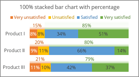
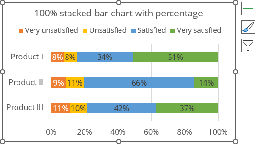
The most convenient way to visualize the responses is to create a percentage scale because the responses are presented in multiple categories, often four or five, that add up to 100%:
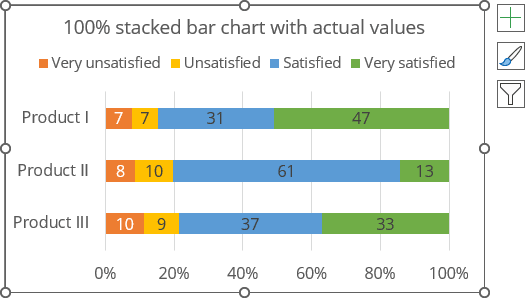
The same chart can be created with actual values:
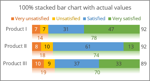
Unlike a regular stacked bar chart, 100% stacked bars do not have different widths and do not represent any absolute values. They are ideal for highlighting relationships between parts of multiple data series, allowing only the composition of different groups to be compared. See also how to create a diverging chart without neutral, diverging with extra neutral, diverging chart with integrated neutrals, and split bars.
The following charts will be created for the same example of the survey results without neutrals (see more about how to create charts with neutral values):

Stacked bar chart with actual values
To create a 100% stacked bar chart in Excel, do the following:
1. Select the data range.
In this example, B2:F5.
2.2. On the Insert tab, in the Charts group, click the Insert Bar or Column Chart button:

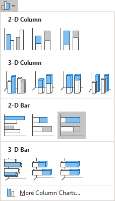
From the Insert Column or Bar Chart dropdown list, under 2-D Bar, select 100% Stacked Bar:
Excel creates a simple 100% stacked bar chart:
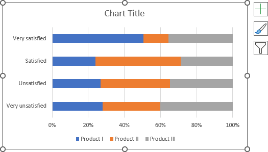
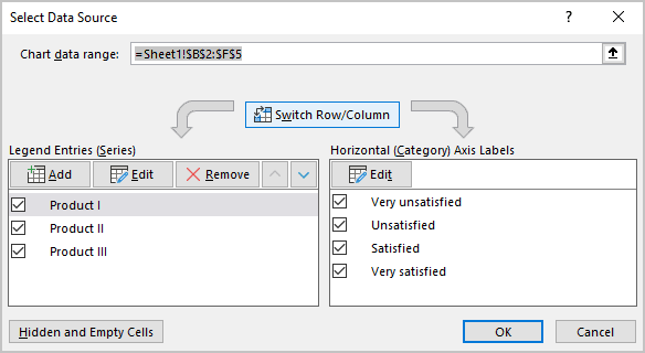
3. Switch rows and columns by doing one of the following:
- On the Chart Design tab, in the Data group, click the Switch Row/Column button:

- Right-click on the chart plot area and choose Select Data... in the popup menu:
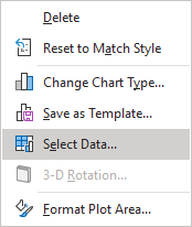
In the Select Data Source dialog box, click the Switch Row/Column button:
4. Add data labels by doing one of the following:
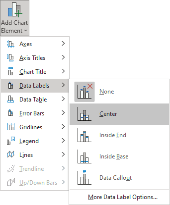
- On the Chart Design tab, in the Chart Layouts group, click the Add Chart Element button:

From the Add Chart Element dropdown list, choose Data Labels, then select the place for the labels:
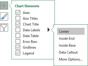
- Click on the Chart Elements button, select the Data Labels list, then select the position of the labels:
5. Format the chart as you prefer.
For example:
Notes:
- To change how data is displayed on a vertical scale, see how to change axis labels order in a bar chart.
- See below how to add the totals and subtotals to the chart.

Stacked bar chart with percentage
To create a 100% stacked bar chart with the percentage in Excel, do the following:
1. Create new data for data labels:
To calculate the percentage of each data point, use the following formula:
Percent = <cell value> / SUM (values of this product),
So, H3: = C3 / SUM (C3:F3), H4: = C4 / SUM (C4:F4), etc.:

2. Repeat steps 1-4 above of Stacked bar chart with actual values.
3. Format data labels by doing the following for each data series labels:
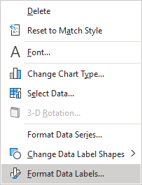
3.1. Right-click on the data label and select Format Data Labels... in the popup menu:
3.2. On the Format Data Labels pane, in the Label Options section, under Label Contains:
- Select the Value From Cells checkbox, then choose data labels in the Data Label Range dialog box:
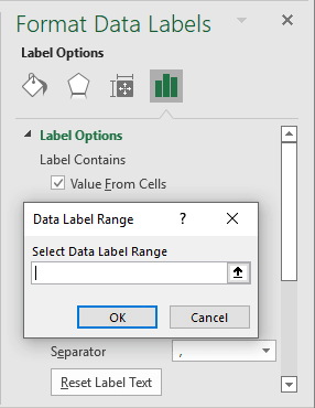
- Unselect all other checkboxes.
4. Format the chart as you prefer.
For example:
Add subtotals
In many cases, the total number of "Satisfied" and "Unsatisfied" ("Agree" and "Disagree") is more important than the individual "Very satisfied" ("Strongly agree") and "Very unsatisfied" ("Strongly disagree") values.
To add the subtotals, for example, for the diverging chart, do the following:
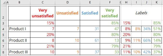
1. Add new data:
- For subtotals:
Subtotal percent = SUM (<values>) / SUM (<values of this product>),
where <values> are positive and negative values appropriately.
So, C3: = SUM (C4:D4) / SUM (C4:F4), F3: = SUM (E4:F4) / SUM (C4:F4), etc.
- For labels (equal to the calculated values):
2. Excel automatically adds the new data series to the chart except the first one. Simply add the new data series to the chart by doing the following:
2.1. Select the chart to see the data range on the spreadsheet, then move the mouse to see the resizing cursor on the top right corner:
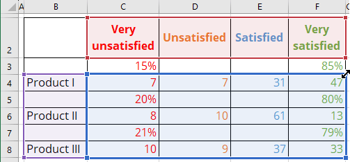
2.2. Press the mouse button and move the cursor to include the necessary rows in the chart data range:
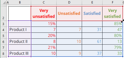
Excel renews the chart data:
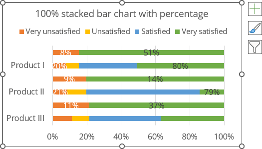
3. Reassign the labels to see the correct data series labels.
4. Remove the gap for the data series:
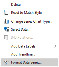
4.1. Right-click on any data series and choose Format Data Series... in the popup menu:
4.2. On the Format Data Series pane, on the Series Options tab, change the Gap Width setting:
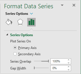
Excel redraws the chart without gaps between data series:
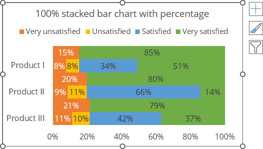
5. Select each data point of subtotals (hold the Ctrl key and use the arrow buttons to select your desired chart element). Then, on the Format Data Point pane, on the Fill & Line tab, in the Fill group, select the appropriate filling (see more about filling options in Microsoft).
For example:
- Select No Fill to hide the unnecessary data series:
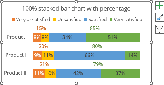
- Select Gradient fill to add more interesting effect:
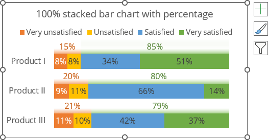
Note: To format visible data points (see also how to format invisible data points), do one of the following:
- Double-click twice on the data point you want to format,
- Hold the Ctrl key and select your desired chart element with the arrow buttons.
If needed, right-click on the selection and choose Format Data Point... in the popup menu.
