Cascade chart using stepped line chart in Excel
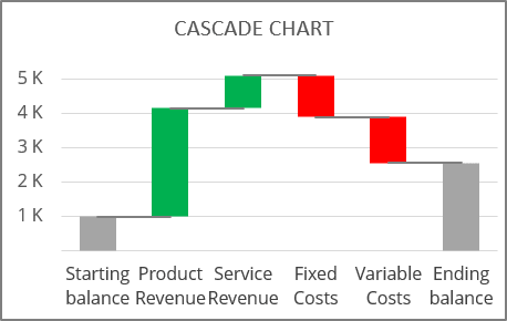
Despite the fact that the latest versions of Excel for Microsoft 365 provide a pre-configured template for creating a waterfall chart, it has some limitations that can be avoided using other tools (see also how to create a waterfall chart using bar charts). A stepped line chart is probably the most acceptable solution for creating a cascade chart.
A stepped line chart, also known as a step chart or step line chart, is a line chart in which points are connected by horizontal and vertical line segments, looking like steps of a staircase. Step line charts are used when it is necessary to highlight the irregularity of changes: for example, when it is necessary to visualize changes in exchange or interest rates.
It is easy to create a stepped line or stepped area chart in Excel when the data changes over time - the horizontal axis shows some dates, months, and years in any date format.
When you need to create a step chart for non-date, categorized data, you need to take a few extra steps:
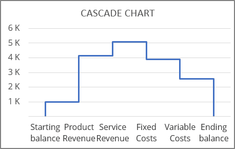
To create a stepped chart, each data point should be in date format and have two values (except the first and last one, where it is optional):
- The initial value,
- The final value.
So, to create a cascade chart as a stepped line, do the following:
1. Prepare data
If the data range for the cascade chart is not big, you can manually create a new data range. See how to create named ranges for the step charts.
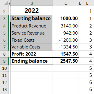
1.1. Add a new column to the data range with the numbers of the categorized labels that should be added twice - for the initial and the final values.
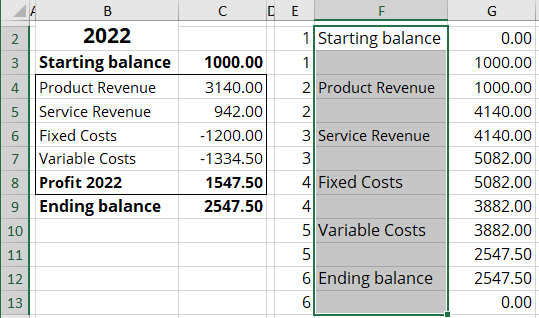
In this example, the chart will be created for 6 categories (the highlighted) - the numbers are added to the E column:
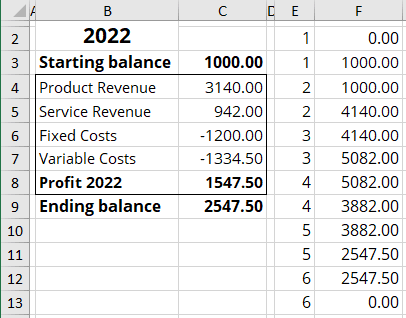
1.2. Calculate the initial and final values for each data point.
In this example:
- The first data point:
- The initial value F2: = 0,
- The final value F3: = C3 (Starting balance),
- The second data point:
- The initial value F4: = F3 (the previous value),
- The final value F5: = F4 + C4 (the previous value + value of this data point),
- ...
- The last data point:
- The initial value F12: = F11 (the previous value),
- The final value F13: = 0:
2. Create a chart
2.1. Select the newly added data values.
In this example, F2:F13.
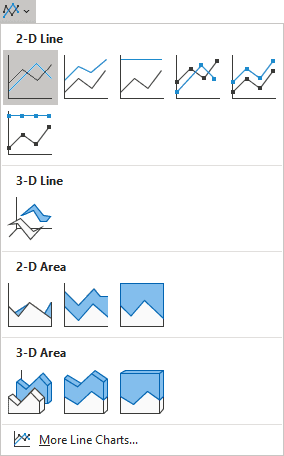
2.2. On the Insert tab, in the Charts group, choose the Insert Line or Area Chart button:

From the Insert Line or Area Chart dropdown list, select Line:
Excel creates a simple stepped line chart:
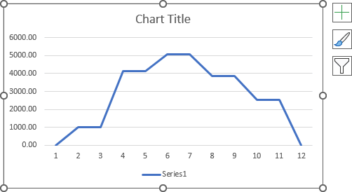
3. Format a chart
3.1. Do one of the following:
- On the Chart Design tab, in the Data group, choose Select Data:

- Right-click on the chart area and choose Select Data... in the popup menu:
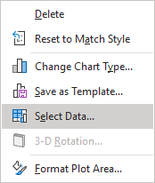
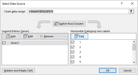
3.2. In the Select Data Source dialog box, under Horizontal (Category) Axis Labels, click the Edit button:
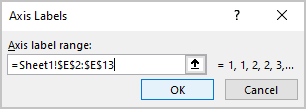
3.3. In the Axis Labels dialog box, in the Axis label range field, type the numbers created for the categorized labels (in this example, E2:E13), then click OK twice:
Excel changes the horizontal axis labels:
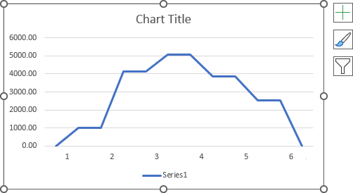
4. Format a horizontal axis
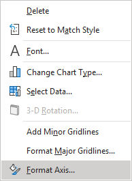
4.1. Right-click the horizontal axis, then choose Format Axis... in the popup menu:
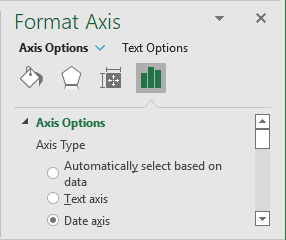
4.2. On the Format Axis pane, on the Axis Options tab, in the Axis Options section, under Axis Type, choose the Date axis option:
Excel creates the stepped line chart:
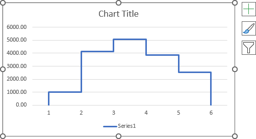
5. Format axis labels
5.1. Add a new data series to the chart
The main purpose of the new data series is to substitute the axis labels - the new data series labels will be displayed instead of the axis labels.
To add one or multiple data series to the existing chart, follow the next steps:
5.1.1. Open the Select Data Source dialog box (see step 3.1.).
5.1.2. In the Select Data Source dialog box, under Legend Entries (Series), click the Add button:
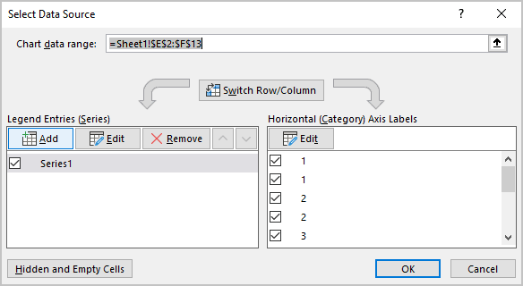
5.1.3. In the Edit Series dialog box, in the Series values field, type the constant values equal to the minimal visible value on your chart as many times as many data points created (see step 1.1.).
For example, 12 zeros = {0,0,0,0,0,0,0,0,0,0,0,0}:
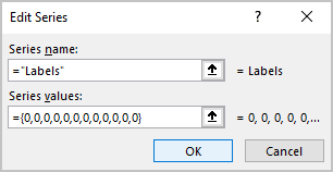
5.1.4. Click the OK button twice to close dialog boxes.
Excel rebuilds the chart - you can see the added data series at the axis for some chart types:
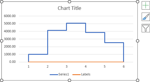
Note: See how to customize the horizontal axis for more details.
5.2. Hide the axis labels
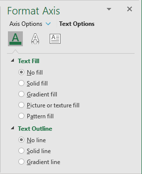
Right-click on the horizontal axis and choose Format Axis... in the popup menu (or double-click the horizontal axis) - see step 4.1.
On the Format Axis pane, on the Text Options tab, in the Text Fill & Outline group:
- In the Text Fill section, select No fill,
- In the Text Outline section, select No line:
5.3. Add the new data series labels
5.3.1. Add a new column to the data range to display the labels you want to see on the axis.
For example, column F:
5.3.2. Select the new data series (even if it is invisible, see how to select such elements on the chart), then do one of the following:
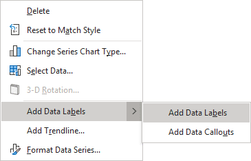
- Right-click on the selection, then choose Add Data Labels -> Add Data Labels in the popup:
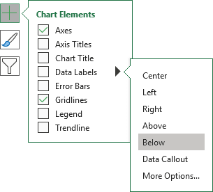
- Click on the Chart Elements button, select the Data Labels list, then choose Below:
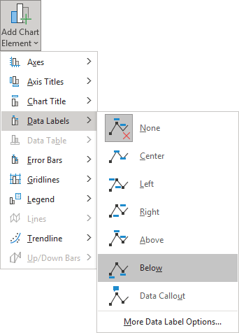
- On the Chart Design tab, in the Chart Layouts group, click the Add Chart Element button:

From the Add Chart Element dropdown list, choose Data Labels, then select Below:
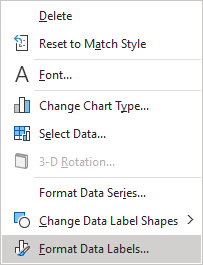
5.3.3. Right-click on the added data series labels and choose Format Data Labels... in the popup menu:
On the Format Data Labels pane, on the Label Options tab, in the Label Options section, under Label Contains:
- Select the Value From Cells checkbox, then choose data labels in the Data Label Range dialog box:
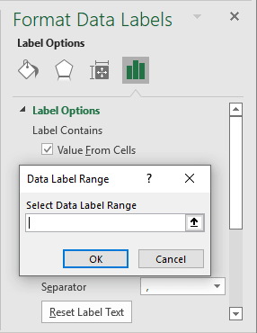
- Unselect all other checkboxes.
5.3.4. Make the formatting you want for the new data series labels instead of axis labels:
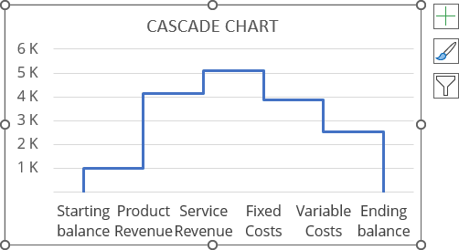
5.4. Hide the labels data series
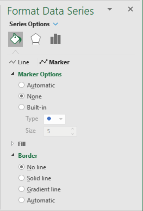
To make the additional data series invisible (if needed), on the Format Data Series pane, on the Series Options tab, in the Fill & Line group:
- In the Marker Options section, select None,
- In the Border section, select No line:
Make any adjustments to the stepped chart as you desire.
