Waterfall chart
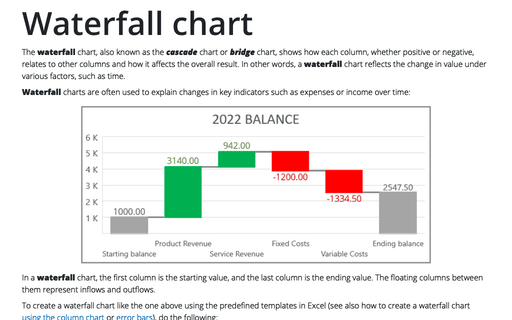
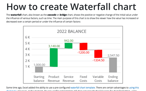
Waterfall charts are often used to explain changes in key indicators such as expenses or income over time:
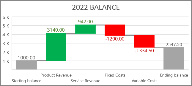
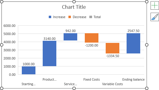
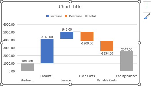
In a waterfall chart, the first column is the starting value, and the last column is the ending value. The floating columns between them represent inflows and outflows.
To create a waterfall chart like the one above using the predefined templates in Excel (see also how to create a waterfall chart using the column chart), do the following:
Create a predefined waterfall chart
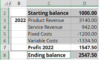
1. Select the chart data.
In this example, C2:D6, C8:D8:
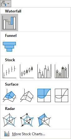
2. On the Insert tab, in the Charts group, choose the Insert Waterfall, Funnel, Stock, Surface, or Radar Chart button:

From the dropdown list, choose Waterfall:
Excel creates the simple waterfall chart:
Define the total amount
The last point in this example is the total amount that Excel displays as an inflow. To change the amount to the total, do one of the following:
- Click three times on the chart data point to select it:
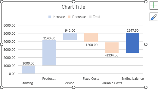
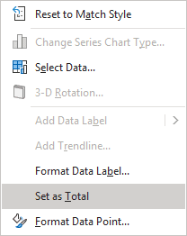
Then right-click on the selection and choose Set as Total in the popup menu:
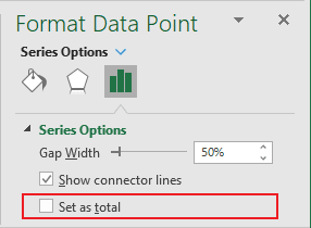
- On the Format Data Point pane (see above how to open this pane), on the Series Options tab, select the Set as total checkbox:
Note: To open the Format Data Point pane, do the following:
- Double-click on the data series to open the Format Data Series pane,
- Click on the data point to switch to the Format Data Point pane.
Excel changes the last bar to the total bar:
Format the waterfall chart
Format a color for different bridges
Excel for Microsoft 365 offers several ways to change color for different data points. You can choose one you prefer:
- To change the color for some data points, do the following:
- Select the data point by clicking three times on it (see step Define the total data for more details).
- Do one of the following:
- Right-click on the selection and choose the appropriate filling from the Fill dropdown list of the Mini toolbar:
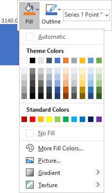
Note: See more about different filling and outline options in Microsoft.
- On the Format Data Point pane, on the Series Options tab, choose the appropriate Fill and Border options:
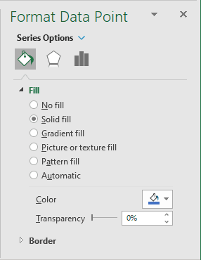
- Right-click on the selection and choose the appropriate filling from the Fill dropdown list of the Mini toolbar:
- To change the color of the stream data points, do the following:
- Select the data point of some stream by clicking the appropriate legend key:
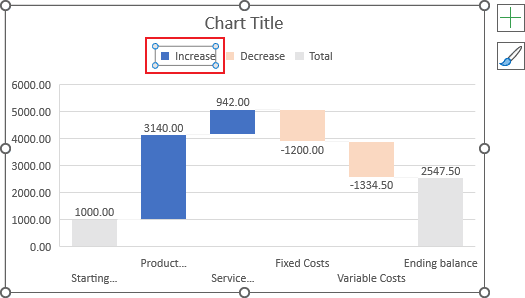
Excel selects data points of the selected stream.
Note: You need to select exactly the legend label. If you can't see the selection borders around the selected legend label, check for the Microsoft Office updates.
- Right-click the selected legend label and choose the wanted Fill options in the Mini toolbar:
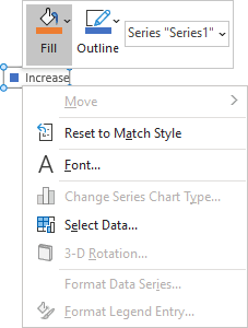
- Select the data point of some stream by clicking the appropriate legend key:
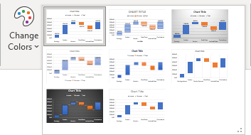
- To use the predefined color scheme for the chart, select the chart, then on the Chart Design tab, in the Chart Styles group, click the Change Colors button:

From the Change Colors drop-down list, choose the predefined set you prefer:
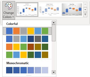
Note: You can also use any of the predefined chart styles by using anyone from the Chart Styles gallery by clicking the More button on the bottom right corner:
- To use the predefined Theme Colors, choose it from the Colors dropdown list in the Themes group on the Page Layout tab:
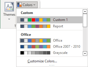
Note: Create a new set of Theme Colors:
- see how to change the default colors that Excel uses for chart series,
- see more about Themes and Theme elements in Excel.
Format the connector lines
To hide or display the connector lines in the waterfall chart, do the following:
1. Open the Format Data Series pane by doing one of the following:
- Click on any data point, then on the Chart Format tab, in the Current Selection group, click the Format Selection button:

- Right-click on any data point, then choose Format Data Series... in the popup menu,
- Double-click on any data point.
2. On the Format Data Series pane, on the Series Options tab, select the Show connector line checkbox:
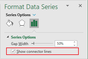
To format the connector line, do the following:
1. Open the Format Data Series pane (see above how to do it).
2. On the Format Data Series pane, on the Fill & Line tab, in the Border section, select the line type, width, color, transparency, etc.:
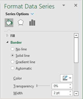
Excel adds the selected line format to all the data series. So, you need to remove or change the format of the data points, if needed:
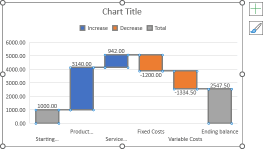
Format axes and title
See how to work with axes and the title for more details. For example:
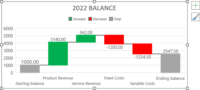
Note: Unfortunately, at the time of this writing, Excel doesn't offer tools to format:
- Plot area - now, changing the plot area dimensions is impossible.
After double-clicking on the plot area, there are no handles to resize the plot area as in other charts.
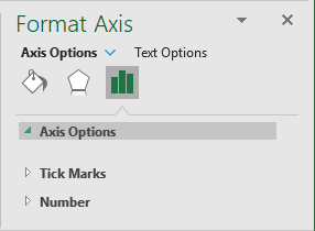
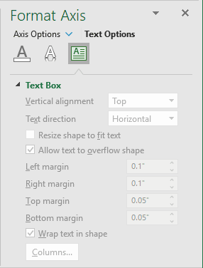
- Horizontal axis - there are no possibilities to change its format:
- For the axis itself:
- For the axis text:
- For the axis itself:
Waterfall charts are new in Excel and have limited functionality. Excel doesn't offer a probability to use several data series in one waterfall chart, use the waterfall chart type in any combination chart, etc.
If you need additional formatting, several data series in one chart, or using one or several waterfall data series in one combination chart, we recommend creating a waterfall or cascade chart using column charts.
