How to add an axis pointer
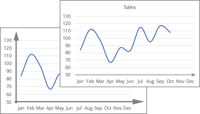
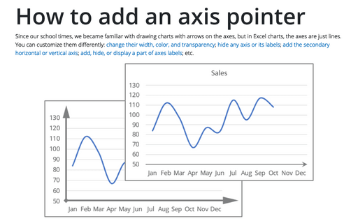
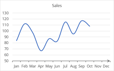
For example, arrows should be added to the horizontal axis of an existing chart instead of simple axes created by default:
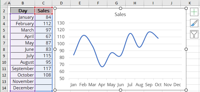
Customize an axis to display an arrow
To display an arrow in the axis, do the following:
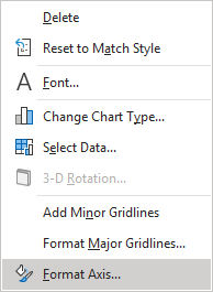
1. Right-click on the axis and select Format Axis... in the popup menu (or double-cick on the axis):
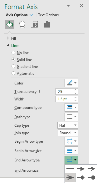
2. On the Format Axis pane, on the Axis Options tab, in the Fill & Line group, in the Line section, for any of the selected options but No line:
- In the End Arrow type list, select Stealth Arrow:
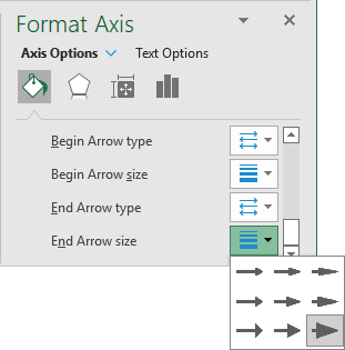
- In the End Arrow size list, select the biggest one: Arrow R Size 9:
Excel displays the arrow at the end of the axis:
Note: You can remove major and minor tick marks if available: on the Format Axis pane, on the Axis Options tab, in the Axis Options group, in the Tick Marks section:
- In the Major type list, choose None:
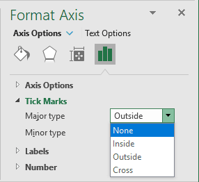
- In the Minor type list, choose None if needed.
Add the shape for the axis arrow
To add a custom arrow to the horizontal (Category) axis, do the following:
Create a shape for an arrow
1. Create the arrow shape: on the Insert tab, in the Illustrations group, click the Shape button (see more about shapes), then select any arrow shape and customize it:

Add new data
2. Add new data for the new data series with the values to be at the rightmost point of the chart horizontal axis:

where,
- 12 for the horizontal position because the rightmost value is 12th months,
- 50 for the vertical position because the minimal visible value in the Y axis is 50.
Add a new data series
3. Add a new data series to the chart:
3.1. To add a new data series to your chart, do one of the following:
- On the Chart Design tab, in the Data group, choose Select Data:

- Right-click on the chart area and choose Select Data... in the popup menu:
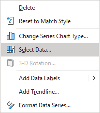
3.2. In the Select Data Source dialog box:
- Under Legend Entries (Series), click the Add button:
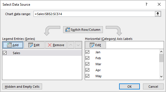
- In the Edit Series dialog box, type:
- In the Series X values box - the cell with the Y value ($D$17):
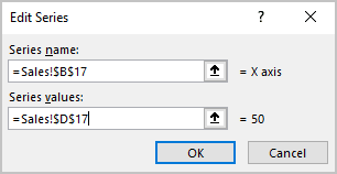
- Click the OK button twice to close the Select Data Source dialog box.
Note: If your chart is a scatter chart, you will see another dialog box. Skip the following steps and go to step 3.6.
3.3. Right-click on the new data series and choose Change Series Chart Type... in the popup menu:
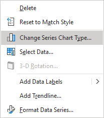
Note: If you don't see the new data series on the chart, see how to select invisible elements on the chart.
3.4. In the Change Chart Type dialog box, for the new data series, choose the Scatter type:
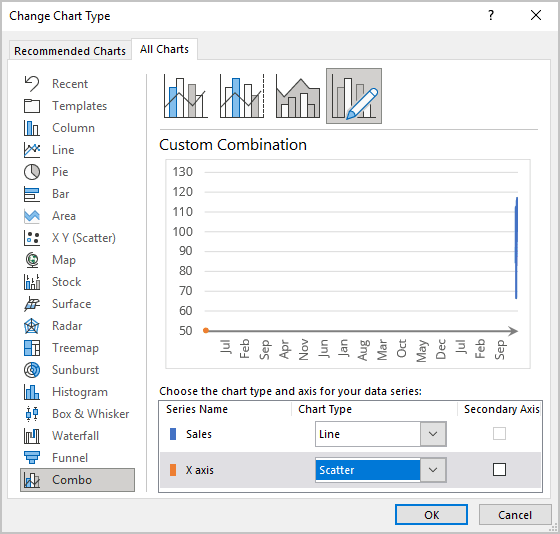
Note: Don't worry about the wrong visualization - you will fix it later.
3.5. Open the Select Data Source dialog box again (see step 3.1.), select the new data series, then under Legend Entries (Series), click the Edit button.
3.6. In the Edit Series dialog box, type:
- In the Series X values box - the cell with the X value ($C$17),
- In the Series Y values box - the cell with the Y value ($D$17):
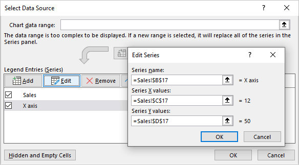
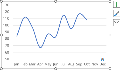
The new data series is added to the rightmost point at the horizontal axis:
Add a data series label
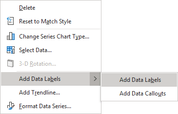
4. Right-click the new data series and choose Add Data Labels -> Add Data Labels in the popup menu:
5. Select the prepared shape for the arrow and copy it to the Clipboard by pressing Ctrl+C or clicking the Copy button in the Clipboard group on the Home tab:

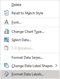
6. Right-click on the new data labels and select Format Data Labels... in the popup menu:
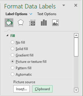
7. On the Format Data Labels pane:
- On the Label Options tab:
- In the Fill & Line group, in the Fill section, select the Picture or texture fill option, then click the Clipboard button:
- In the Label Options group, under Label Options, in the Label Position group, select the Right option:
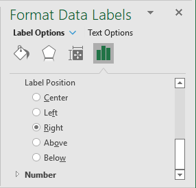
- In the Fill & Line group, in the Fill section, select the Picture or texture fill option, then click the Clipboard button:
- On the Text Options tab, in the Text Fill & Outline group:
- In the Text Fill section, select No fill,
- In the Text Outline section, select No line:
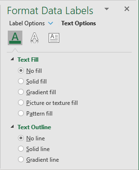
Excel displays the new data series with shape as a label:
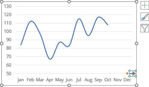
Note: To change the shape dimensions, double-click on it to see the resize handles:
The last and the most important step is to hide the unneeded data series, then customize the horizontal axis.
Note: The same technique can be adapted for the Y axis:
- The shape can look like this:

- The new data for the new data series can be like this:

where,
- 1 for the horizontal position because of the leftmost value,
- 130 for the vertical position because of the maximum visible value in the vertical axis.
- To see the correct position for the shape, on the Format Data Labels pane, in the Label Options group, under Label Options, in the Label Position group, select the Above option.
