Excel 365
How to add a horizontal line to the chart
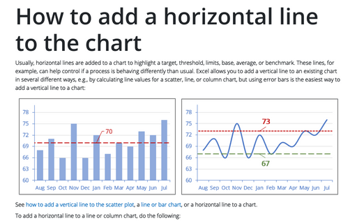
Usually, horizontal lines are added to a chart to highlight a target, threshold, limits, base, average, or benchmark. These lines, for example, can help control if a process is behaving differently than usual. Excel allows you to add a vertical line to an existing chart in several different ways, e.g., by calculating line values for a scatter, line, or column chart, but using error bars is the easiest way to add a vertical line to a chart:
How to create dependent on a volume chart title
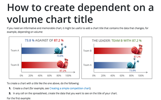
If you need an informative and memorable chart, it might be useful to add a chart title that contains the data that changes, for example, depending on volume:
Competition chart with residual data
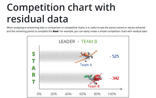
When analyzing or presenting data in comparison or competitive charts, it is useful to see the points scored or results achieved and the remaining points to complete the Goal. For example, you can easily create a simple competition chart with residual data:
Creating a chart with dynamic labels
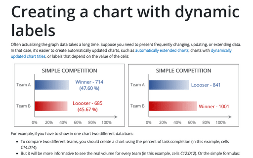
Often actualizing the graph data takes a long time. Suppose you need to present frequently changing, updating, or extending data. In that case, it's easier to create automatically updated charts, such as automatically extended charts, charts with dynamically updated chart titles, or labels that depend on the value of the cells:
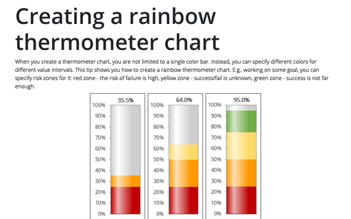
Creating a rainbow thermometer chart
When you create a thermometer chart, you are not limited to a single color bar. Instead, you can specify different colors for different value intervals. This tip shows you how to create a rainbow thermometer chart. E.g., working on some goal, you can specify risk zones for it: red zone - the risk of failure is high, yellow zone - success/fail is unknown, green zone - success is not far enough.
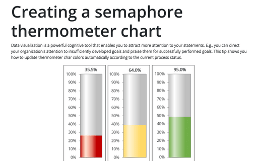
Creating a semaphore thermometer chart
Data visualization is a powerful cognitive tool that enables you to attract more attention to your statements. E.g., you can direct your organization's attention to insufficiently developed goals and praise them for successfully performed goals. This tip shows you how to update thermometer char colors automatically according to the current process status.
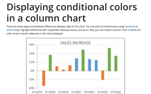
Displaying conditional colors in a column chart
There are many ways to emphasize differences between data on the chart. You can add a threshold value using horizontal or vertical lines, highlight differences with a waterfall, individual values, and so on. Also, you can create a column chart in which the color of each column depends on the value displayed.
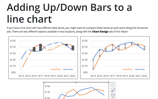
Adding Up/Down Bars to a line chart
If you have a line chart with two different data series, you might want to compare those series at each point along the horizontal axis. There are two different options available in two locations, along with the Chart Design tab of the ribbon:
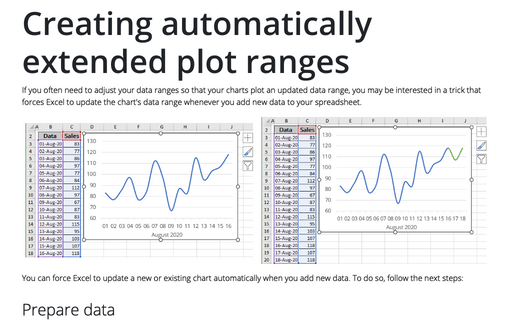
Creating automatically extended plot ranges
If you often need to adjust your data ranges so that your charts plot an updated data range, you may be interested in a trick that forces Excel to update the chart's data range whenever you add new data to your spreadsheet.
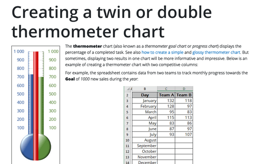
Creating a twin or double thermometer chart
The thermometer chart (also known as a thermometer goal chart or progress chart) displays the percentage of a completed task. See also how to create a simple and glossy thermometer chart. But sometimes, displaying two results in one chart will be more informative and impressive. Below is an example of creating a thermometer chart with two competitive columns:
