Displaying conditional colors in a column chart
For example, you want to demonstrate the differences in sales during 2020 - 2022:
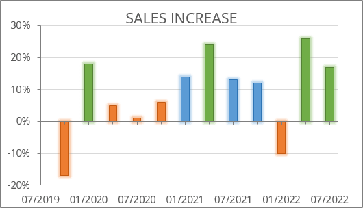
To create a chart like the one above, do the following:
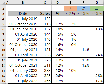
Prepare a new data
1. Split your data into different columns:
For example, split values into three columns:
- Column I - the values less than 7%:
= IF (<cell> < 7%, <cell>, ""),
- Column II - the values less than 15%:
= IF (AND (<cell> >= 7%, <cell> < 15%), <cell>, ""),
- Column III - the values equal to or more than 15%:
= IF (<cell> < 15%, "", <cell>), where <cell> = D*:
Create a column chart
Excel creates charts from the data with gaps in a strange manner. You need to add or change the data series manually. Follow the next steps to create a perfect chart:
2. Select the data cells without gaps (for this example, B3:C16).
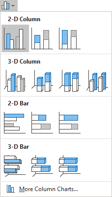
On the Insert tab, in the Charts group, click the Insert Bar or Column Chart button:

Choose Clustered Column:
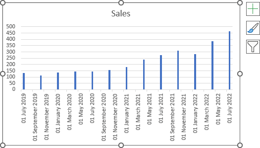
Excel creates a chart from that you need to modify:
Modify the chart data series
3. Do one of the following:
- On the Chart Design tab, in the Data group, choose Select Data:

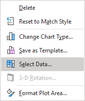
- Right-click on the chart area and choose Select Data... in the popup menu:
In the Select Data Source dialog box, under Legend Entries (Series):
- Click the Add button:
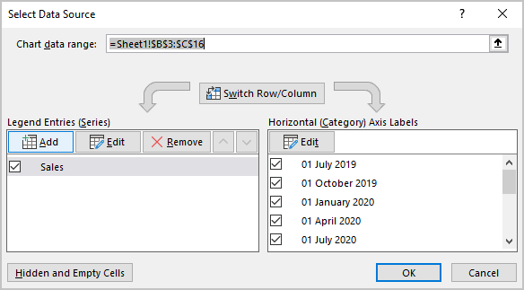
In the Edit Series dialog box, type or choose the data for each data series.
For this example:
- The first data series for values less than 7% (E4:E16),
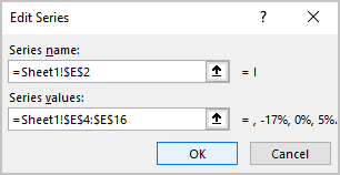
- The second data series for values less than 15% (F4:F16),
- The third data series for values equal to or more than 15% (G4:G16).
- The first data series for values less than 7% (E4:E16),
- Select the existing data series (for this example, Sales), and click the Remove button:
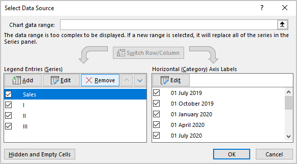
After clicking the OK button, Excel modifies the chart:
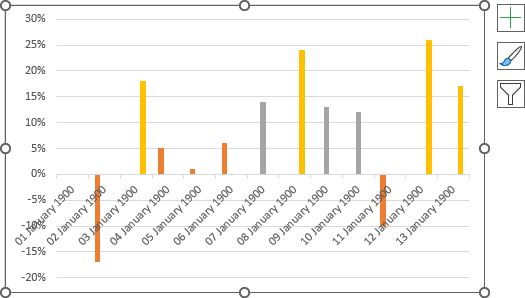
Optionally, format the horizontal axis
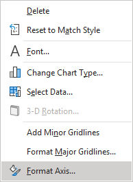
4. Right-click on the horizontal axis and select Format Axis... in the popup menu (or double-click on the axis):
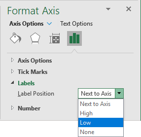
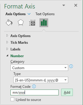
On the Format Axis pane, on the Axis Options tab:
- In the Labels group, from the Label Position list, choose Low:
- In the Number group, choose the format you prefer:
See more about conditional formatting for the horizontal axis.
You can then make any other adjustments to get the look you need.
See also this tip in French: Affichage des couleurs conditionnelles dans un graphique à colonnes.
