Displaying conditional colors in a column chart
For example, you want to demonstrate the differences in sales during 2012 - 2015:
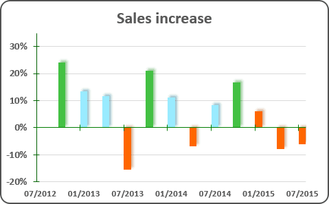
To create the chart like this one, do the following:
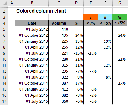
1. Split your data to the different columns:
- Column I = IF (cell<7%, cell, ""),
- Column II = IF (AND (cell>=7%, cell<15%, cell, ""),
- Column III = IF (cell>15%, cell, ""),
For example (here cell = D*):
2. Select the data cells.
3. On the Insert tab, in the Charts group, choose the Column button:

Choose the Clustered Column
 chart.
Change Data Source if necessary:
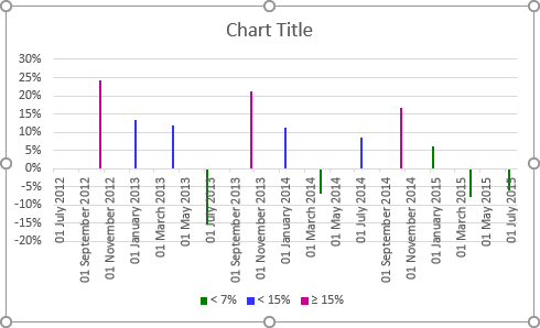
4. Open Format Axis on the Format task pane, in which:
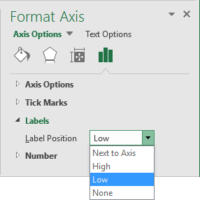
- In the Labels group, in the Label Position list, choose Low:
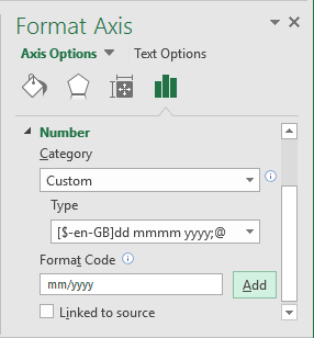
- In the Number group, choose the format you prefer:
You can then make any other adjustments to get the look you need.
See also this tip in French: Affichage des couleurs conditionnelles dans un graphique à colonnes.
