Adding Up/Down Bars to a line chart
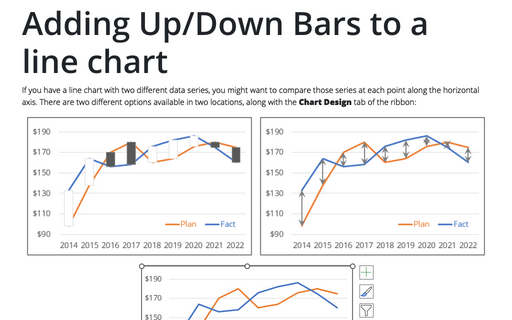
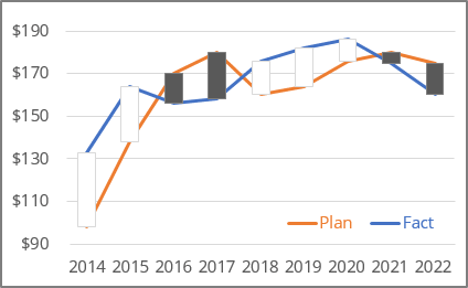
- Add Up/Down Bars to the chart:
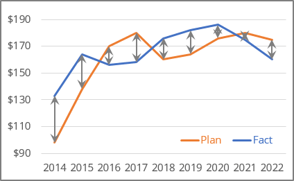
- Add High-Low Lines to the chart:
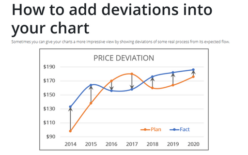
There are advantages and disadvantages of using one or another chart element.
To use any of the mentioned elements, create a line chart with two different data series, for example:
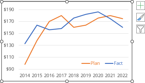
Add Up/Down Bars to the chart
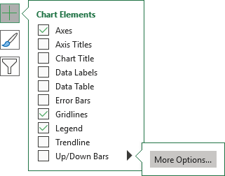
To add Up/Down Bars to your chart, select the chart and then do one of the following:
- Click on the Chart Elements button, select the Up/Down Bars list, then choose More Options...:
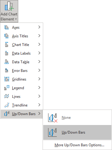
- On the Chart Design tab, in the Chart Layouts group, click the Add Chart Element dropdown list:

In the Add Chart Element dropdown list, choose the Up/Down Bars list, then click Up/Down Bars again or choose More Up/Down Bars Options...:
Add High-Low Lines to the chart
To add High-Low Lines to your chart, select the chart and then on the Chart Design tab, in the Chart Layouts group, click the Add Chart Element dropdown list, then choose Lines list:
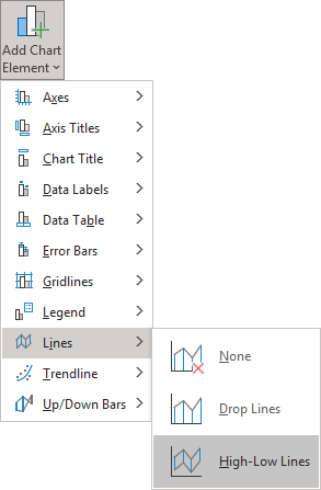
In the Lines drop-down list, select High-Low Lines.
Format Up/Down Bars
Excel offers several ways to modify Up/Down Bars:
- Filling color and its transparency,
- Border color, its transparency, width, and style:
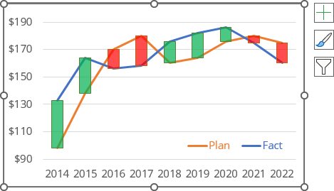
Unfortunately, you can't change the bar width.
To format Up/Down Bars, do the following:
1. Right-click on the Up Bars or Down Bars, then select Format Up Bars... or Format Down Bars... in the popup menu:
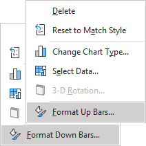
2. On the Format Up Bars or Format Down Bars pane:
- On the Fill & Line group, select the appropriate options in the Fill and Border sections:
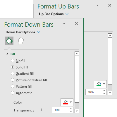
See more about fill and outline options in Microsoft Excel.
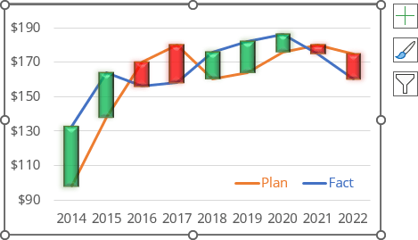
- On the Effects group, choose effects to apply to the bars, such as Shadow, Glow, Soft Edges, or 3-D Format:
Format High-Low Lines
You can modify High-Low Lines as a regular line:
- Filling color and its transparency,
- Customize line width and style, and add the arrows or points to the beginning or end of the line:
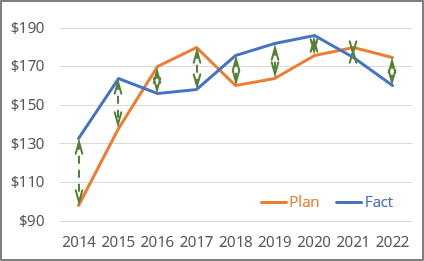
Unfortunately, you can't change the high and low lines separately.
To format High-Low Lines, do the following:
3. Right-click on the High-Low Lines, then select Format High-Low Lines... in the popup menu:
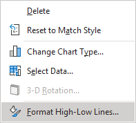
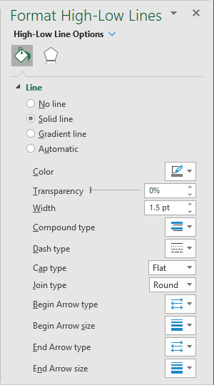
4. On the Format High-Low Lines pane:
- On the Fill & Line group, the appropriate options in the Line sections:
- On the Effects group, choose effects to apply to the bars, such as Shadow, Glow, or Soft Edges:
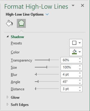
For example:
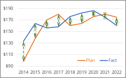
Delete Up/Down Bars
To remove the Up/Down Bars from the chart, do one of the following:
- Click on the Chart Elements button, and unselect the Up/Down Bars checkbox:
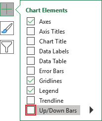
Be careful! After unselecting that checkbox, you lose all previous customization if you want to add them later.
- On the Chart Design tab, in the Chart Layouts group, click the Add Chart Element dropdown list. In the Add Chart Element dropdown list, choose the Up/Down Bars list, and click None.
- Select any of the Up/Down Bars, then click Delete.
Delete High-Low Lines
To remove the High-Low Lines from the chart, do one of the following:
- On the Chart Design tab, in the Chart Layouts group, click the Add Chart Element drop-down list. In the Add Chart Element drop-down list, choose the Lines list, and click None.
- Select any of the High-Low Lines, then click Delete.
See also this tip in French: Ajouter de barres Haut / Bas à un graphique en courbes.
