Creating a twin or double thermometer chart
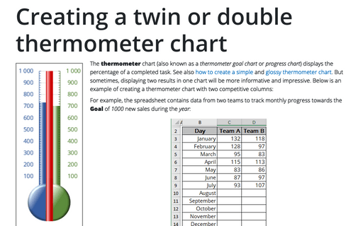
The thermometer chart (also known as a thermometer goal chart or progress chart) displays the percentage of a completed task. See also how to create a simple and glossy thermometer chart. But sometimes, displaying two results in one chart will be more informative and impressive. Below is an example of creating a thermometer chart with two competitive columns:
How to create a Marimekko chart or Mekko chart in Excel
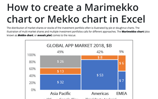
The distribution of market shares or stocks of the investment portfolio often is illustrated
by pie or doughnut charts. The illustration of multi-market shares and multiple investment
portfolios calls for different approaches. The Marimekko chart (also known as
Mekko chart, or mosaic plot) comes to the rescue.
Bubble chart
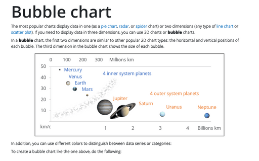
The most popular charts display data in one (as a pie chart, radar, or spider chart) or two dimensions (any type of line chart or scatter plot). If you need to display data in three dimensions, you can use 3D charts or bubble charts.
Bubble and Area chart
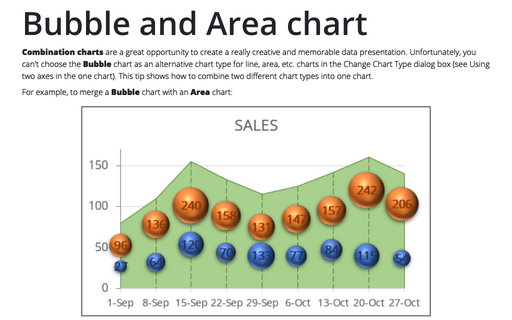
Combination charts are a great opportunity to create a really creative and memorable data presentation. Unfortunately, you can't choose the Bubble chart as an alternative chart type for line, area, etc. charts in the Change Chart Type dialog box (see Using two axes in the one chart). This tip shows how to combine two different chart types into one chart.
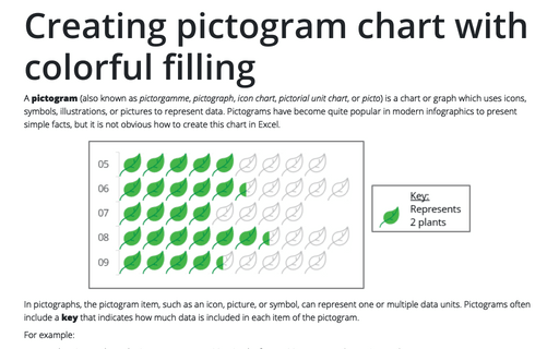
Creating pictogram chart with colorful filling
A pictogram (also known as pictorgamme, pictograph, icon chart, pictorial unit chart, or picto) is a chart or graph which uses icons, symbols, illustrations, or pictures to represent data. Pictograms have become quite popular in modern infographics to present simple facts, but it is not obvious how to create this chart in Excel.
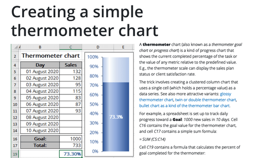
Creating a simple thermometer chart
A thermometer chart (also known as a thermometer goal chart or progress chart) is a kind of progress chart that shows the current completed percentage of the task or the value of any metric relative to the predefined value. E.g., the thermometer scale can display the sales plan status or client satisfaction rate.
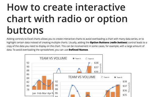
How to create interactive chart with radio or option buttons
Adding controls to Excel charts allows you to create interactive charts to avoid overloading a chart with many data series, or to highlight certain data instead of creating multiple charts. Usually, adding the Option Buttons (radio buttons) control leads to a copy of the data you need to display on the chart. This can be inconvenient in some cases, for example, with a large amount of data. To avoid overloading the spreadsheet, you can use Defined Names.
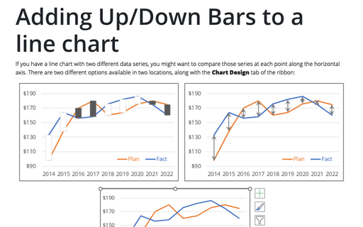
Adding Up/Down Bars to a line chart
If you have a line chart with two different data series, you might want to compare those series at each point along the horizontal axis. There are two different options available in two locations, along with the Chart Design tab of the ribbon:
Simple combination chart
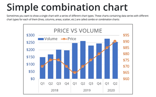
Sometimes you want to show a single chart with a series of different chart types. These charts containing data series with different chart types for each of them (lines, columns, areas, scatter, etc.) are called combo or combination charts:
Creating a glossy thermometer chart
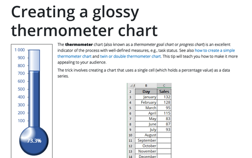
The thermometer chart (also known as a thermometer goal chart or progress chart) is an excellent indicator of the process with well-defined measures, e.g., task status. See also how to create a simple thermometer chart and twin or double thermometer chart. This tip will teach you how to make it more appealing to your audience.
