Simple combination chart
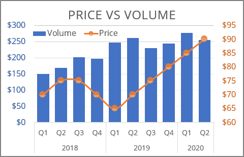
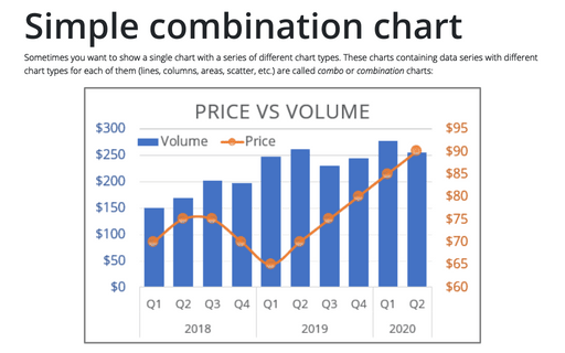
Not all the available chart types in Excel can be displayed on a single combo chart. For example, you cannot use bar and column data series in the same chart or combine a pie chart with any other type than a donut.
For example, you can have two different volumes (e.g., the Volume of sales and the product Price), and you want to see them in one chart:
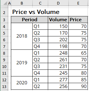
To create one chart for this data, follow these steps:
1. Select the data range (in this example, cells B3:E13).
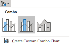
2. On the Insert tab, in the Charts group, click the Insert Combo Chart button:

From the Insert Combo Chart list, choose Clustered Column - Line in Secondary Axis:
3. Modify this chart.
Notes:
- If you prefer to use another chart type instead of the one proposed by Excel, do the following:
- Select the data series your want to change.
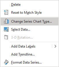
- Right-click the selection and choose Change Series Chart Type... in the popup menu:
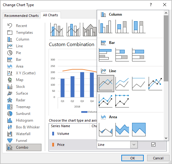
- In the Change Chart Type dialog box, select the appropriate chart type for
the data series:
- To add the next data series with another axis, see Combining several charts into one chart.
See also this tip in French: Comment créer le graphique de combinaison simple.
