How to create simple interactive chart with radio or option buttons
Option Buttons (also known as radio buttons) are used to select from a list of options.
See other techniques for creating interactive charts.
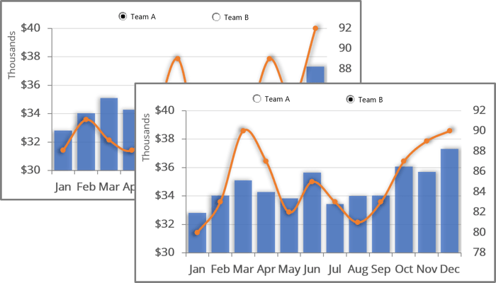
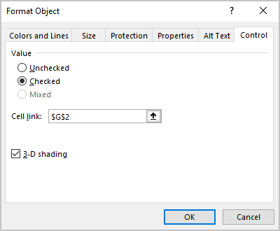
The trick of using Option buttons is to assign the same cell to all the Option buttons in a particular group. Initially, the cell value is assigned to the first element of the option group. Next, all added Option buttons will automatically use and change the value of this cell.
Of course, you can create several different groups of options that will be linked to different cells - each group of options has its own data cell.
To create a simple interactive chart with option buttons, do the following:
1. Prepare the data that will be shown in the chart
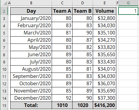
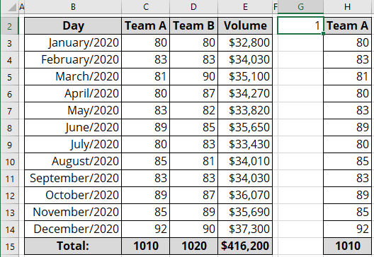
1.1. Add the new data to select one of the teams.
For example, enter in the cell G2 the number 1:
1.2. To the next cells, add the following formula:
= CHOOSE (<index>, <first item>, <second item> ...)
The CHOOSE () function returns the value from the list (<first item>, <second item>, etc.) specified by the first parameter <index>.
In this example:
= CHOOSE ($G$2, C2, D2).
So, you will see the column that will be shown in your chart:
2. Create a chart with visible data
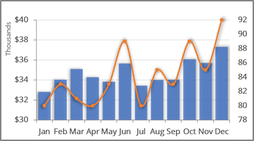
See how to create a combination chart for more details.
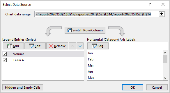
In this example:
- Volume: Volumes from the range E3:E14,
- Team A: Team A from the range H3:H14:
3. Add the option buttons to the chart
3.1. On the Developer tab (see Show the Developer tab), in the Controls group, click the Insert dropdown list and then choose Option Button (Form Controls):
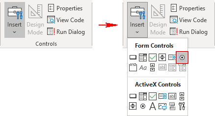
Note: You can also add to the Quick Access Toolbar (see how to add commands to the Quick Access Toolbar):
- The entire Insert controls dropdown list:
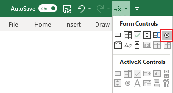
- The Option Button control.
Add as many option buttons as the number of series selected by these option buttons and place them where you want.
In this example, just two option buttons were used:
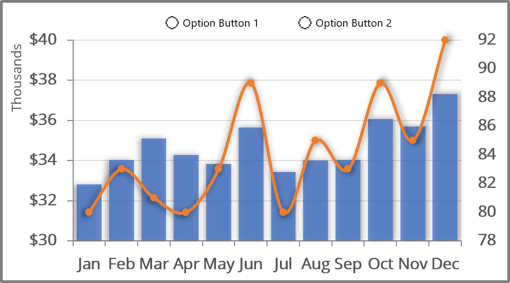
3.2. Format option buttons:
3.2.1. Double-click on every option button and change the label.
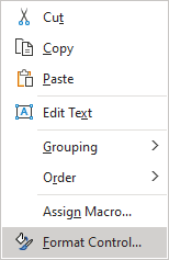
3.2.2. Right-click on each Options button and choose Format Control... in the popup menu:
3.2.3. In the Format Control dialog box, on the Control tab, choose the appropriate cell in the Cell link field (in this example, G2):
See also this tip in French: Comment créer un graphique interactif simple avec des boutons radio ou des cases d'option.
