How to create simple interactive chart with radio or option buttons
See also interactive charts.
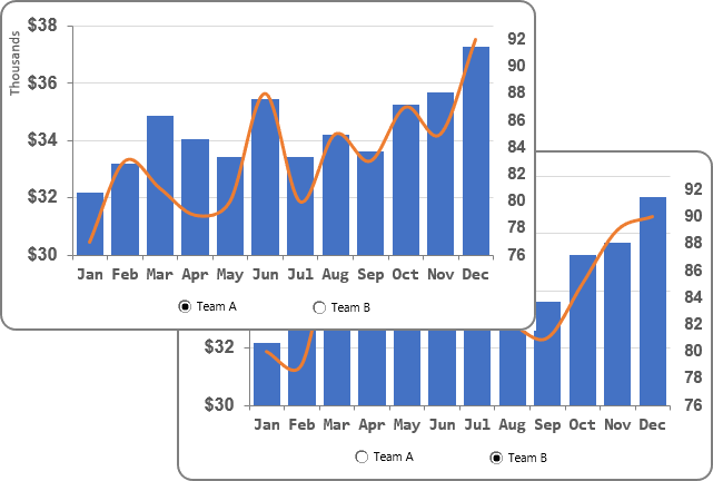
To create a simple interactive chart with radio or option buttons, do the following:
1. Prepare the data that will be shown in the chart:
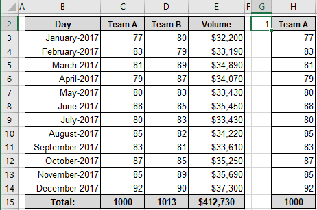
1.1. Add the new data to select one of the teams. For example, enter in the cell G2 the number 1:
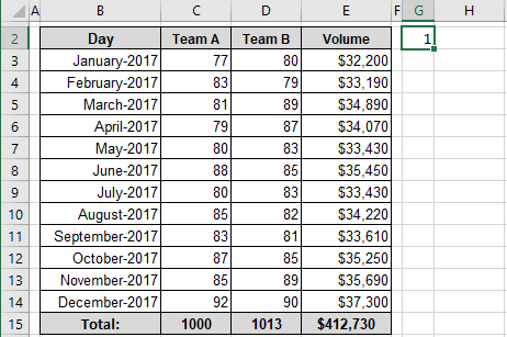
1.2. To the next cells, add the following formula:
= CHOOSE (<index>, <first item>, <second item> ...)
Where: the index is the selected item from the following items: first item, second item, etc.
In this example:
= CHOOSE ($G$2, C2, D2)
So, you will see the column that will be shown in your chart:
2. Create a chart with visible data:
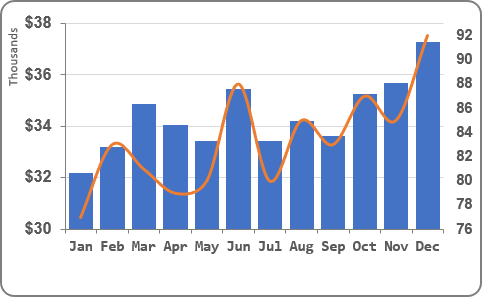
In this example:
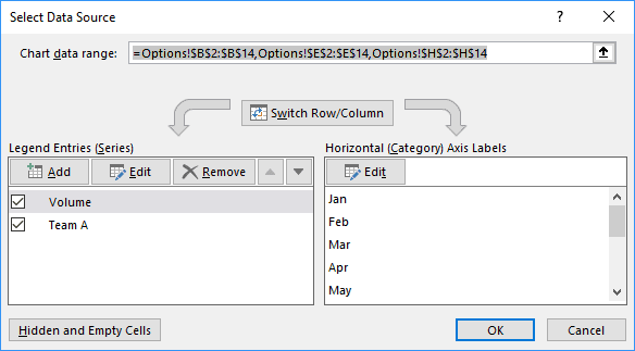
- Series 1: Volumes from the range E3:E14,
- Series 2: Team A from the range H3:H14:
3. Add the option buttons to the chart:
3.1. On the Developer tab (see Show the Developer tab), in the Controls group, click the Insert drop-down list and then choose Option Button:
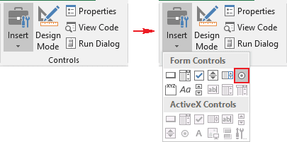
Add as many option buttons as the number of series, which will be selected by these option buttons and place them where you want.
In this example, just two option buttons were used:
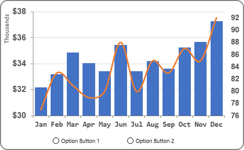
3.2. Format option buttons:
3.2.1. Double-click on every option button and change the label.
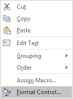
3.2.2. Right-click on the options button and choose Format Control... in the popup menu:
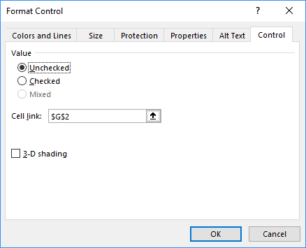
3.2.3. In the Format Control dialog box, on the Control tab, choose the appropriate cell in the Cell link field (in this example, G2):
See also this tip in French: Comment créer un graphique interactif simple avec des boutons radio ou des cases d'option.
