How to add Dividers to the chart
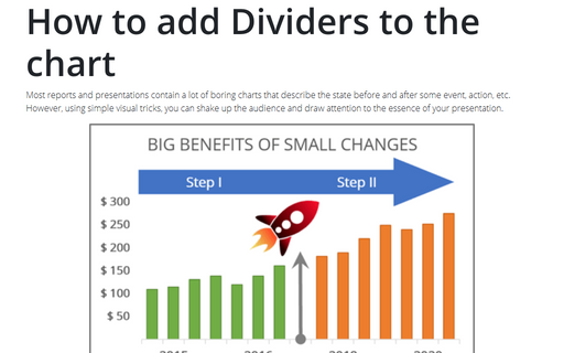
Most reports and presentations contain a lot of boring charts that describe the state before and after some
event, action, etc. However, using simple visual tricks, you can shake up the audience and draw attention
to the essence of your presentation.
How to freeze charts, shapes, text boxes, and other objects in Excel
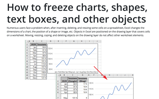
Numerous users face a problem when, after inserting, deleting, and resizing some cells on a spreadsheet, Excel changes the dimensions of a chart, the position of a shape or image, etc. Objects in Excel are positioned on the drawing layer that covers cells on a worksheet.
How to draw a pie chart with crayon effect in PowerPoint
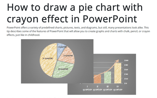
PowerPoint offers a variety of predefined charts, pictures, texts, and diagrams, but still, many presentations look alike. This tip describes some of the features of PowerPoint that will allow you to create graphs and charts with chalk, pencil, or crayon effects, just like in childhood.
Create bidirectional bar chart in Excel
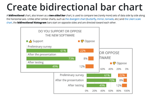
A bidirectional chart, also known as a two-sided bar chart, is used to compare two (rarely more) sets of data side by side along the horizontal axis. Unlike other similar charts, such as the divergent chart (butterfly, mirror, tornado, etc.) and the Likert scale chart, the bidirectional histogram bars start on opposite sides and are directed toward each other.
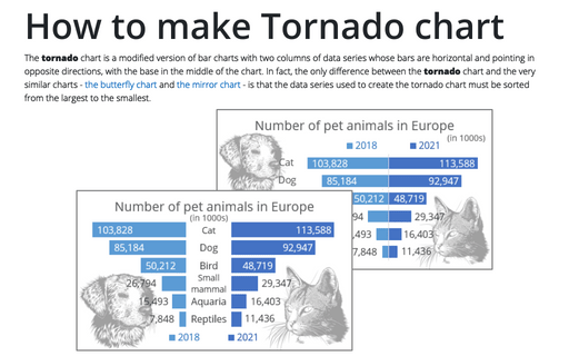
How to make Tornado chart in Excel
The tornado chart is a modified version of bar charts with two columns of data series whose bars are horizontal and pointing in opposite directions, with the base in the middle of the chart. In fact, the only difference between the tornado chart and the very similar charts - the butterfly chart and the mirror chart - is that the data series used to create the tornado chart must be sorted from the largest to the smallest.
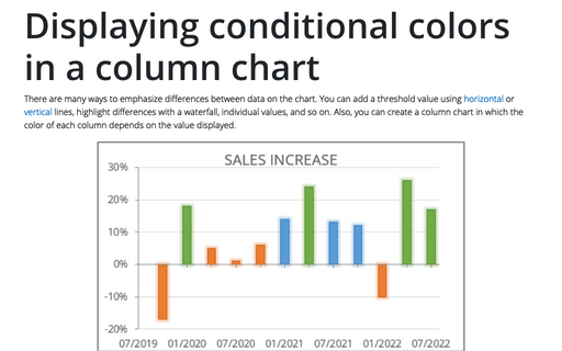
Displaying conditional colors in a column chart
There are many ways to emphasize differences between data on the chart. You can add a threshold value using horizontal or vertical lines, highlight differences with a waterfall, individual values, and so on. Also, you can create a column chart in which the color of each column depends on the value displayed.
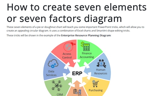
How to create seven elements graph or seven factors diagram
These seven elements of a pie or doughnut chart will teach you some important PowerPoint tricks, which will allow you to create an appealing circular diagram. It uses a combination of Excel charts and SmartArt shape editing tricks.
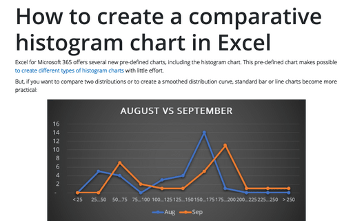
How to create a comparative histogram chart in Excel
Excel for Microsoft 365 offers several new pre-defined charts, including the histogram chart. This pre-defined chart makes possible to create different types of histogram charts with little effort.
Using Arrows in a Chart
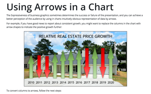
The Expressiveness of business graphics sometimes determines the success or failure of the presentation, and you can achieve a better perception of the audience by using in charts intuitively obvious representation of data by arrows.
Tally chart in Excel
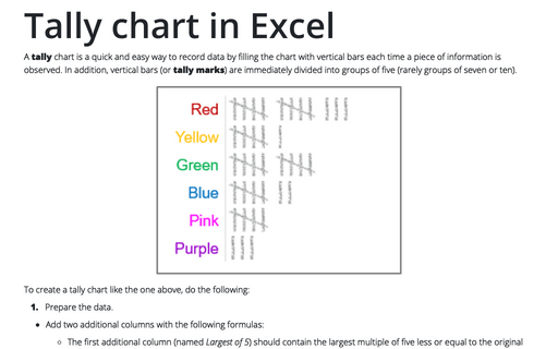
A tally chart is a quick and easy way to record data by filling the chart with vertical bars each time a piece of information is observed. In addition, vertical bars (or tally marks) are immediately divided into groups of five (rarely groups of seven or ten).
