Cascade chart using stepped line chart in Excel
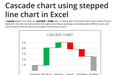
A cascade diagram, also known as a waterfall or bridge chart, is a special type of chart often used in accounting for financial statements. This chart represents positive and negative cash flows as ascending or descending bars of different colors. Each column except the first one starts at the endpoint of the previous column:
How to make Mirror chart in Excel
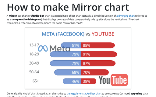
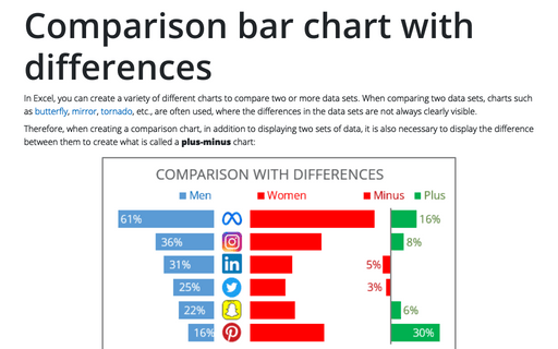
A mirror bar chart or double bar chart is a special type of bar chart (actually, a simplified version of a diverging chart referred to as a comparative histogram) that displays two sets of data comparatively side by side along the vertical axis. The chart resembles a reflection of a mirror, hence the name "mirror bar chart":
How to show Likert scale chart (integrated neutral)
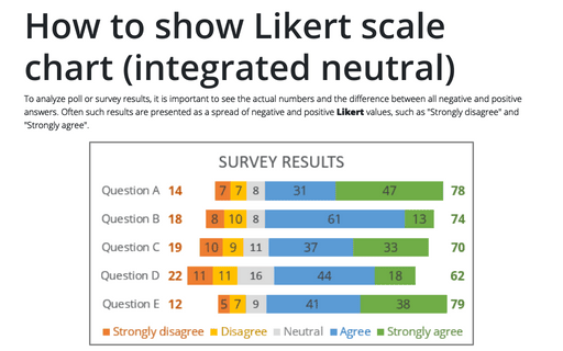
To analyze poll or survey results, it is important to see the actual numbers and the difference between all negative and positive answers. Often such results are presented as a spread of negative and positive Likert values, such as "Strongly disagree" and "Strongly agree".
Gantt chart with progress or progress Gantt chart
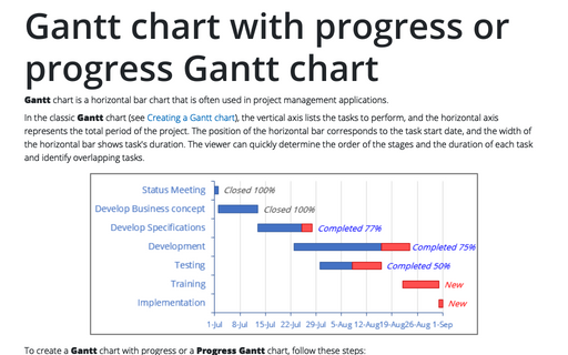
Gantt chart is a horizontal bar chart that is often used in project management
applications.
How to create simple diverging bar chart
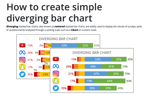
Diverging stacked bar charts, also known as centered stacked bar charts, are widely used to display the results of surveys, polls, or questionnaires analyzed through a ranking scale such as a Likert or numeric scale.
How to create a funny dog breeds lifespan chart in Excel
Span chart, also known as a range bar graph (range column graph), floating bar graph, difference graph, high-low graph, used to display the specific variable value range. Span charts are ideal for comparing ranges, and typically, each variable represents a particular category. All values for the selected category fall between minimal and maximal values that correspond to lower and upper bounds of the interval.
How to change axis labels order in a bar chart
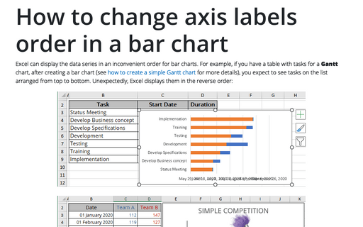
Excel can display the data series in an inconvenient order for bar charts. For example, if you have a table with tasks for a Gantt chart, after creating a bar chart (see how to create a simple Gantt chart for more details), you expect to see tasks on the list arranged from top to bottom. Unexpectedly, Excel displays them in the reverse order:
How to add pictures to vertical axis of the bar chart
Nowadays, icons, logos, and abbreviations often carry more information than the textual names of companies, brands, applications, games, etc. To create memorable charts and faster understanding and recognition of information, instead of the names of countries, brands, etc., you can substitute the corresponding pictures on the axis of the charts.
How to create two horizontal axes on the same side
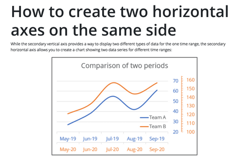
While the secondary vertical axis provides a way to display two different types of data for the one time range, the secondary horizontal axis allows you to create a chart showing two data series for different time ranges:
