Gantt chart with progress or progress Gantt chart
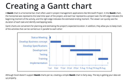
In the classic Gantt chart (see Creating a Gantt chart), the vertical axis lists the tasks to perform, and the horizontal axis represents the total period of the project. The position of the horizontal bar corresponds to the task start date, and the width of the horizontal bar shows task's duration. The viewer can quickly determine the order of the stages and the duration of each task and identify overlapping tasks.
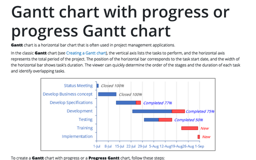
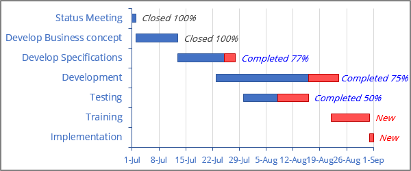
Progress Gantt charts add an additional visual clue - the shading of the bar that is proportional to the degree of the task completion:
To create a Gantt chart with progress or a Progress Gantt chart, follow these steps:
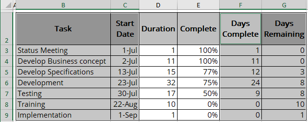
1. Select the data range, for example, $B$2:$C$9; $F$2:$G$9:
Create a bar chart
2. On the Insert tab, in the Charts group, click the Insert Bar or Column Chart button:

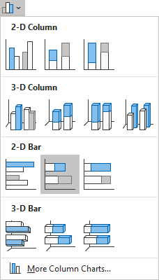
From the Insert Bar or Column Chart dropdown list, select Stacked Bar:
Correct the chart data
3. Remove the chart Title and Legend, then do one of the following:
- On the Chart Design tab, in the Data group, choose Select Data:

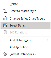
- Right-click on the chart area and choose Select Data... in the popup menu:
In the Select Data Source dialog box:
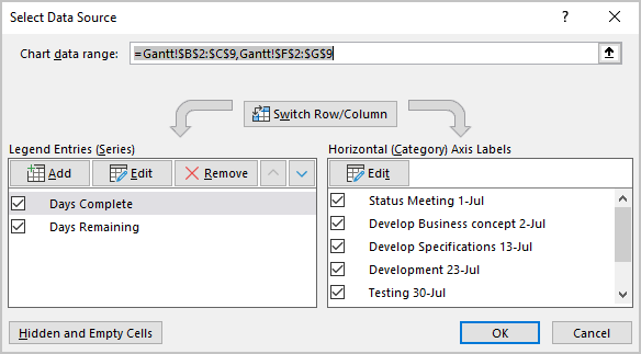
3.1. Under Horizontal (Category) Axis Labels, click the Edit button to correct data for the horizontal axis (notice that Excel incorrectly uses the first two columns as the Horizontal (Category) Axis Labels):
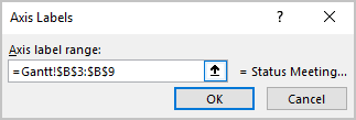
In the Axis Labels dialog box, change data to the appropriate data range (task names). For example, $B$3:$B$9:
3.2. Under Legend Entries (Series):
- Ensure that the existing data series contain the correct data ranges. For this example:
- Days Complete - $F$3:$F$9
- Days Remaining - $G$3:$G$9
- Add a new data series for the start date by clicking the Add button.
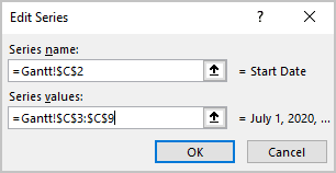
In the Edit Series dialog box, type or select the appropriate data. For this example:
- Start Date - $C$3:$C$9:
- Reorder data series by clicking the moving buttons:
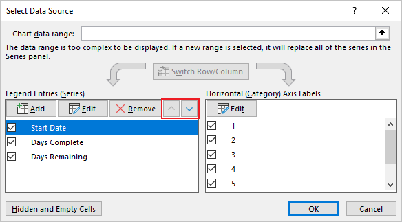
- The first data series: data range for starting date,
- The second data series: data range for the days complete,
- The third data series: data range for the days remaining.
Customize axes
4. Customize vertical and horizontal axes (for more details, see Creating a Gantt chart).
Hide the first data series
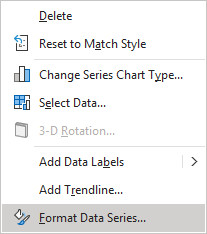
5. Right-click on the first of data series and choose Format Data Series... in the popup menu:
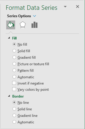
To make the first data series invisible, on the Format Data Series pane, on the Series Options tab, in the Fill & Line group:
- In the Fill section, select No fill,
- In the Border section, select No line:
You can then make any other adjustments to get the expected look.
Add the data labels
6. To add the labels to the Progress Gantt chart, do the following:
6.1. Add new data series with data range $E$3:$E$9 that contains the percentage of the completed tasks:
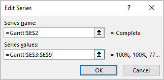
6.2. Select the added data series, then do one of the following:
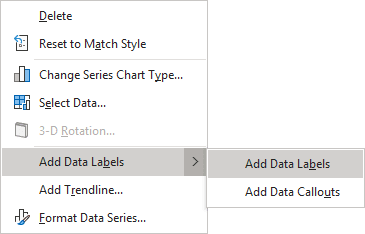
- Right-click on the selection and choose Add Data Labels -> Add Data Labels in the popup:
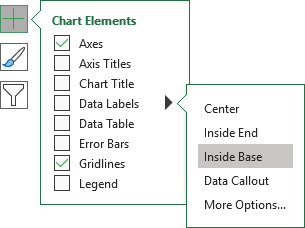
- Click on the Chart Elements button, select the Data Labels list, then choose Inside Base:
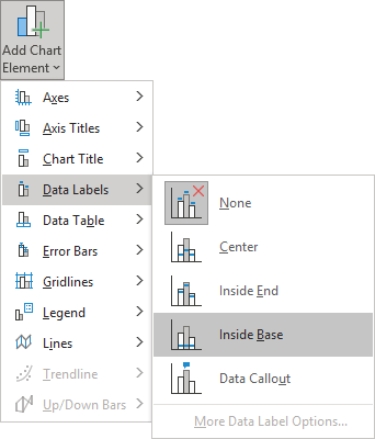
- On the Chart Design tab, in the Chart Layouts group, click the Add Chart Element dropdown list:

In the Add Chart Element dropdown list, choose the Data Labels list, then select Inside Base:
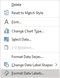
6.3. Right-click on the data series labels and choose Format Data Labels... in the popup menu:
6.4. On the Format Data Labels pane, on the Label Options tab:
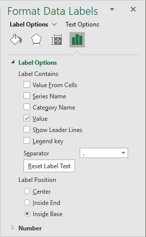
- In the Label Options section:
- Under Label Contains, ensure that the Value checkbox is selected and unselect all other checkboxes,
- Under Label Position, ensure that the Inside Base option is selected:
- On the Number tab, in the Category list, select Custom, enter
the format that you want in the Format Code field, and press the Add button:
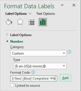
For example:
[=1]"Closed "#%; [=0][Red]"New"; [Blue]"Completed "#%
For more details, see the conditional formatting of chart axes.
7. Make the new data series invisible.
If everything is on schedule, the tasks before the current date are all blue (100% complete), the tasks after the current date are partially blue and partially red, or completely red. To simplify the analysis of the Gantt chart schedule, you can add a vertical line for the current date. The vertical line serves as an excellent visual hint for the tasks ahead and behind schedule.
See also this tip in French: Comment créer un diagramme de Gantt avec progrès.
