Conditional formatting for chart axes
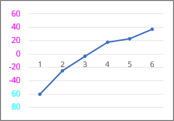
The conditional formatting includes:
- Color formatting - Excel displays characters in the specified color - black, blue, cyan, green, magenta, red, white , or yellow ,
- Custom criteria for each number format section.
See more about custom formatting.
There are some differences in customizing axes in Excel:
- You can apply conditional formatting:
- For the vertical (Value) axis labels in scatter, line, column, and area charts,
- For the horizontal (Category) axis labels in a scatter and bar chart.
- You can't apply conditional formatting - Excel ignores the custom conditional formatting for such axes:
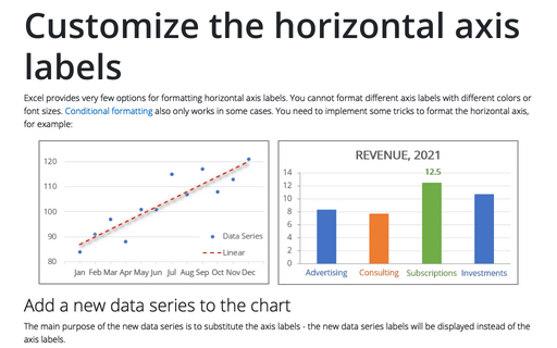
- For the horizontal (Category) axis labels in line, column, and area charts,
- For the vertical (Value) axis labels in a bar chart.
So, the standard conditional formatting can be applied for both axes just for scatter plots. For other charts, see below the workaround for applying conditional formatting for axis labels.
Apply standard conditional formatting for axes
To change the format of the label on the Excel for Microsoft 365 chart axis (horizontal or vertical, depending on the chart type), do the following:
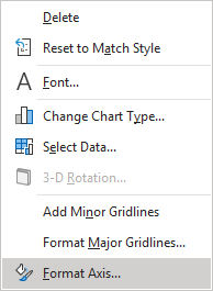
1. Right-click on the axis and choose Format Axis... in the popup menu:
2. On the Format Axis task pane, in the Number group, select Custom category and then change the field Format Code and click the Add button:
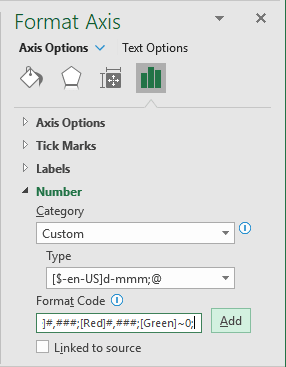
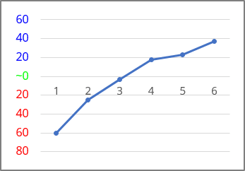
- If you need a unique representation for positive, negative, and zero values, just write multiple formats, separating each with a semicolon (or a comma, see how to change the semicolon to a comma or vice versa):
{positive value}; {negative value}; {zero}; {text value}
- If you write two formats, the first applies to positive and zero values, and the second applies to negative values.
- If you write three formats, the first applies to positive values, the second to negative values, and the third to zero.
- If you write four formats, they apply to positive, negative, zero, and text values, respectively.
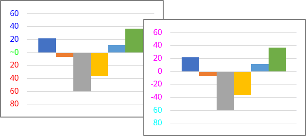
[Blue]#,###;[Red]#,###;[Green]~0;
- If you want to create a custom condition based on values below or equal to some point (for example, -60) and greater than it, you could type the following condition codes:
[Cyan][<=-60];[Magenta][>-60]
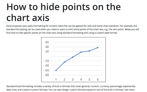
See also How to hide points on the chart axis.
Workaround for conditional formatting
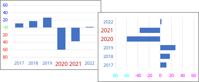
To apply formatting for the vertical (Value) axis for the bar chart or horizontal (Category) axis for other types of charts, where Excel ignore the standard conditional formatting, do the following:
1. Create new data for the axis labels
The main purpose of the new data series is to substitute the axis labels with custom values with different formatting. So, the new data series values should be displayed instead of the axis labels.
For example, to highlight the horizontal (Category) axis labels for all negative values, add two data series - for positive and for negative values:

2. Add a new data series to the chart
2.1. Do one of the following:
- On the Chart Design tab, in the Data group, choose Select Data:

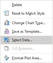
- Right-click on the chart area and choose Select Data... in the popup menu:
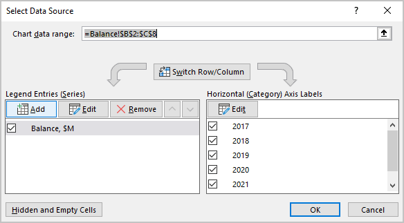
2.2. In the Select Data Source dialog box:
- Under Legend Entries (Series), click the Add button:
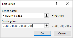
- In the Edit Series dialog box, in the Series values field, type the constant values equal to the minimal visible value in the axis as many times as labels you need to add:
= {-80, -80, -80, -80, -80, -80}:
2.3. Repeat previous steps to add the second additional data series for negative values.
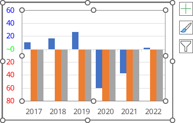
After closing the Select Data Source dialog box, Excel rebuilds the chart:
3. Hide the horizontal axis labels
3.1. Right-click on the horizontal axis and choose Format Axis... in the popup menu:

3.2. On the Format Axis pane:
If necessary, return the correct labels:
- On the Axis Options tab, in the Axis Options group, in the Bounds section, type the correct Minimum and Maximum values.
Hide the axis labels:
Do one of the following:
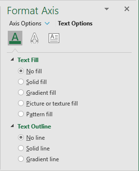
- On the Text Options tab, in the Text Fill & Outline group:
- In the Text Fill section, select No fill,
- In the Text Outline section, select No line:
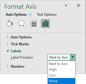
- On the Axis Options tab, in the Axis Options group, in the Labels section, from the Label Position list, select None:
4. Add the new data series labels
4.1. Select the data series (see more about how to select chart elements), then do one of the following:
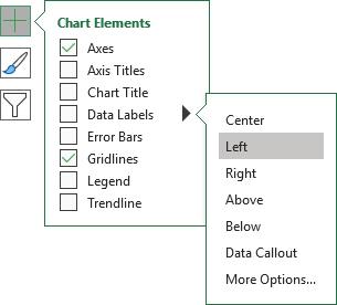
- Click on the Chart Elements button, select the Data Labels list:
- For the horizontal axis, choose Below (or Outside End),
- For the vertical axis, choose Left:
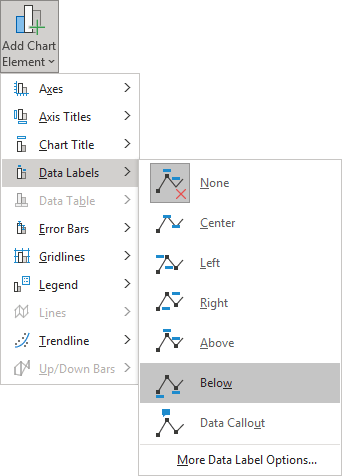
- On the Chart Design tab, in the Chart Layouts group, click the Add Chart Element button:

From the Add Chart Elements list, choose Data Labels, then select the place for the labels. For example, Below:
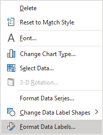
4.2. Right-click on the added data series labels and choose Format Data Labels... in the popup menu:
4.3. On the Format Data Labels pane, on the Label Options tab, in the Label Options section, under Label Contains:
- Select the Value From Cells checkbox, then choose data labels in the Data Label Range dialog box:
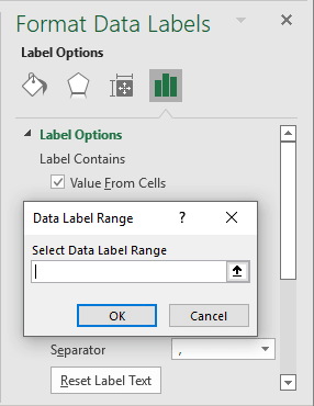
- Unselect all other checkboxes.
5. Repeat steps
Repeat step 4 for the second data series - add the data labels for the negative values and format them
6. Customize the data labels as you prefer
7. Hide the unneeded data series
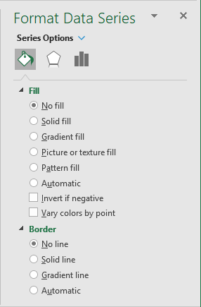
7.1. Right-click on the data series you want to hide and choose Format Data Series... in the popup menu:
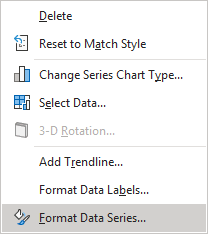
7.2. On the Format Data Series pane, in the Fill & Line group:
- In the Fill section, select No fill,
- In the Border section, select No line:
Apply another formatting as desired.
See also this tip in French: Mise en forme conditionnelle des axes du graphique.
