Displaying conditional colors in a column chart
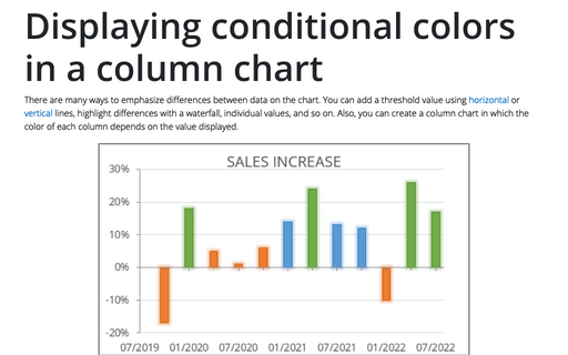
There are many ways to emphasize differences between data on the chart. You can add a threshold value using horizontal or vertical lines, highlight differences with a waterfall, individual values, and so on. Also, you can create a column chart in which the color of each column depends on the value displayed.
How to create seven elements graph or seven factors diagram
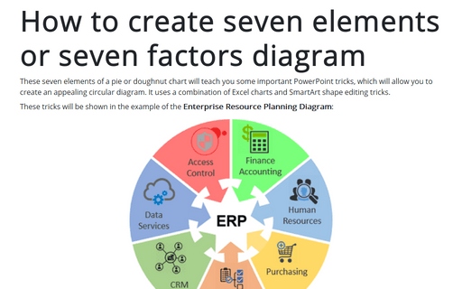
These seven elements of a pie or doughnut chart will teach you some important PowerPoint tricks, which will allow you to create an appealing circular diagram. It uses a combination of Excel charts and SmartArt shape editing tricks.
How to create a comparative histogram chart in Excel
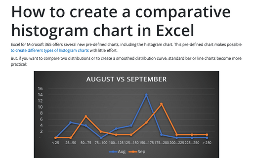
Excel for Microsoft 365 offers several new pre-defined charts, including the histogram chart. This pre-defined chart makes possible to create different types of histogram charts with little effort.
Using Arrows in a Chart
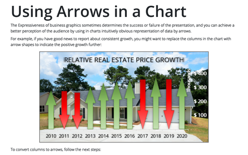
The Expressiveness of business graphics sometimes determines the success or failure of the presentation, and you can achieve a better perception of the audience by using in charts intuitively obvious representation of data by arrows.
Tally chart in Excel
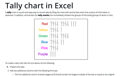
A tally chart is a quick and easy way to record data by filling the chart with vertical bars each time a piece of information is observed. In addition, vertical bars (or tally marks) are immediately divided into groups of five (rarely groups of seven or ten).
Creating a twin or double thermometer chart
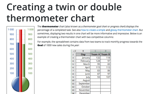
The thermometer chart (also known as a thermometer goal chart or progress chart) displays the percentage of a completed task. See also how to create a simple and glossy thermometer chart. But sometimes, displaying two results in one chart will be more informative and impressive. Below is an example of creating a thermometer chart with two competitive columns:
How to add a vertical line to the scatter chart
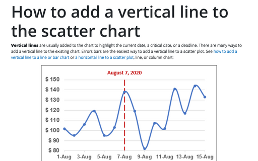
Vertical lines are usually added to the chart to highlight the current date, a critical date, or a deadline. There are many ways to add a vertical line to the existing chart. Errors bars are the easiest way to add a vertical line to a scatter plot. See how to add a vertical line to a line or bar chart or a horizontal line to a scatter plot, line, or column chart:
How to plot investment opportunity zones in Excel
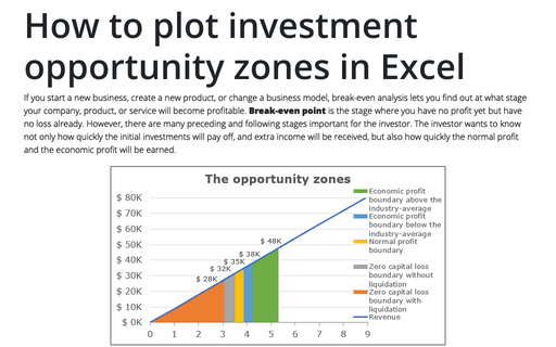
If you start a new business, create a new product, or change a business model, break-even analysis lets you find out at what stage your company, product, or service will become profitable. Break-even point is the stage where you have no profit yet but have no loss already. However, there are many preceding and following stages important for the investor. The investor wants to know not only how quickly the initial investments will pay off, and extra income will be received, but also how quickly the normal profit and the economic profit will be earned.
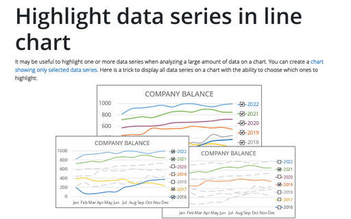
Highlight data series in line chart
It may be useful to highlight one or more data series when analyzing a large amount of data on a chart. You can create a chart showing only selected data series. Here is a trick to display all data series on a chart with the ability to choose which ones to highlight:
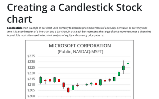
Creating a Candlestick Stock chart
Candlestick chart is a style of bar-chart used primarily to describe price movements of a security, derivative, or currency over time. It is a combination of a line-chart and a bar-chart, in that each bar represents the range of price movement over a given time interval. It is most often used in technical analysis of equity and currency price patterns.
