Highlight data series in line chart
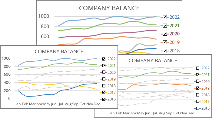
This visualization can be useful if you have a lot of data and don't want to hide some data series completely.
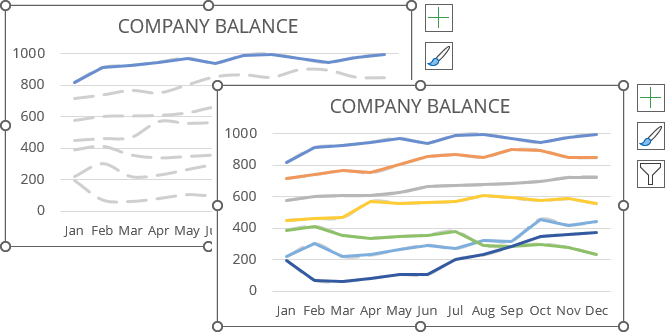
The main trick of creating such a chart is duplicating all the data series. The first copy makes a gray background image of the chart, and the second contains the condition to highlight some data series.
1. Create a simple chart
1.1. Select the data range.
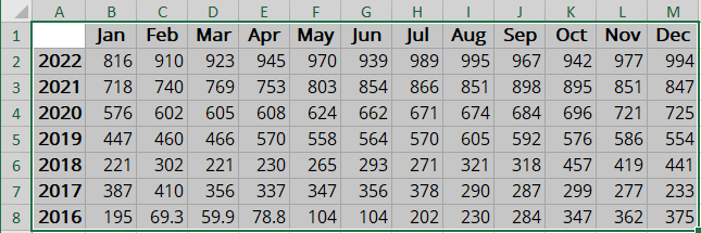
In this example, A1:M8 is the company balance data for the last 7 years (in thousands):
1.2. On the Insert tab, in the Charts group, choose the Insert Line or Area Chart button:

From the Insert Line or Area Chart dropdown list, select Line:
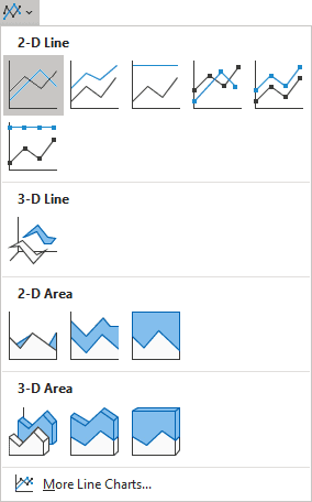
Excel creates a simple line chart:
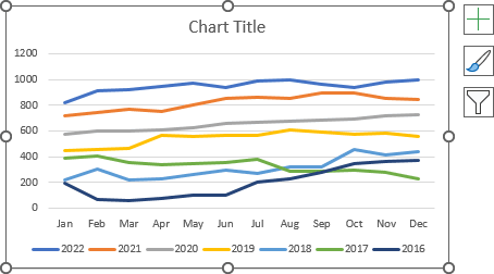
1.3. Format the chart:
- Optionally, add the title,
- Optionally, change the color schema (see how to create a custom color scheme in Excel),
- Temporarily remove the legend from the chart - it will be added later.
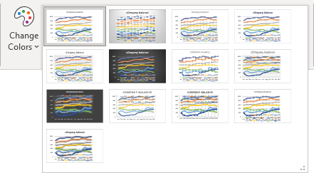
Note: You can choose the style on the Chart Design tab, in the Chart Styles gallery:

To see the full gallery, click the More button:
2. Format the line series
To change the data series line color and style by doing the following:
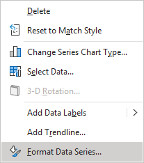
2.1. Right-click on any data series and choose Format Data Series... in the popup menu:
2.2. On the Format Data Series pane, on the Fill & Line tab, in the Line section:
- Select the Solid line option,
- Select the preferred color from the Color dropdown list (see how to apply a solid color for more details),
- Select or type the line width you prefer in the Width field,
- Select the appropriate dash type from the Dash type dropdown list:
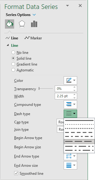
- Optionally, select the Smoothed line checkbox.
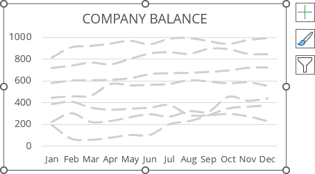
For example:
3. Create named ranges
An easy way is to duplicate your data table and add the second table data series. Below is a more complicated way to set up but easier to organize — the creation of named ranges:
3.1. Add a new data column with the Boolean variables TRUE and FALSE for all the data series.
For example, type TRUE for all data series (it will be changed later):

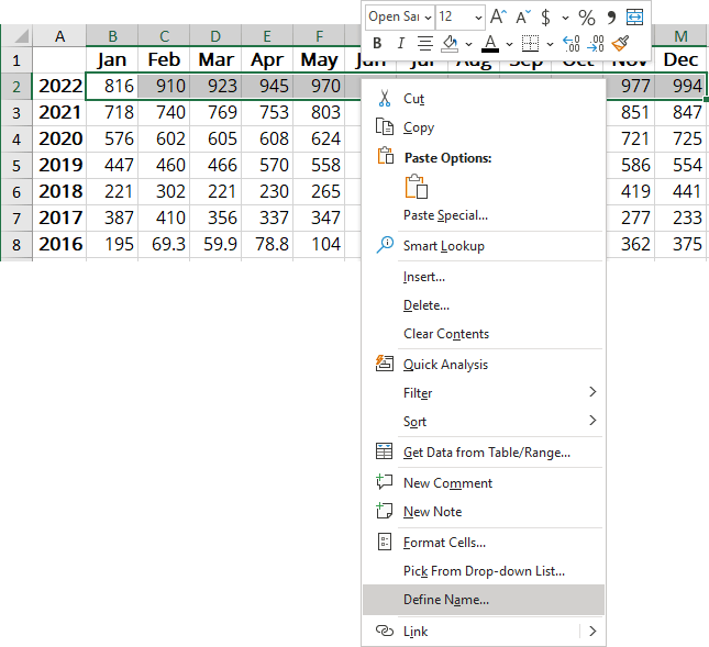
3.2. Select the first data series (in this example, B2:M2).
3.3. Do one of the following:
- On the Formulas tab, in the Defined Names group, click Define Name (see how to create and use named ranges for more details):

- Right-click on the selection and choose Define name... in the popup menu:
3.4. In the New Name dialog box:
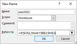
- In the Name field, enter the name of this new range, for example, year2022 (see the requirements for the names),
- In the Refers to field, type the following formula:
= IF (<condition>, <data range>),
In this example, = IF ($O$2, $B$2:$M$2):
3.5. Repeat the previous step for all other data series with the appropriate conditions.
For this example:
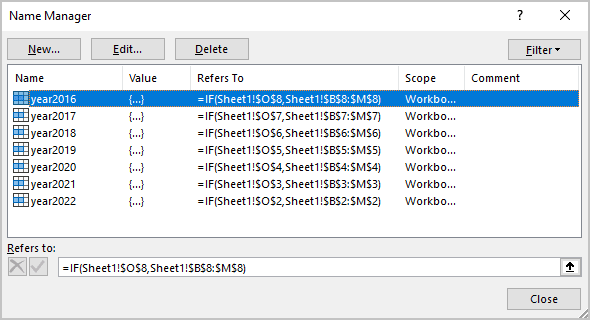
Note: To see the Name Manager dialog box: on the Formulas tab, in the Defined Names group, click the Name Manager button:

4. Add new data series to the chart
4.1. Do one of the following:
- On the Chart Design tab, in the Data group, click the Select Data button:

- Right-click on the chart area and choose Select Data... in the popup menu:
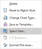
4.2. In the Select Data Source dialog box, under Legend Entries (Series), click the Add button:
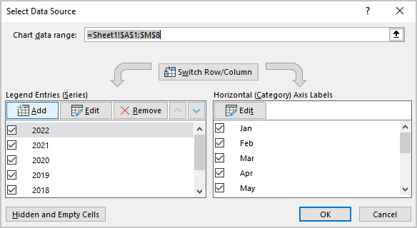
5. Optionally, add empty (fake) data series
Excel uses the default color scheme to redraw each data series you want to display or hide for the highlighting effect. In other words, even if you customize the colors for the data series to be highlighted, Excel applies the default color scheme the next time a particular data series is displayed.
Fortunately, Excel repeats the colors for the data series in the chart in some increments. For example, in the default color scheme used by Excel for Microsoft 365:
- Excel uses six colors (Blue, Orange, Gray, Gold, Blue, Green):
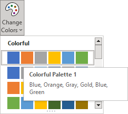
- Then it uses the same colors in the dark range,
- And then again, Excel uses these colors but a tone lighter, etc.
So, the thirteenth data series will use roughly the same color as the first default color.
Note: You can experiment with colors - some color schemes may take a different approach for the color of the 7th data series and beyond.
To display the valuable data series from the 13th to use the colors by default, you need to add a few empty data series:
5.1. In the Edit Series dialog box:
- In the Series name field, type the data series name you prefer (to identify it as fake data series),
- In the Series values field, don't change the value by default, then click OK:
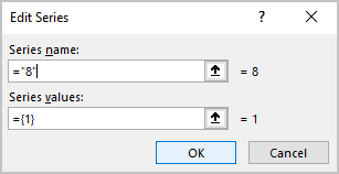
5.2. Repeat the previous steps to add as many data series as needed to have 12.
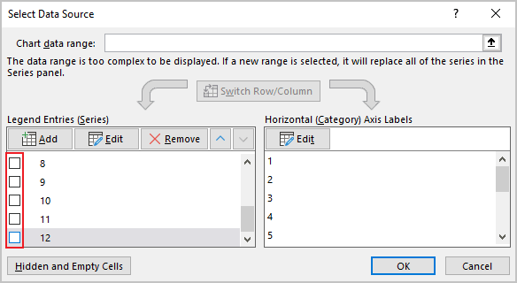
5.3. Optionally, hide these unnecessary data series. To do so, just unselect them in the Select Data Source dialog box:
6. Add new valuable data series
6.1. In the Edit Series dialog box:
- In the Series name field, type the data series name you prefer to see in the Legend,
- In the Series values field, type the defined names, then click OK:
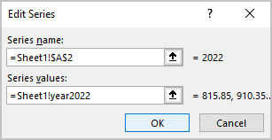
6.2. Repeat the previous steps to add all the data series you want to see on the chart.
Excel rebuilds the chart with newly added data series if you type TRUE for all the data series (see step 3.1.):
7. Format the chart
7.1. Format the lines as you prefer.
Note: Don't forget that color and other parameters, such as width and shadow, will be changed anyway by the default style after the first switch. Excel "remembers" only parameters by the chosen chart style.
7.2. Add the legend to the chart by doing one of the following:
- On the Chart Design tab, in the Chart Layouts group, click the Add Chart Element drop-down list:

In the Add Chart Element dropdown list, select the Legend list and then select the place for the legend:
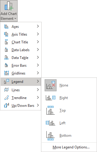
- On the Chart Design tab, in the Chart Layouts group, click the Add Chart Element dropdown list:
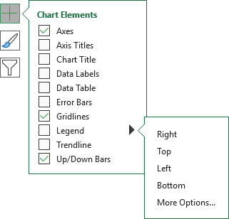
Excel adds the legend:
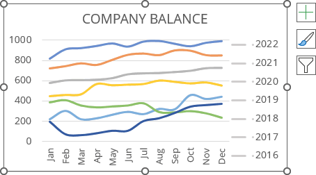
7.3. Remove all unnecessary labels from the legend:
7.3.1. Click on the first legend label to select it, then do one of the following:
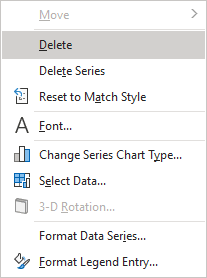
- Press Delete to remove it:
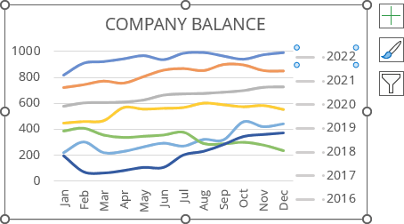
- Right-click the selection and choose Delete in the popup menu:
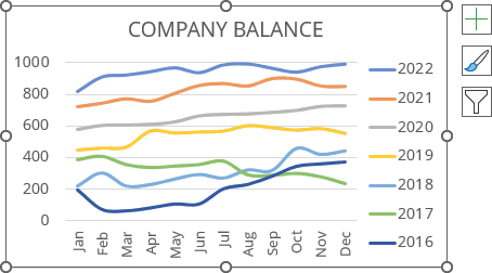
7.3.2. Repeat the previous step to remove all grayed data series:
8. Add the checkboxes to the chart
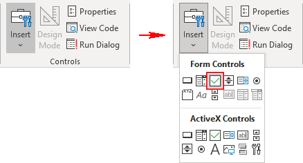
8.1. On the Developer tab (see Show the Developer tab), in the Controls group, click the Insert dropdown list and then choose Check Box (Form Controls):
Note: You can also add to the Quick Access Toolbar (see how to add commands to the Quick Access Toolbar):
- The entire Insert controls dropdown list,
- The Check Box control.
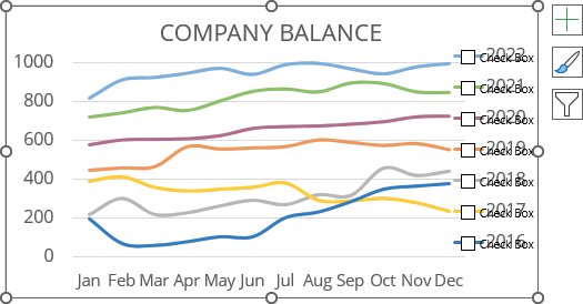
Add as many checkboxes as the data series can be selected, and place them where you want.
For this example, right near the legend:
Note: See how to easily organize shapes in Excel.
9. Format checkboxes
9.1. Double-click on every checkbox and change or remove the label.
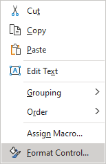
9.2. Right-click on each checkbox and choose Format Control... in the popup menu:
9.3. In the Format Control dialog box, on the Control tab, choose the appropriate cell in the Cell link field (in this example, O2):
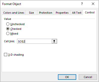
9.4. Format other checkboxes (in this example, for cells O3 - O8).
Make any other adjustments to get the look you desire.
