Object effect types and presets
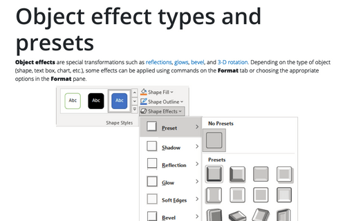
Object effects are special transformations such as reflections, glows, bevel, and 3-D rotation. Depending on the type of object (shape, text box, chart, etc.), some effects can be applied using commands on the Format tab or choosing the appropriate options on the Format pane.
Add 3D look to graphic objects
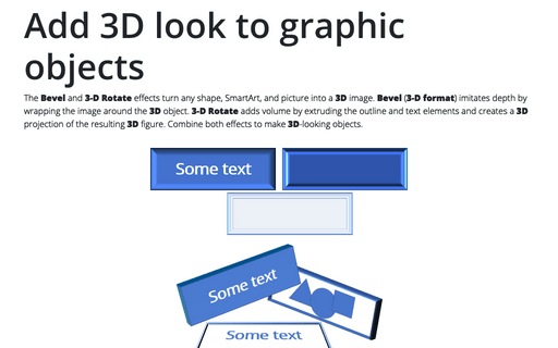
The Bevel and 3-D Rotate effects turn any shape, SmartArt, and picture into a 3D image. Bevel (3-D format) imitates depth by wrapping the image around the 3D object. 3-D Rotate adds volume by extruding the outline and text elements and creates a 3D projection of the resulting 3D figure. Combine both effects to make 3D-looking objects.
Creating a semaphore thermometer chart
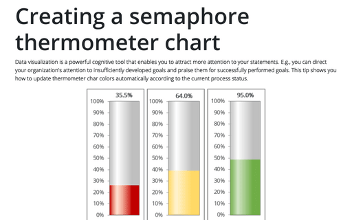
Data visualization is a powerful cognitive tool that enables you to attract more attention to your statements. E.g., you can direct your organization's attention to insufficiently developed goals and praise them for successfully performed goals. This tip shows you how to update thermometer char colors automatically according to the current process status.
Adding error bars
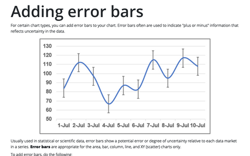
For certain chart types, you can add error bars to your chart. Error bars often are used to indicate "plus or minus" information that reflects uncertainty in the data.
Creating a Gantt chart
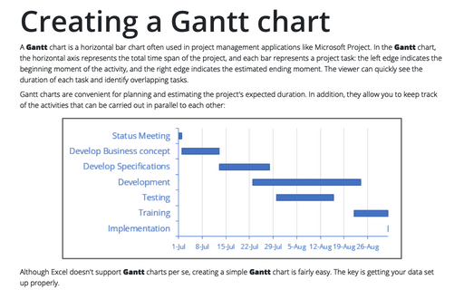
A Gantt chart is a horizontal bar chart often used in project management applications like Microsoft Project. In the Gantt chart, the horizontal axis represents the total time span of the project, and each bar represents a project task: the left edge indicates the beginning moment of the activity, and the right edge indicates the estimated ending moment. The viewer can quickly see the duration of each task and identify overlapping tasks.
How to create a simple Bullet graph in Excel
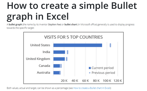
A bullet graph (the name by its inventor Stephen Few) or bullet chart (in Microsoft office) generally is used to display progress towards the specific target:
How to create a Bullet chart in Excel
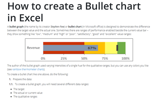
A bullet graph (the name by its creator Stephen Few) or bullet chart (in Microsoft office) is designed to demonstrate the difference between the target value and the actual one. Sometimes there are ranges of performance enabled beside the current value bar – they show something like "low", "medium" and "high" or "poor", "satisfactory", "good" and "excellent" value ranges:
Side by side comparison bar chart
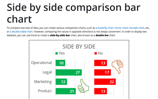
To compare two sets of data, you can create various comparison charts, such as a butterfly chart, mirror chart, tornado chart, etc., or a double-sided chart. However, comparing the values in opposite directions is not always convenient. In order to display two datasets, you can use Excel to create a side-by-side bar chart, also known as a double bar chart.
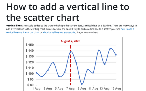
How to add a vertical line to the scatter chart
Vertical lines are usually added to the chart to highlight the current date, a critical date, or a deadline. There are many ways to add a vertical line to the existing chart. Errors bars are the easiest way to add a vertical line to a scatter plot. See how to add a vertical line to a line or bar chart or a horizontal line to a scatter plot, line, or column chart:
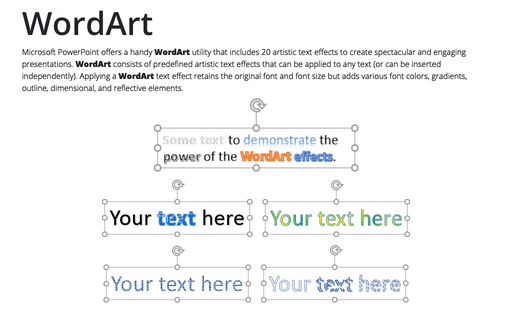
WordArt
Microsoft PowerPoint offers a handy WordArt utility that includes 20 artistic text effects to create spectacular and engaging presentations. WordArt consists of predefined artistic text effects that can be applied to any text (or can be inserted independently). Applying a WordArt text effect retains the original font and font size but adds various font colors, gradients, outline, dimensional, and reflective elements.
