Excel 365
How to change axis labels order in a bar chart
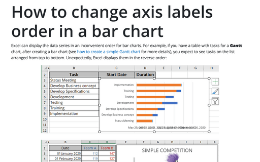
Excel can display the data series in an inconvenient order for bar charts. For example, if you have a table with tasks for a Gantt chart, after creating a bar chart (see how to create a simple Gantt chart for more details), you expect to see tasks on the list arranged from top to bottom. Unexpectedly, Excel displays them in the reverse order:
How to freeze charts, shapes, text boxes, and other objects in Excel
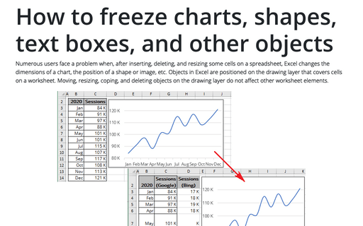
Numerous users face a problem when, after inserting, deleting, and resizing some cells on a spreadsheet, Excel changes the dimensions of a chart, the position of a shape or image, etc. Objects in Excel are positioned on the drawing layer that covers cells on a worksheet.
Power trend equation and forecast
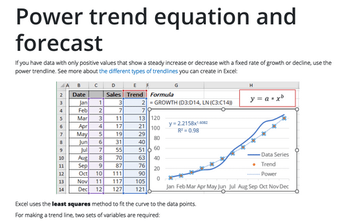
If you have data with only positive values that show a steady increase or decrease with a fixed rate of growth or decline, use the power trendline. See more about the different types of trendlines you can create in Excel:
Polynomial trend equation and forecast
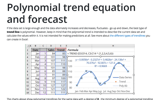
If the data set is large enough and the data alternately increases and decreases, fluctuates - go up and down, the best type of trend line is polynomial. However, keep in mind that the polynomial trend is intended to describe the current data set and calculate the values within it. It is not intended for making predictions at all. See more about the different types of trendlines you can create in Excel:
Logarithmic trend equation and forecast
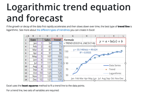
If the growth or decay of the data first rapidly accelerates and then slows down over time, the best type of trend line is logarithmic. See more about the different types of trendlines you can create in Excel:
Exponential trend equation and forecast
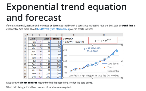
If the data is strictly positive and increases or decreases rapidly with a constantly increasing rate, the best type of trend line is exponential. See more about the different types of trendlines you can create in Excel:
Linear trend equation and forecast
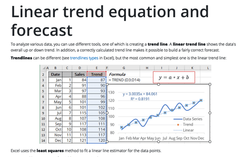
To analyze various data, you can use different tools, one of which is creating a trend line. A linear trend line shows the data's overall up or down trend. In addition, a correctly calculated trend line makes it possible to build a fairly correct forecast.
Glossy Gantt chart with a vertical line
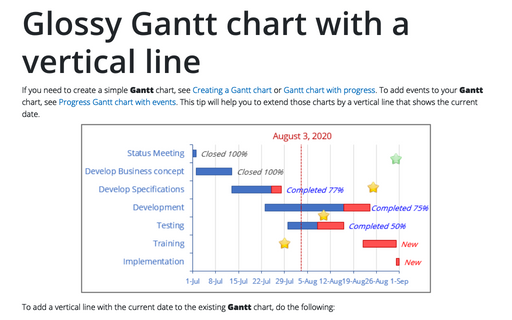
If you need to create a simple Gantt chart, see Creating a Gantt chart or Gantt chart with progress. To add events to your Gantt chart, see Progress Gantt chart with events. This tip will help you to extend those charts by a vertical line that shows the current date.
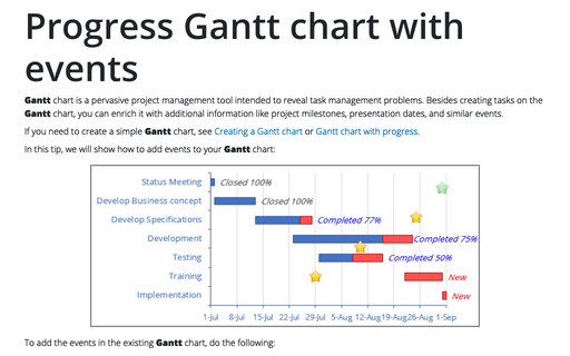
Progress Gantt chart with events
Gantt chart is a pervasive project management tool intended to reveal task management problems. Besides creating tasks on the Gantt chart, you can enrich it with additional information like project milestones, presentation dates, and similar events.
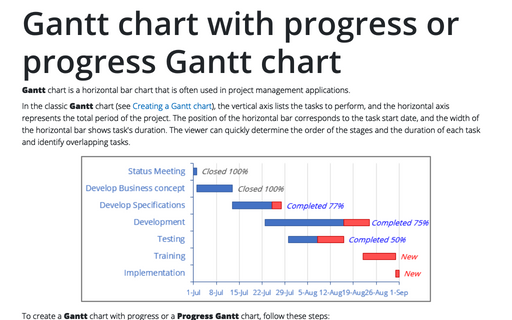
Gantt chart with progress or progress Gantt chart
Gantt chart is a horizontal bar chart that is often used in project management
applications.
