Excel 365
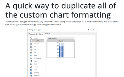
A quick way to duplicate all of the custom chart formatting
The creation of a large number of visually consistent charts to represent different data is a time consuming and error prone task unless you know how to copy formatting between charts.
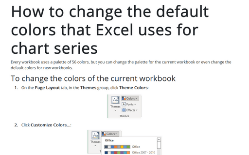
How to change the default colors that Excel uses for chart series
Every workbook uses a palette of 56 colors, but you can change the palette for the current workbook or even change the default colors for new workbooks.
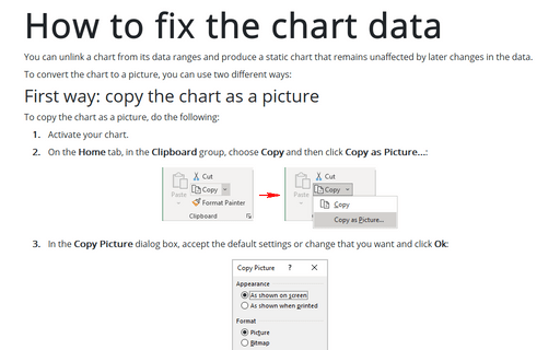
How to fix the chart data
You can unlink a chart from its data ranges and produce a static chart that remains unaffected by later changes in the data.
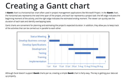
Creating a Gantt chart
A Gantt chart is a horizontal bar chart often used in project management applications like Microsoft Project. In the Gantt chart, the horizontal axis represents the total time span of the project, and each bar represents a project task: the left edge indicates the beginning moment of the activity, and the right edge indicates the estimated ending moment. The viewer can quickly see the duration of each task and identify overlapping tasks.
Creating picture charts
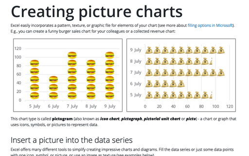
Excel easily incorporates a pattern, texture, or graphic file for elements of your chart (see more about filling options in Microsoft). E.g., you can create a funny burger sales chart for your colleagues or a collected revenue chart:
Adding error bars
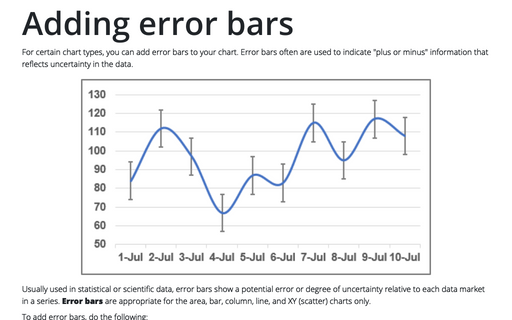
For certain chart types, you can add error bars to your chart. Error bars often are used to indicate "plus or minus" information that reflects uncertainty in the data.
Protect Excel spreadsheet options
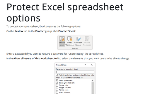
To protect your spreadsheet, Excel proposes the following options:
How to manage Add-ins
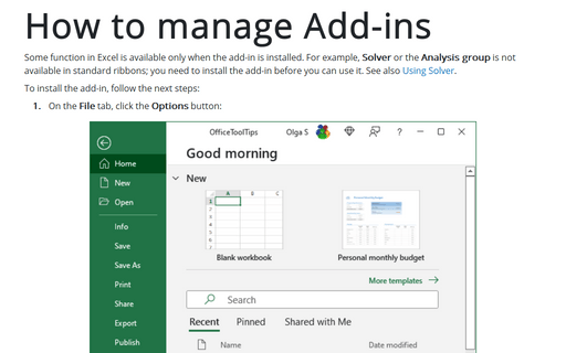
Some function in Excel is available only when the add-in is installed. For example, Solver or the Analysis group is not available in standard ribbons; you need to install the add-in before you can use it. See also Using Solver.
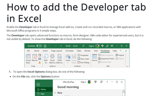
How to add the Developer tab in Excel
Enable the Developer tab in Excel to manage Excel add-ins, create and run recorded macros, or VBA applications with Microsoft Office programs in 3 simple steps.
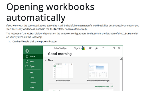
Opening workbooks automatically
If you work with the same workbooks every day, it will be helpful to open specific workbook files automatically whenever you start Excel. Any workbooks placed in the XLStart folder open automatically.
