Excel 365
How to create a histogram chart by categories in Excel
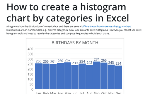
Histograms show the distribution of numeric data, and there are several different ways how to create a histogram chart. Distributions of non-numeric data, e.g., ordered categorical data, look similar to
Excel histograms. However, you cannot use Excel histogram tools and need to reorder the categories and compute frequencies to build such charts.
How to create a simple histogram chart in Excel
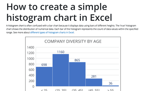
A histogram chart is often confused with a bar chart because it displays data using bars of different heights. The 'true' histogram chart shows the distribution of numerical data. Each bar of the histogram represents the count of data values within the specified range. See more about different types of histogram charts in Excel.
How to hide the cell values in Excel without hiding cells
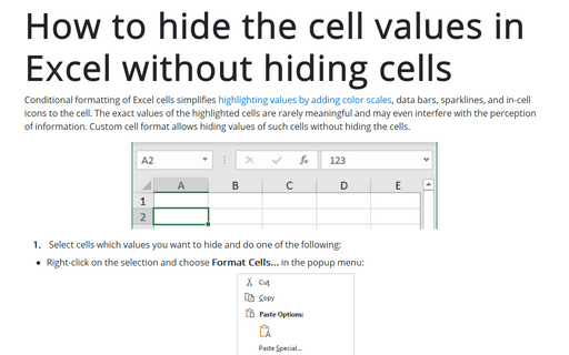
Conditional formatting of Excel cells simplifies highlighting values by adding color scales, data bars, sparklines, and in-cell icons to the cell. The exact values of the highlighted cells are rarely meaningful and may even interfere with the perception of information. Custom cell format allows hiding values of such cells without hiding the cells.
How to change comma to decimal point and vice versa in Excel
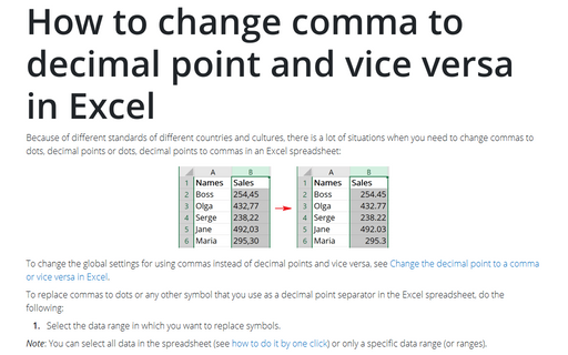
Because of different standards of different countries and cultures, there is a lot
of situations when you need to change commas to dots, decimal points or dots, decimal
points to commas in an Excel spreadsheet:
How to reduce ribbon size in Excel
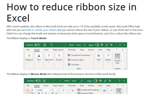
After recent updates, the ribbon in Microsoft Excel can take up to 1/3 of the available screen space. Microsoft Office help tells that you can hide or unhide your ribbon, but you cannot reduce the size of your ribbon or the size of the text or the icons. False! You can change the mode, remove unnecessary white space around buttons and, thus, reduce the ribbon size.
How to create an axis with subcategories
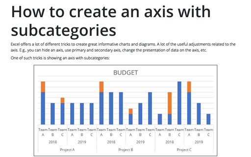
Excel offers a lot of different tricks to create great informative charts and diagrams. A lot of
the useful adjustments related to the axis. E.g., you can hide an axis, use primary and
secondary axis, change the presentation of data on the axis, etc.
Different rounding effects in Excel
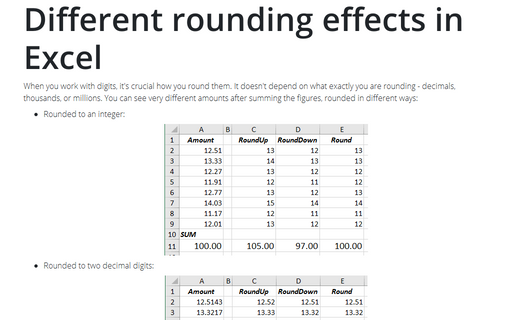
When you work with digits, it's crucial how you round them. It doesn't depend on what exactly you
are rounding - decimals, thousands, or millions. You can see very different amounts after summing
the figures, rounded in different ways:
Unrealized Gain and Loss
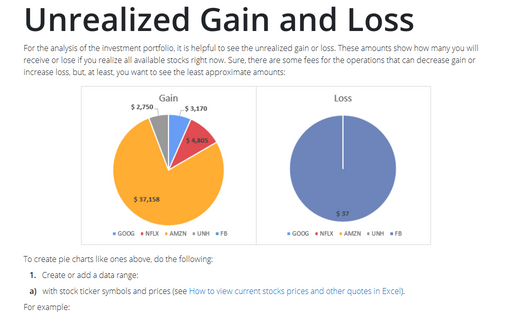
For the analysis of the investment portfolio, it is helpful to see the unrealized gain or loss. These amounts show how many you will receive or lose if you realize all available stocks right now. Sure, there are some fees for the operations that can decrease gain or increase loss, but, at least, you want to see the least approximate amounts:
The Area chart for Investments
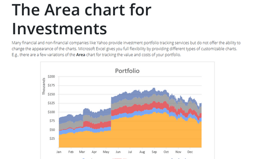
Many financial and non-financial companies like Yahoo provide investment portfolio tracking services
but do not offer the ability to change the appearance of the charts. Microsoft Excel gives you full
flexibility by providing different types of customizable charts. E.g., there are a few variations of
the Area chart for tracking the value and costs of your portfolio.
How to highlight a data point
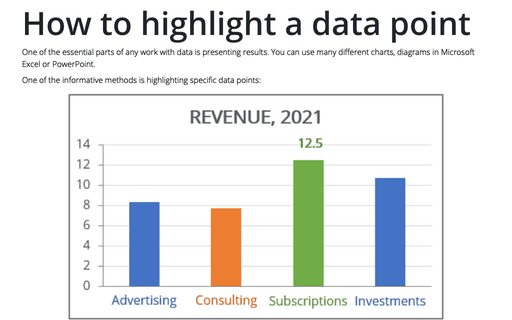
One of the essential parts of any work with data is presenting results. You can use many different
charts, diagrams in Microsoft Excel or PowerPoint.
