Excel 365
Import a structured text file to an Excel spreadsheet
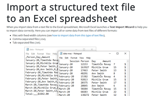
When you import data from a text file to the Excel spreadsheet, Microsoft Excel launches a
Text Import Wizard to help you to import data correctly. Here you can import all or
some data from text files of different formats:
How to remove the diamond with question mark symbol
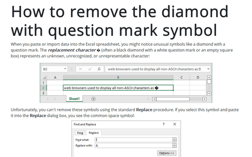
When you paste or import data into the Excel spreadsheet, you might notice unusual symbols like a diamond with a question mark. The replacement character � (often a black diamond with a white question mark or an empty square box) represents an unknown, unrecognized, or unrepresentable character:
Three different ways for printing a selected area
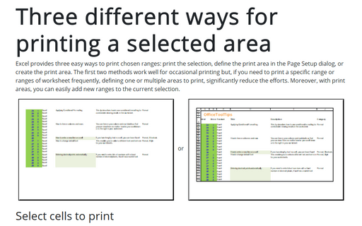
Excel provides three easy ways to print chosen ranges: print the selection, define the print area in the Page Setup dialog, or create the print area. The first two methods work well for occasional printing but, if you need to print a specific range or ranges of worksheet frequently, defining one or multiple areas to print, significantly reduce the efforts. Moreover, with print areas, you can easily add new ranges to the current selection.
Protecting workbook elements
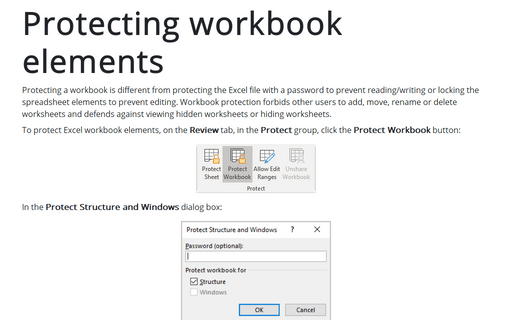
Protecting a workbook is different from protecting the Excel file with a password to prevent reading/writing or locking the spreadsheet elements to prevent editing. Workbook protection forbids other users to add, move, rename or delete worksheets and defends against viewing hidden worksheets or hiding worksheets.
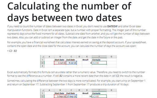
Calculating the number of days between two dates
If you need to count the number of dates between two dates in Excel, you don't need to use
DATEDIF and other Excel date manipulation functions. Date in Excel isn't a separate
type, but a number with proper formatting. The integer part of this number represents days
since the fixed moment for all dates. Subtract one date from another, and you will get the
number of days between two dates. Also, you can add or subtract an integer from the date,
and get the date in the future or the past.
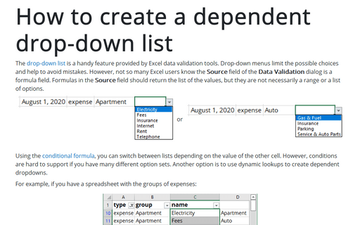
How to create a dependent drop-down list
The drop-down list is a handy feature provided by Excel data validation tools. Drop-down menus limit the possible choices and help to avoid mistakes. However, not so many Excel users know the Source field of the Data Validation dialog is a formula field. Formulas in the Source field should return the list of the values, but they are not necessarily a range or a list of options.
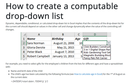
How to create a computable drop-down list
Dynamic, dependable, conditional, or calculated drop-down list in Excel implies that the contents of the drop-down list for the current cell should depend on values in the other cell and change dynamically when the value of the controlling cell changes.
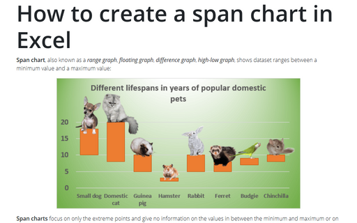
How to create a span chart in Excel
Span chart, also known as a range graph, floating graph, difference graph, high-low graph, shows dataset ranges between a minimum value and a maximum value:
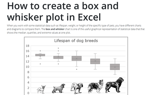
How to create a box and whisker plot in Excel
When you work with some statistical data such as lifespan, weight, or height of the specific type of pets, you have different charts and diagrams to compare them. The box and whisker chart is one of the useful graphical representation of statistical data that that shows the median, quartiles, and extreme values at one plot.
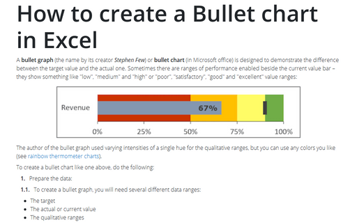
How to create a Bullet chart in Excel
A bullet graph (the name by its creator Stephen Few) or bullet chart (in Microsoft office) is designed to demonstrate the difference between the target value and the actual one. Sometimes there are ranges of performance enabled beside the current value bar – they show something like "low", "medium" and "high" or "poor", "satisfactory", "good" and "excellent" value ranges:
