How to create a simple histogram chart in Excel
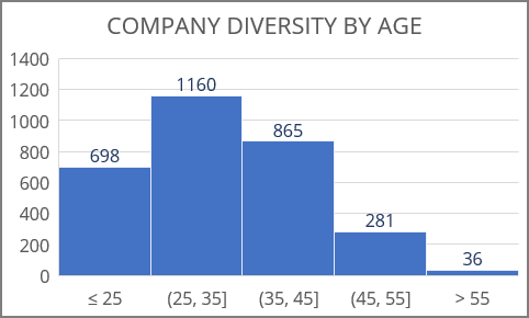
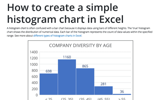
The chart above shows the distribution of employees ages. The graph contains two unique bins <= 25 and > 55 covering edge cases.
To create a histogram in Excel for Microsoft 365, do the following:
1. Add the data for the chart and transform it (if needed):
For this example, the birthday date transformed to the age of people:
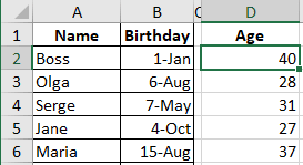
To calculate full years, use the formula:
= DATEDIF (<birthday>, TODAY (), "y")
Note: The function TODAY () returns the current date, and DATEDIFF () with the last "y" parameter returns the full number of years between two dates.
See more How to calculate age in Excel.
2. Create a histogram chart:
2.1. Select the prepared data (in this example, C2:D20).
2.2. On the Insert tab, in the Charts group, click on the Insert Statistic Chart button:

From the Insert Statistic Chart dropdown list, select Histogram:
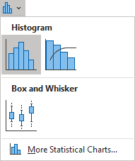
Excel creates the histogram chart from the data:
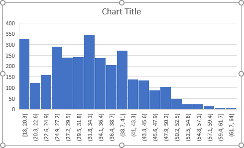
As you can see, the default histogram has too many bins (bars), but you can change the number of bins and bin widths.
3. Format the histogram chart:
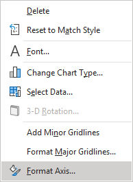
3.1. Right-click on the horizontal axis and choose Format Axis... in the popup menu:
3.2. On the Format Axis pane, on the Axis Options tab, under Bins:
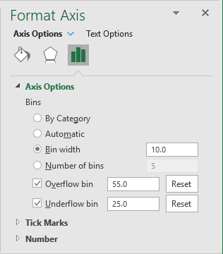
- In the Bin Width field, define the number range size for bins.
For this example, every age range spans 10 years.
- Select the Overflow bin checkbox and type the number, all values above this number will be added to the last bin, ignoring other options such as Bin Width.
- Select the Underflow bin checkbox and type the number, all values below and equal to this number will be added to the first bin, ignoring other options such as Bin Width.
Make other adjustments as you desire.
Note: Histograms show the shape and the spread of continuous data. For categorical data, discrete by its definition, you should use bar charts that represent category frequencies.
