Excel 365
Column and row headers
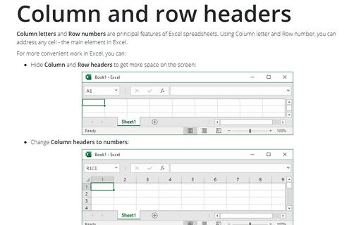
Column letters and Row numbers are principal features of Excel spreadsheets. Using Column letter and Row number, you can address any cell - the main element in Excel.
How to work with a large number of objects in Excel
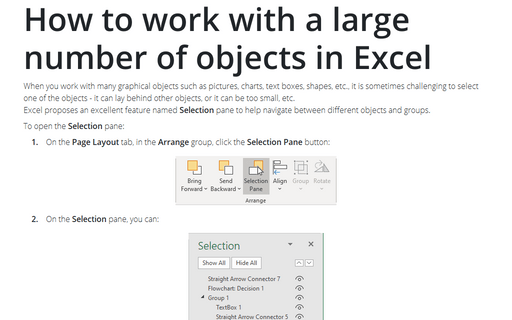
When you work with many graphical objects such as pictures, charts, text boxes, shapes, etc., it is sometimes challenging to select one of the objects - it can lay behind other objects, or it can be too small, etc.
Excel proposes an excellent feature named Selection pane to help navigate between different objects and groups.
Excel proposes an excellent feature named Selection pane to help navigate between different objects and groups.
Formatting comments
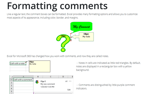
Like a regular text, the comment boxes can be formatted. Excel provides many formatting options and allows you to customize most aspects of its appearance, including color, border, and margins.
Changing a comment shape
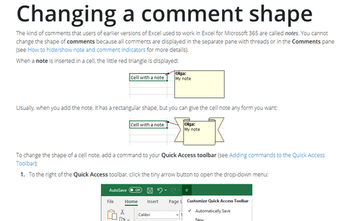
The kind of comments that users of earlier versions of Excel used to work in Excel for Microsoft 365 are called notes. You cannot change the shape of comments because all comments are displayed in the separate pane with threads or on the Comments pane (see
How to hide/show note and comment indicators for more details).
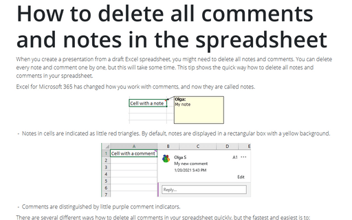
How to delete all comments and notes in the spreadsheet
When you create a presentation from a draft Excel spreadsheet, you might need to delete all notes and
comments. You can delete every note and comment one by one, but this will take some time. This tip shows the
quick way how to delete all notes and comments in your spreadsheet.
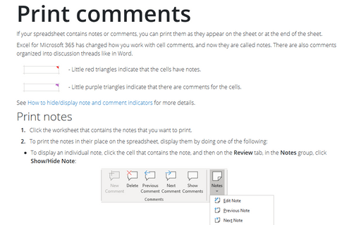
Print comments
If your spreadsheet contains notes or comments, you can print them as they appear on the sheet or at the end of the sheet.
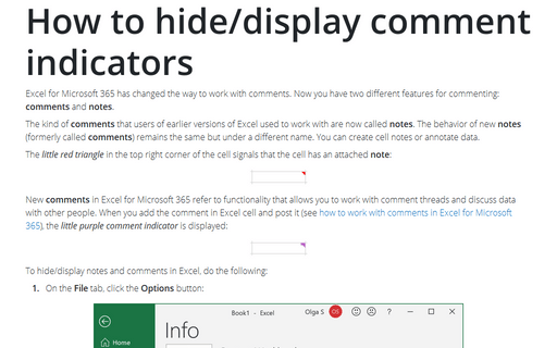
How to hide/display comment indicators
Excel for Microsoft 365 has changed the way to work with comments. Now you have two different features for commenting: comments and notes.
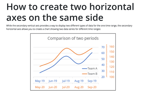
How to create two horizontal axes on the same side
While the secondary vertical axis provides a way to display two different types of data for the one time range, the secondary horizontal axis allows you to create a chart showing two data series for different time ranges:
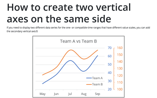
How to create two vertical axes on the same side
If you need to display two different data series for the one- or compatible-time ranges that have different value scales, you can add the secondary vertical axis:ß
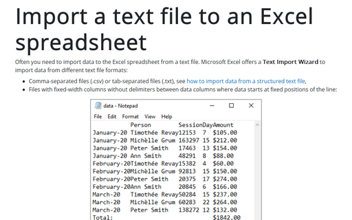
Import a text file to an Excel spreadsheet
Often you need to import data to the Excel spreadsheet from a text file. Microsoft Excel offers a Text Import Wizard to import data from different text file formats:
