Creating a twin or double thermometer chart
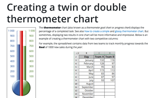
The thermometer chart (also known as a thermometer goal chart or progress chart) displays the percentage of a completed task. See also how to create a simple and glossy thermometer chart. But sometimes, displaying two results in one chart will be more informative and impressive. Below is an example of creating a thermometer chart with two competitive columns:
How to plot investment opportunity zones in Excel
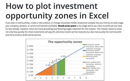
If you start a new business, create a new product, or change a business model, break-even analysis lets you find out at what stage your company, product, or service will become profitable. Break-even point is the stage where you have no profit yet but have no loss already. However, there are many preceding and following stages important for the investor. The investor wants to know not only how quickly the initial investments will pay off, and extra income will be received, but also how quickly the normal profit and the economic profit will be earned.
Highlight data series in line chart
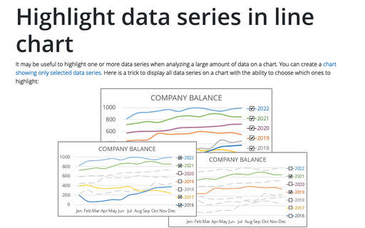
It may be useful to highlight one or more data series when analyzing a large amount of data on a chart. You can create a chart showing only selected data series. Here is a trick to display all data series on a chart with the ability to choose which ones to highlight:
Creating a Candlestick Stock chart
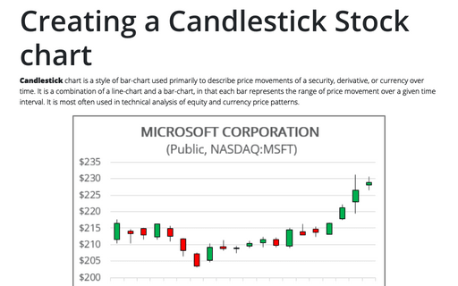
Candlestick chart is a style of bar-chart used primarily to describe price movements of a security, derivative, or currency over time. It is a combination of a line-chart and a bar-chart, in that each bar represents the range of price movement over a given time interval. It is most often used in technical analysis of equity and currency price patterns.
How to create a simple histogram chart in Excel
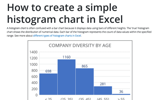
A histogram chart is often confused with a bar chart because it displays data using bars of different heights. The 'true' histogram chart shows the distribution of numerical data. Each bar of the histogram represents the count of data values within the specified range. See more about different types of histogram charts in Excel.
Side by side comparison bar chart with the same axes
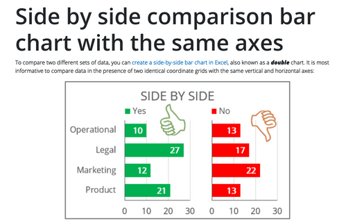
To compare two different sets of data, you can create a side-by-side bar chart in Excel, also known as a double chart. It is most informative to compare data in the presence of two identical coordinate grids with the same vertical and horizontal axes:
Excel 3-D Pie charts
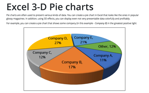
Pie charts are often used to present various kinds of data. You can create a pie chart in Excel that looks like the ones in popular glossy magazines. In addition, using 3D effects, you can display even not very presentable data colorfully and profitably.
Creating a Gantt chart
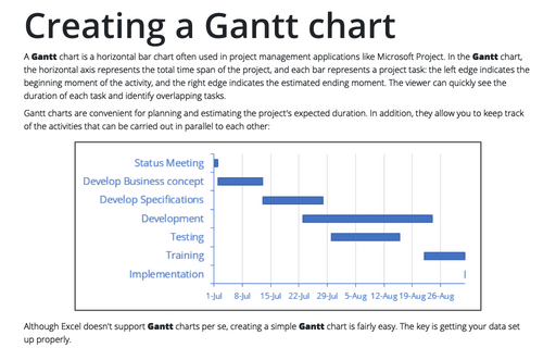
A Gantt chart is a horizontal bar chart often used in project management applications like Microsoft Project. In the Gantt chart, the horizontal axis represents the total time span of the project, and each bar represents a project task: the left edge indicates the beginning moment of the activity, and the right edge indicates the estimated ending moment. The viewer can quickly see the duration of each task and identify overlapping tasks.
Show chart data for empty cells
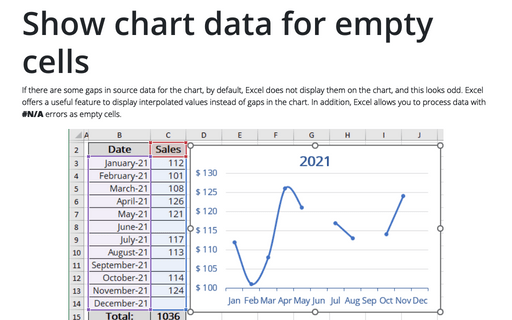
If there are some gaps in source data for the chart, by default, Excel does not display them on the chart, and this looks odd. Excel offers a useful feature to display interpolated values instead of gaps in the chart. In addition, Excel allows you to process data with #N/A errors as empty cells.
How to create full circle progress charts in PowerPoint
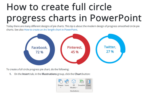
Today there are many different designs of pie charts. This tip is about the modern design of progress smoothed circle pie charts.
See also How to create an Arc length chart in PowerPoint.
See also How to create an Arc length chart in PowerPoint.
