Excel 3-D Pie charts
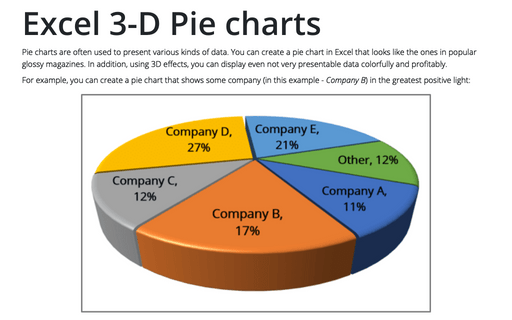
For example, you can create a pie chart that shows some company (in this example - Company B) in the greatest positive light:
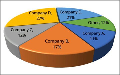
To create a chart like the one above, do the following:
Create a 3D pie chart
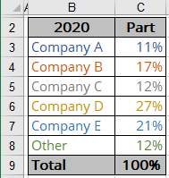
1. Select the data range.
In this example, B3:C8:
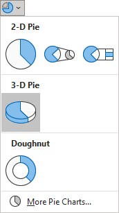
2. On the Insert tab, in the Charts group, click the Insert Pie or Doughnut Chart button:

From the Insert Pie or Doughnut Chart dropdown list, choose the 3-D Pie chart:
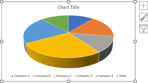
Excel creates a simple 3D pie chart:
Format the chart
Add and format data labels
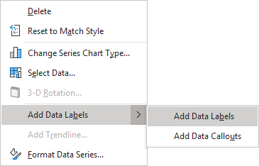
3. Right-click on the chart area, then select Add Data Labels and click Add Data Labels in the popup menu:
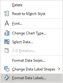
4. Click on one of the labels to select all of them, then right-click on the selection and choose Format Data Labels... in the popup menu:
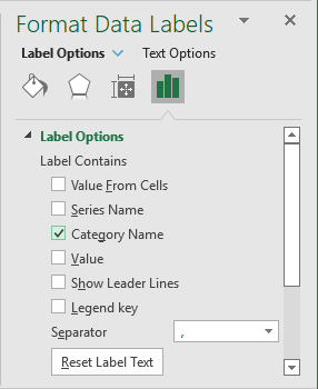
5. On the Format Data Labels pane, on the Label Options tab, in the Label Options section:
- Under Label Contains:
- Select the Category Name checkbox:
- Optionally, select the Value checkbox and choose the appropriate separator:
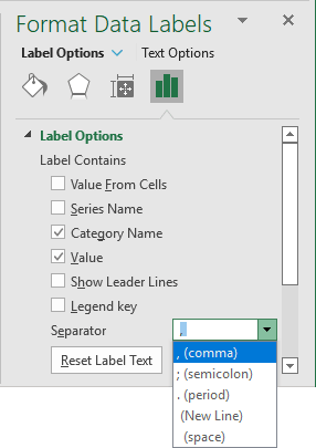
- Unselect all other checkboxes.
- Select the Category Name checkbox:
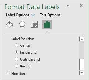
- Under Label Position, select the one you prefer.
For example, Inside End:
Rotate the chart
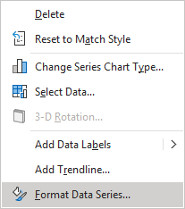
6. Right-click on the data series and select Format Data Series... in the popup menu:
7. On the Format Data Series pane:
- On the Series Options tab, in the Series Options section:
- Under Angle of first slice, move the sliding handle to the rotation degree that you want, or type, or select a number between 0 and 360 degrees in the appropriate field. The default setting is 0 degrees.
- Under Pie Explosion, move the sliding handle to the percentage of the explosion that you want, or type, or select a percentage between 0 and 400 in the appropriate field. The default setting is 0%.
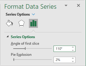
- On the Effects tab, in the 3-D Format group, make the changes you want.
For example, in the 3-D Format section, from the Top bevel list, select the Round type:
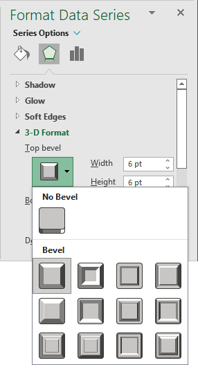
The more important pie slice will look more presentable:
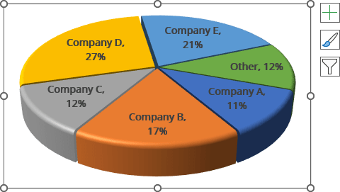
Add a perspective
8. Right-click on the plot area and select 3-D Rotation... in the popup menu:
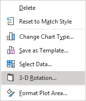
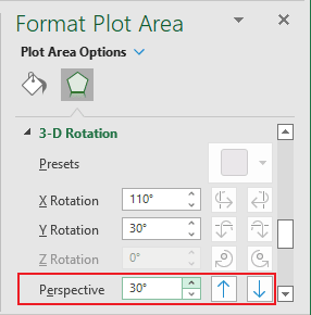
9. On the Format Plot Area pane, on the Effects tab, in the 3-D Rotation section, choose the appropriate value for the Perspective field.
For this example, 30o:
You can then make any other adjustments to get the look you desire.
See also this tip in French: Graphiques à secteurs 3-D.
