How to add a vertical line to the scatter chart
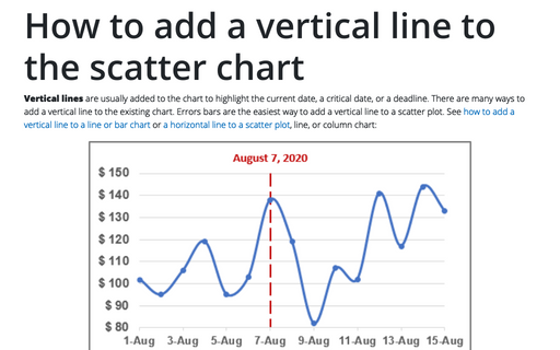
Vertical lines are usually added to the chart to highlight the current date, a critical date, or a deadline. There are many ways to add a vertical line to the existing chart. Errors bars are the easiest way to add a vertical line to a scatter plot. See how to add a vertical line to a line or bar chart or a horizontal line to a scatter plot, line, or column chart:
How to create step chart in Excel
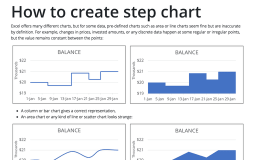
Excel offers many different charts, but for some data, pre-defined charts such as area or line charts seem fine but are inaccurate by definition. For example, changes in prices, invested amounts, or any discrete data happen at some regular or irregular points, but the value remains constant between the points:
How to use progress pie charts for numbering in PowerPoint
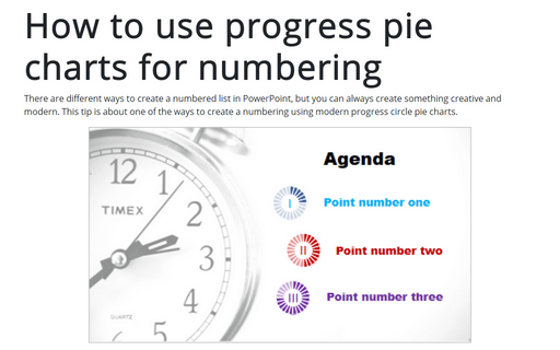
There are different ways to create a numbered list in PowerPoint, but you can always create something creative and modern. This tip is about one of the ways to create a numbering using modern progress circle pie charts.
Creating a Candlestick Stock chart with volume
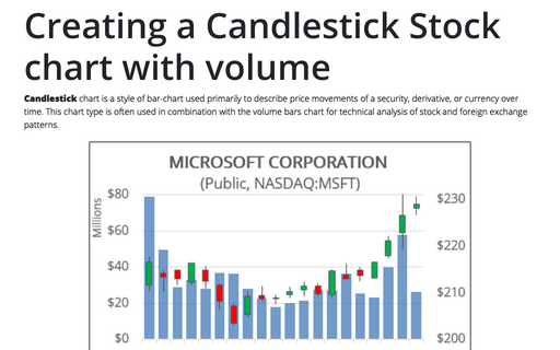
Candlestick chart is a style of bar-chart used primarily to describe price movements of a security, derivative, or currency over time. This chart type is often used in combination with the volume bars chart for technical analysis of stock and foreign exchange patterns.
How to add a horizontal line to the chart
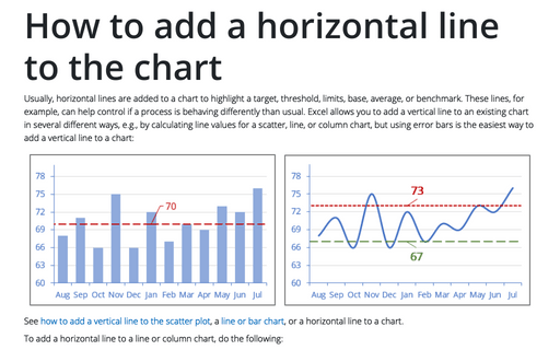
Usually, horizontal lines are added to a chart to highlight a target, threshold, limits, base, average, or benchmark. These lines, for example, can help control if a process is behaving differently than usual. Excel allows you to add a vertical line to an existing chart in several different ways, e.g., by calculating line values for a scatter, line, or column chart, but using error bars is the easiest way to add a vertical line to a chart:
Create bidirectional bar chart in Excel
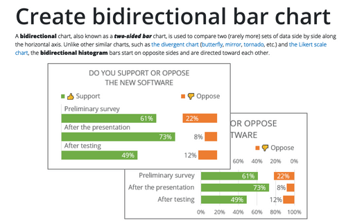
A bidirectional chart, also known as a two-sided bar chart, is used to compare two (rarely more) sets of data side by side along the horizontal axis. Unlike other similar charts, such as the divergent chart (butterfly, mirror, tornado, etc.) and the Likert scale chart, the bidirectional histogram bars start on opposite sides and are directed toward each other.
Creating a gauge chart
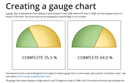
A gauge, dial, or speedometer chart displays a value between 0 and 100%. Where the Goal is 100%, and the displayed value is a fraction of the Goal. The actual value can be displayed as a percentage or as a number:
How to select row and column by keyboard
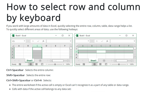
If you work with large amounts of data in Excel, quickly selecting the entire row, column, table, data range helps a lot.
To quickly select different areas of data, use the following hotkeys:
To quickly select different areas of data, use the following hotkeys:
Move entire column or entire row in Excel
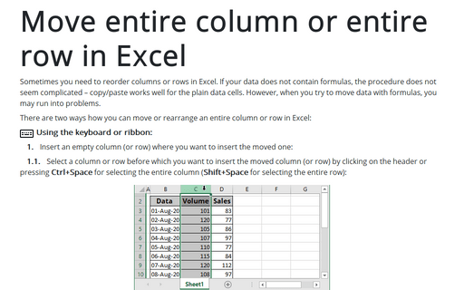
Sometimes you need to reorder columns or rows in Excel. If your data does not contain formulas, the procedure does not seem complicated – copy/paste works well for the plain data cells. However, when you try to move data with formulas, you may run into problems.
How to create a box and whisker plot in Excel
When you work with some statistical data such as lifespan, weight, or height of the specific type of pets, you have different charts and diagrams to compare them. The box and whisker chart is one of the useful graphical representation of statistical data that that shows the median, quartiles, and extreme values at one plot.
