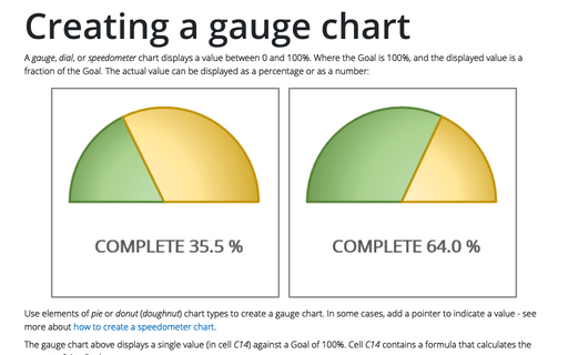
Creating a gauge chart
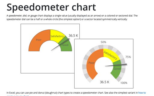
Use elements of pie or donut (doughnut) chart types to create a gauge chart. In some cases, add a pointer to indicate a value - see more about how to create a speedometer chart.
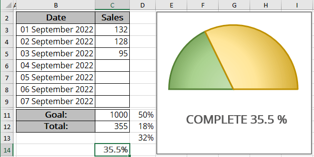
The gauge chart above displays a single value (in cell C14) against a Goal of 100%. Cell C14 contains a formula that calculates the percent of the Goal:
= C12 / C11
Three data points (in this example, cells D11:D13) are used to create a gauge chart:
- Cell D11 consists of 50%, and that slice is hidden,
- Cell D12 contains the formula to calculate the value in percentage of the Goal:
= MIN (C14, 100%) / 2.
The MIN () function displays the smaller of two values: the value in cell C14 or 100%. The result is divided by 2 because it only deals with the visible half of the pie chart. The MIN () function prevents the chart from displaying more than 100%.
- Cell D13 contains the formula that calculates the remaining part of the pie:
= D11 - D12.
As you enter new data in column C, the formulas display the current results:
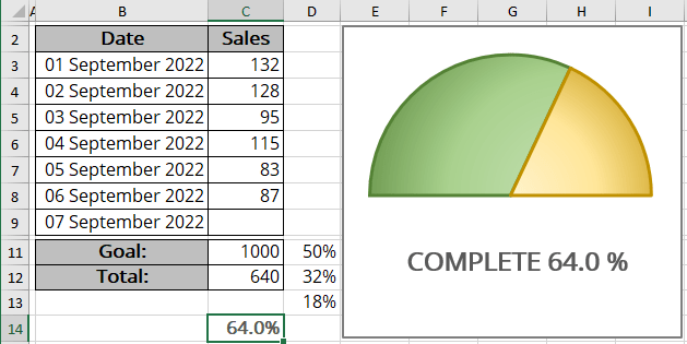
To create a chart like the one above, do the following:
Create a simple pie chart
1. Select the cells with your data (for this example, D11:D13).
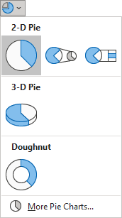
2. On the Insert tab, in the Charts group, click the Insert Pie or Doughnut Chart button:

From the Insert Pie or Doughnut Chart dropdown list, choose the Pie chart:
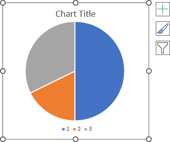
Excel creates a simple pie chart:
Format the chart
3. Optionally, remove the chart title and legend.
Rotate the pie chart
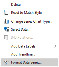
4. Right-click on the data series and choose Format Data Series... in the popup menu:
5. On the Format Data Series pane, in the Series Options tab, change the Angle of first slice setting:
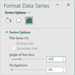
For this example, choose or type 90%.
Hide the unneeded data point
6. Double-click on the data point you want to hide to select it instead of selecting the data series.
In this example, double-click on the slice of 50%.
7. Right-click on the selection and choose Format Data Point... in the popup menu:
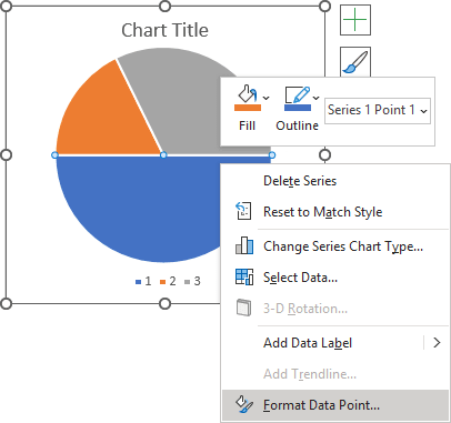
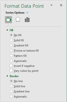
8. On the Format Data Point pane, on the Fill & Line tab:
- In the Fill section, select No fill,
- In the Border section, select No Line:
Format visible data points
9. Do one of the following:
- Double-click twice on the data point you want to format,
- Hold the Ctrl key and use the arrow buttons to select the chart element you need.
If needed, right-click on the selection and choose Format Data Point... in the popup menu.
10. On the Format Data Point pane, on the Fill & Line tab, select the appropriate filling option for each data point.
See more about different filling options.
You can then make any other adjustments to get the look you desire.
See also How to create dependent on a volume chart title.
See also this tip in French: Comment créer un graphique en jauge simple.
