Creating a gauge chart
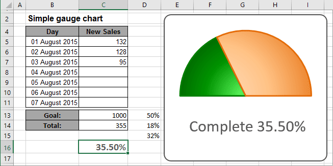
This example shows a pie chart set up to resemble a gauge. Although this chart displays a single value (entered in cell C16), it actually uses three data points (in D13:D15). Cell C16 contains a formula that calculates the percent of goal:
= C14 / C13
As you enter new data in column C, the formulas display the current results:
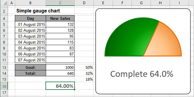
Cell D13 consists of 50%, and that slice is hidden.
The other two slices are apportioned based on the value in cell C16. The formula in cell D14 is
= MIN (C16, 100%) / 2.
This formula uses the MIN function to display the smaller of two values: either the value in cell C16 or 100%. It then divides this value by 2 because it only dealing with the visible half of the pie chart. Using the MIN function prevents the chart from displaying more than 100%.
The formula in cell D15, shown below, simply calculate the remaining part of the pie:
= D13 - D14
To create the chart like this one, do the following:
1. Select the cells with your data (for this example, D13:D15).
2. On the Insert tab, in the Charts group, click the Pie and Doughnut button:

In the Pie and Doughnut dropdown list, choose the Pie  chart.
3. Remove the legend.
4. Right-click in the data series and choose Format Data Series... in the popup menu:
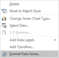
5. On the Format Data Series pane, in the Series Options tab, change the Angle of first slice setting:
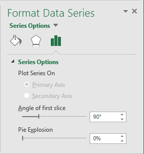
6. Right-click in the data point you want to hide (in this example, the slice of 50%) and choose Format Data Point... in the popup menu.
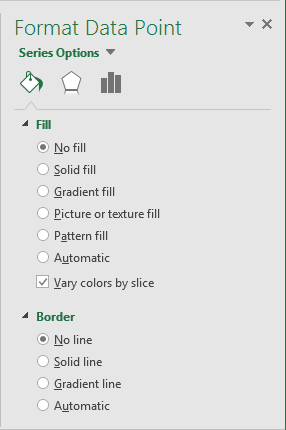
7. On the Format Data Point pane:
- On the Fill section, select No fill,
- On the Border section, select No Line:
You can then make any other adjustments to get the look you desire. See also How to create dependent on a volume chart title.
See also this tip in French: Comment créer un graphique en jauge simple.
