How to create a simple histogram chart in Excel
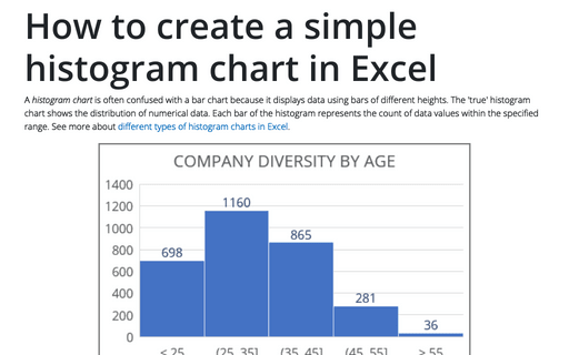
A histogram chart is often confused with a bar chart because it displays data using bars of different heights. The 'true' histogram chart shows the distribution of numerical data. Each bar of the histogram represents the count of data values within the specified range. See more about different types of histogram charts in Excel.
Side by side comparison bar chart with the same axes
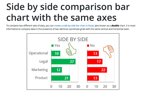
To compare two different sets of data, you can create a side-by-side bar chart in Excel, also known as a double chart. It is most informative to compare data in the presence of two identical coordinate grids with the same vertical and horizontal axes:
Excel 3-D Pie charts
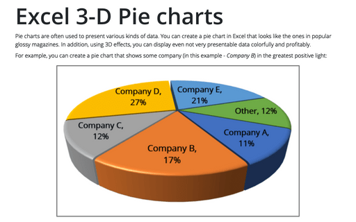
Pie charts are often used to present various kinds of data. You can create a pie chart in Excel that looks like the ones in popular glossy magazines. In addition, using 3D effects, you can display even not very presentable data colorfully and profitably.
Creating a Gantt chart
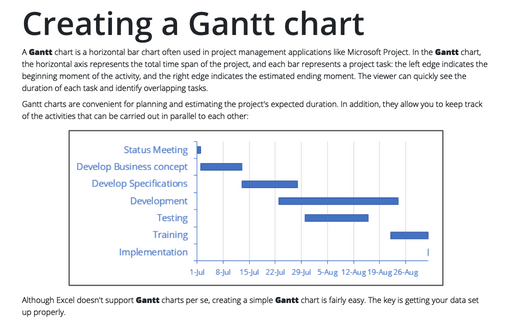
A Gantt chart is a horizontal bar chart often used in project management applications like Microsoft Project. In the Gantt chart, the horizontal axis represents the total time span of the project, and each bar represents a project task: the left edge indicates the beginning moment of the activity, and the right edge indicates the estimated ending moment. The viewer can quickly see the duration of each task and identify overlapping tasks.
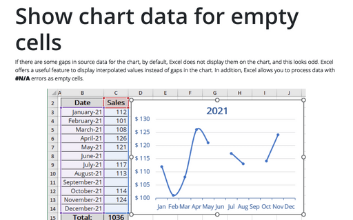
Show chart data for empty cells
If there are some gaps in source data for the chart, by default, Excel does not display them on the chart, and this looks odd. Excel offers a useful feature to display interpolated values instead of gaps in the chart. In addition, Excel allows you to process data with #N/A errors as empty cells.
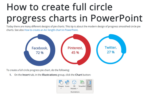
How to create full circle progress charts in PowerPoint
Today there are many different designs of pie charts. This tip is about the modern design of progress smoothed circle pie charts.
See also How to create an Arc length chart in PowerPoint.
See also How to create an Arc length chart in PowerPoint.
How to create a Scrolling chart
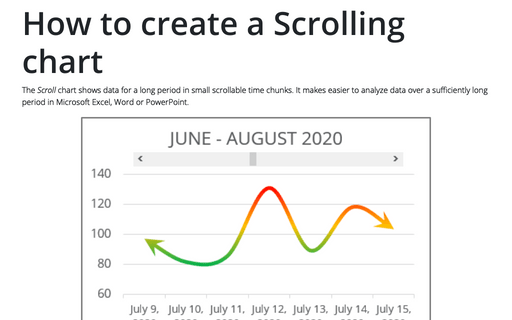
The Scroll chart shows data for a long period in small scrollable time chunks. It makes easier to analyze data over a sufficiently long period in Microsoft Excel, Word or PowerPoint.
The Scroll chart displays some contiguous range of data from a large dataset. Using the provided Control tools, it is possible to add a scroll bar to the chart area and view the desired data range:
The Scroll chart displays some contiguous range of data from a large dataset. Using the provided Control tools, it is possible to add a scroll bar to the chart area and view the desired data range:
Using the Organizational Chart Tool
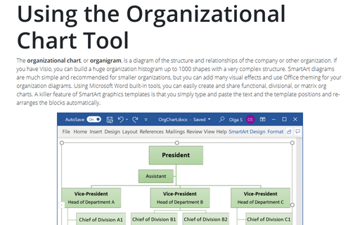
The organizational chart, or organigram, is a diagram of the structure and
relationships of the company or other organization. If you have Visio, you can build
a huge organization histogram up to 1000 shapes with a very complex structure. SmartArt
diagrams are much simple and recommended for smaller organizations, but you can add many
visual effects and use Office theming for your organization diagrams. Using Microsoft
Word built-in tools, you can easily create and share functional, divisional, or matrix
org charts. A killer feature of SmartArt graphics templates is that you simply type and
paste the text and the template positions and re-arranges the blocks automatically.
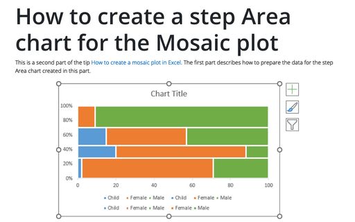
How to create a step Area chart for the Mosaic plot in Excel
This is a second part of the tip How to create a Mosaic plot in Excel. The first part describes how to prepare the data for the step Area chart created in this part.
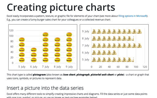
Creating picture charts
Excel easily incorporates a pattern, texture, or graphic file for elements of your chart (see more about filling options in Microsoft). E.g., you can create a funny burger sales chart for your colleagues or a collected revenue chart:
