How to create a break-even chart in Excel
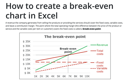
A revenue the company generates from selling the products or providing the services should cover the
fixed costs, variable costs, and leave a contribution margin. The point where the total operating
margin (the difference between the price of the product or service and the variable costs per item
or customer) covers the fixed costs is called a break-even point.
How to draw a chart with chalk effect in PowerPoint
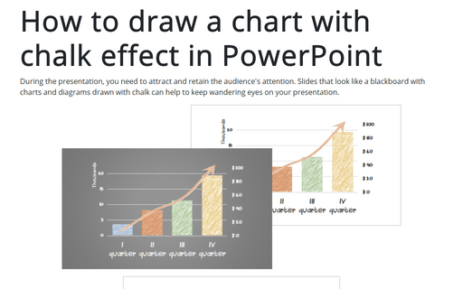
During the presentation, you need to attract and retain the audience's attention. Slides that look like
a blackboard with charts and diagrams drawn with chalk can help to keep wandering eyes on your
presentation.
How to create bar chart of the survey results
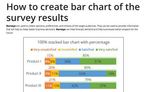
Surveys are used to collect opinions, preferences, and choices of the target audiences. They can be used to provide information that will help to make better business decisions. Surveys can help forecast demand and help businesses better prepare for the future.
How to select row and column by keyboard
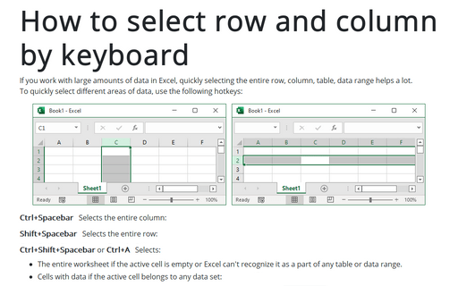
If you work with large amounts of data in Excel, quickly selecting the entire row, column, table, data range helps a lot.
To quickly select different areas of data, use the following hotkeys:
To quickly select different areas of data, use the following hotkeys:
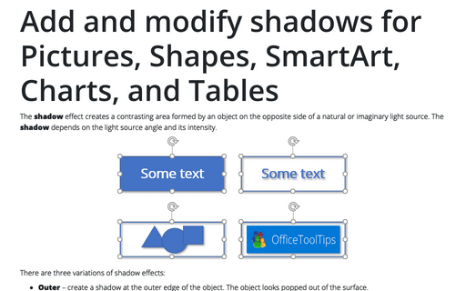
Add and modify shadows for Pictures, Shapes, SmartArt, Charts, and Tables in Powerpoint
The shadow effect creates a contrasting area formed by an object on the opposite side of a natural or imaginary light source. The shadow depends on the light source angle and its intensity.
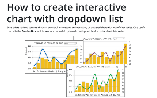
How to create interactive chart with dropdown list in Excel
Excel offers various controls that can be useful for creating an interactive, uncluttered chart with lots of data series. One useful control is the Combo Box, which creates a normal dropdown list with possible alternative chart data series.
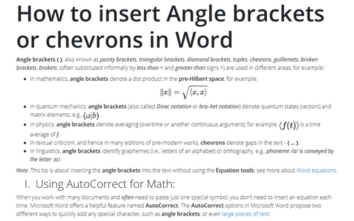
How to insert Angle brackets or chevrons in Word
Angle brackets ⟨ ⟩, also known as pointy brackets, triangular brackets, diamond brackets, tuples, chevrons, guillemets, broken brackets, brokets, (often substituted informally by less-than < and greater-than signs >) are used in different areas, for example:
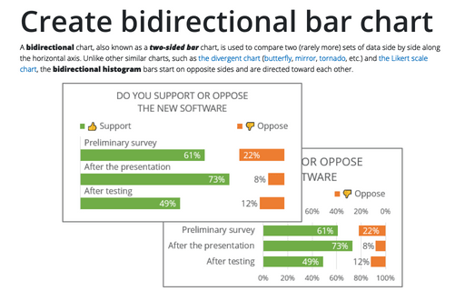
Create bidirectional bar chart in Excel
A bidirectional chart, also known as a two-sided bar chart, is used to compare two (rarely more) sets of data side by side along the horizontal axis. Unlike other similar charts, such as the divergent chart (butterfly, mirror, tornado, etc.) and the Likert scale chart, the bidirectional histogram bars start on opposite sides and are directed toward each other.
How to create interactive chart with radio or option buttons
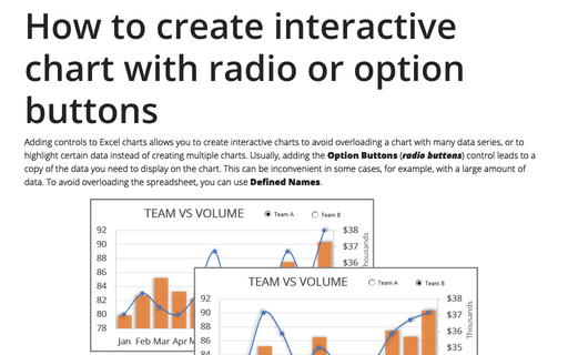
Adding controls to Excel charts allows you to create interactive charts to avoid overloading a chart with many data series, or to highlight certain data instead of creating multiple charts. Usually, adding the Option Buttons (radio buttons) control leads to a copy of the data you need to display on the chart. This can be inconvenient in some cases, for example, with a large amount of data. To avoid overloading the spreadsheet, you can use Defined Names.
How to make Tornado chart in Excel
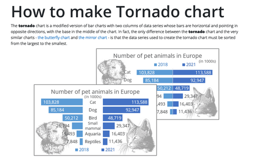
The tornado chart is a modified version of bar charts with two columns of data series whose bars are horizontal and pointing in opposite directions, with the base in the middle of the chart. In fact, the only difference between the tornado chart and the very similar charts - the butterfly chart and the mirror chart - is that the data series used to create the tornado chart must be sorted from the largest to the smallest.
