Customize the horizontal axis labels
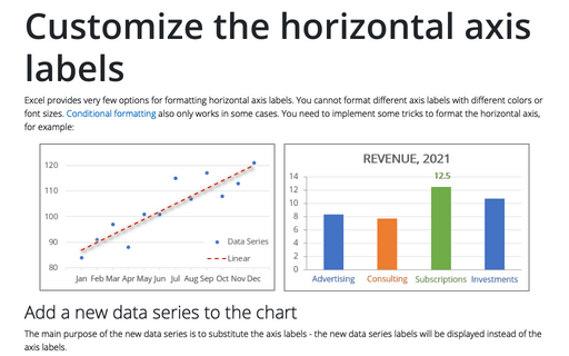
Excel provides very few options for formatting horizontal axis labels. You cannot format different axis labels with different colors or font sizes. Conditional formatting also only works in some cases. You need to implement some tricks to format the horizontal axis, for example:
How to add a horizontal line to the chart
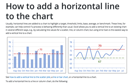
Usually, horizontal lines are added to a chart to highlight a target, threshold, limits, base, average, or benchmark. These lines, for example, can help control if a process is behaving differently than usual. Excel allows you to add a vertical line to an existing chart in several different ways, e.g., by calculating line values for a scatter, line, or column chart, but using error bars is the easiest way to add a vertical line to a chart:
Customize the vertical axis labels
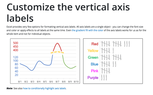
Excel provides very few options for formatting vertical axis labels. All axis labels are a single object - you can change the font size and color or apply effects to all labels at the same time. Even the gradient fill with the color of the axis labels works for us as for the whole item and not for individual objects.
How to create interactive chart with checkboxes in Excel
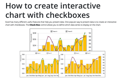
Excel has many different useful features that help you present data. One popular way to present data is to create an interactive chart with checkboxes. The Check Box control allows you to define which data series to display on the chart.
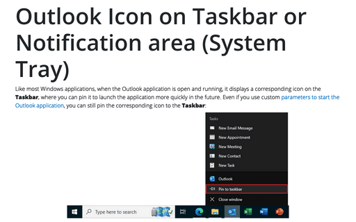
Outlook Icon on Taskbar or Notification area (System Tray)
Like most Windows applications, when the Outlook application is open and running, it displays a corresponding icon on the Taskbar, where you can pin it to launch the application more quickly in the future. Even if you use custom parameters to start the Outlook application, you can still pin the corresponding icon to the Taskbar:
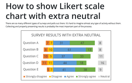
How to show Likert scale chart with extra neutral
There are so many different types of surveys and polls out there. It's hard to imagine almost any type of activity without them. Collecting and properly presenting results is probably the most important part of the process.
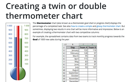
Creating a twin or double thermometer chart
The thermometer chart (also known as a thermometer goal chart or progress chart) displays the percentage of a completed task. See also how to create a simple and glossy thermometer chart. But sometimes, displaying two results in one chart will be more informative and impressive. Below is an example of creating a thermometer chart with two competitive columns:
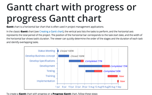
Gantt chart with progress or progress Gantt chart
Gantt chart is a horizontal bar chart that is often used in project management
applications.
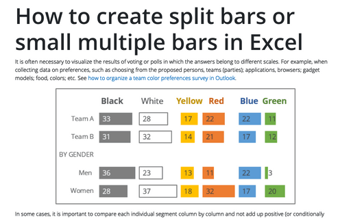
How to create one chat of split bars or small multiple bars in Excel
It is often necessary to visualize the results of voting or polls in which the answers belong to different scales. For example, when collecting data on preferences, such as choosing from the proposed persons, teams (parties); applications, browsers; gadget models; food, colors; etc. See how to organize a team color preferences survey in Outlook.
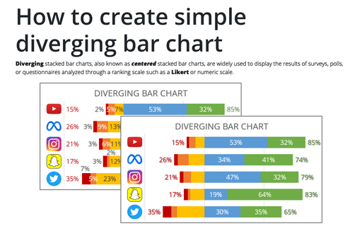
How to create simple diverging bar chart
Diverging stacked bar charts, also known as centered stacked bar charts, are widely used to display the results of surveys, polls, or questionnaires analyzed through a ranking scale such as a Likert or numeric scale.
