Trendlines and Moving Average in Excel
Trends can be described by various equations - linear, logarithmic, exponential, and so on. The more accurately the equation describes the data, the less distinct is the trend line. The trend line can also be used to forecast future trends and make forecasts:
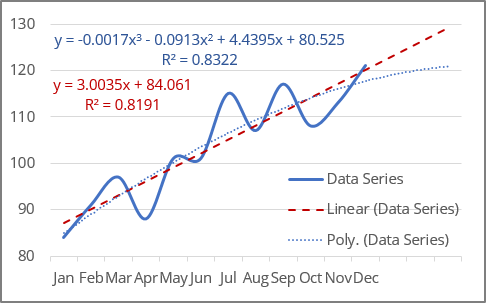
Excel makes adding a trend line to a chart quite simple.
Notes:
- In Excel, trendlines can be added for 2-dimensional charts only: a 2-D area, bar, line, column, stock, scatter, or bubble chart. You cannot add a trendline for 3-D or stacked charts, pie, radar, and similar.
- When creating a trend line, you should remember that Excel treats any data along the axes as numbers:
- Excel generates a mathematically correct trend line using data values only for the XY scatter plot because the Y-axis and the X-axis are real numeric values for this type of chart. Excel treats the Category axis values for all other chart types as the list {1, 2, 3, ... n}, where n is the number of text elements on the axis.
- If one of the chart's axes is based on text data, Excel uses the list {1, 2, 3, ... n} to calculate the trend and its formula, where n is the number of text elements on the axis.
Attention! Excel takes the first value as x = 1, not x = 0 as usual. So, don't expect a proper intersection with Y-axis.
For example, for a line chart, the vertical (Value) axis crosses the horizontal (Category) axis at a non-zero position - see the example above.
- If one of the chart axes is a time scale with dates, Excel uses numbers that correspond to dates to calculate the trend and its equation (e.g., "January 1, 2020" is 43831, "December 1, 2020" is 44166). Thus, trends degenerate because the value differences of the secondary axis are extremely small compared to the magnitude of the primary time axis values:
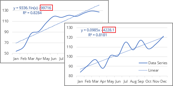
To solve this issue, you can change the data values to text values (see how to change the axis labels format below).
- If you change the chart type to one that does not support trendlines, the trendline will not be displayed.
Add a trend line
To add a trendline, select the data series to which you want to add a trendline, and do one of the following:
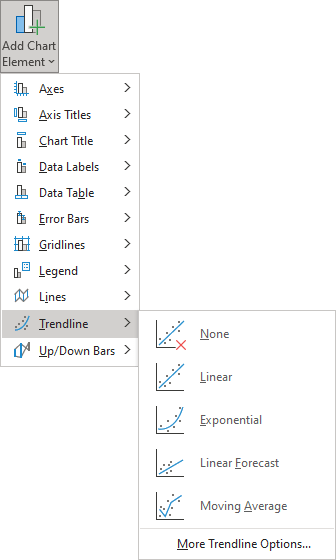
- On the Chart Design tab, in the Chart Layouts group, click the Add Chart Element dropdown list:

From the Add Chart Element dropdown list, choose the Trendline list, where select the desirable trend function if available (see more about different options below) or click More Trendline Options... to open the Format Trendline pane:
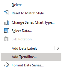
- Right-click on the selected data series and select Add Trendline... in the popup menu:
- Click the Chart Elements button:
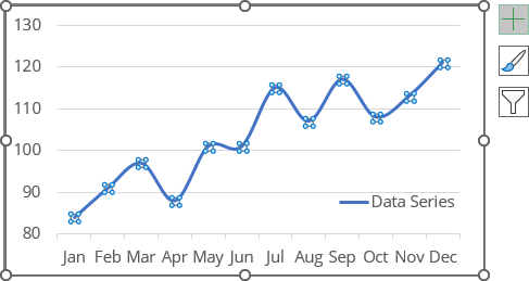
In the Chart elements list, choose the Trendline list, then select the desired trend function (see more about different trend functions below) or click More Options... to open the Format Trendline pane:
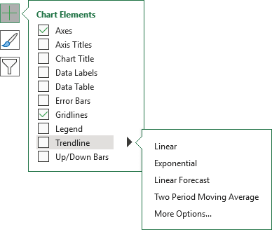
Notes:
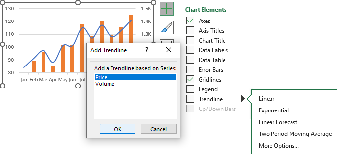
- If there are several data series on the chart, click the Chart Elements list without selecting any data series, choose the Trendline list, then select the option you prefer (anyone, including More Options...).
Excel will show a list of the data series from the chart. Select the one you need and click OK:
- You can add several trend lines to the same data series. After adding the first trendline, just add another one. To select the needed trendline if you can't find them on the chart, see how to select an invisible element in the chart.
Excel displays several trendlines for the same data series; see examples below.
Trendline types
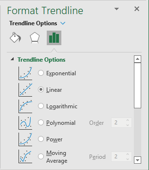
The type of trend line that you choose depends on your data. You can see all possible trend lines that Excel can add to the chart on the Format Trendline pane, on the Trendline Options tab, in the Trendline Options group:
- Exponential trendlines can only be added for data with positive values. They are best suited for data that increases or decreases rapidly (the rate of data change is continuously increasing):
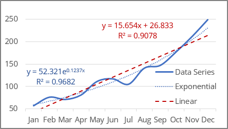
The exponential trend lines are common if the vertical axis has a log scale.
See more about the exponential trendline equation and formulas, calculating the trendline values, and creating a forecast.
- Linear trends are most common and can be added for data with positive and negative values. They are used in the simplest cases when the data increases or decreases at a constant rate:
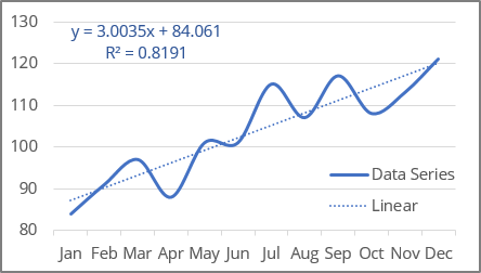
Linear trendlines are used to estimate a linear relationship in the data.
See more about the linear trendline equation and formulas, how to calculate the trendline values, and build a forecast.
- Logarithmic trendlines can be used for data with positive and negative values. They are best used for data increases or decreases very quickly at the beginning but then slow down and level off over time:
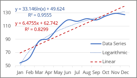
The logarithmic trend lines are common if the horizontal axis has a log scale.
Note: To create a logarithmic trendline for the displayed data, you should remember that Excel "understands" dates as numbers. If you use an axis as the timeline with dates, Excel treats them as numbers. So, you won't see an expected logarithmic trend because the logarithm function degenerates into a line parallel to the X-axis for large X-values (for example, "January 1, 2020" = 43831, "December 1, 2020" = 44166):
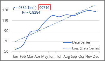
See below for how to solve that issue.
See more about the logarithmic trendline equation and formulas, calculating the trendline values, and creating a forecast.
- Polynomial trend lines can be added for data with both positive and negative values. Use them to describe data that alternately increase and decrease, fluctuate - go up and down, and you need to evaluate the ups and downs of a large set of data.
Additionally, for polynomial trendlines, you can specify the degree of the polynomial in the Order field. This value determines the maximum number of extrema (maxima and minima) of the curve:
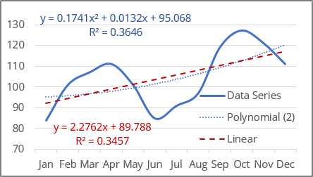
- A polynomial trendline of the second degree (Quadratic polynomial trend line with Order 2, used by default) can describe only one maximum or minimum (one hill or valley).
- A polynomial trendline of the third degree (Cubic polynomial trend line with Order 3) has one or two extrema.
- A polynomial trendline of the fourth degree (polynomial trend line with Order 4) can have no more than three extrema:
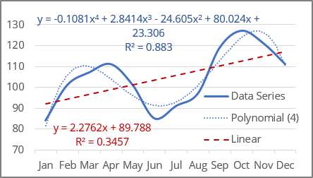
Excel allows to choose from 2nd to 6th degree in the Order field:
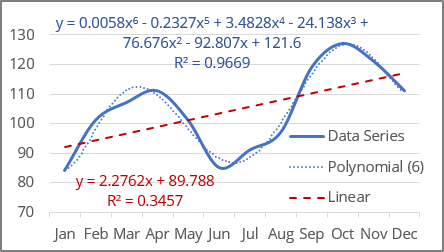
See more about the polynomial trendline equation and formulas, calculating the trendline values, and creating a forecast.
- Power trendlines can only be added for data with positive values. They are best suited for data that shows a steady increase or decrease in the rate of growth or decline.
In other words, you can try this type of trend line if you see that the trend is:
- non-linear due to uneven data changes,
- not polynomial due to the absence of fluctuations and extrema,
- non-exponential, which implies extreme behavior at the end of a trend,
- not logarithmic, which implies extreme behavior at the beginning of a trend:
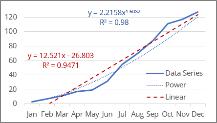
Note: The difference between a linear trend line and a power trend line is noticeable only when the first or first few values are close to zero or the difference between the values increases very significantly. If you analyze data far from zero or with a small growth rate, the difference between a linear and a power trend will not be significant.
The power trend lines are common if both the vertical and horizontal axes are in log scales.
See more about the power trendline equation and formulas, calculating the trendline values, and creating a forecast.
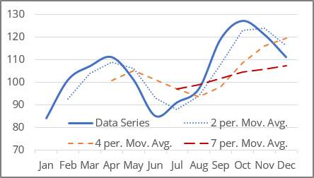
- A Moving Average trendline (also known as rolling average, running average, or moving mean) can only be added for the data with positive values. It is suitable for data with large fluctuations - it smooths out data that has a lot of variation (that is, "noisy" data):
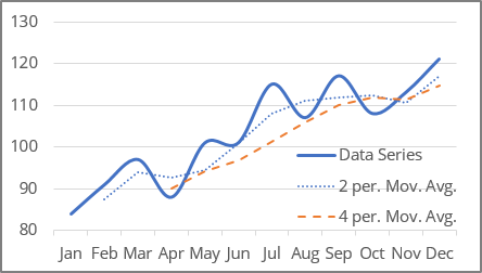
The Moving Average is a series of straight lines based on the average of the previous points. In the Period field, specify how many points are used for calculating the average:
Notes:
- Excel offers to choose the Period value from two to the number of data points minus one. For this example, from 2 to 11.
- The number of points in a Moving Average trendline equals the total number of points in the data series plus one and minus the number specified in the Period field.
Delete a trendline
To delete a trendline, select it (see how to select invisible chart elements for more details), then do one of the following:
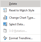
- Right-click the selection and choose Delete in the popup menu:
- Press Delete.
Change the axis labels format
If Excel incorrectly treats dates on the axis as numbers, change the axis label format from date to text.
Excel treats text values as a numbered sequence of elements (1, 2, 3, etc.). To change the axis labels, do the following:
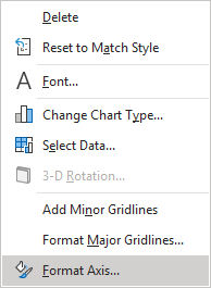
1. Right-click on the axis for which you need to change the format of the labels and choose Format Axis... in the popup menu:
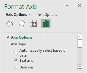
2. On the Format Axis pane, on the Axis Options tab, in the Axis Options group, under Axis Type, select the Text axis option:
See also this tip in French: Comment ajouter une courbe de tendance.
