Displaying conditional colors in a column chart
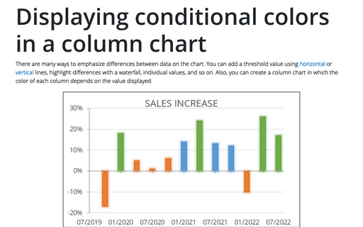
There are many ways to emphasize differences between data on the chart. You can add a threshold value using horizontal or vertical lines, highlight differences with a waterfall, individual values, and so on. Also, you can create a column chart in which the color of each column depends on the value displayed.
Waterfall chart
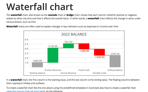
The waterfall chart, also known as the cascade chart or bridge chart, shows how each column, whether positive or negative, relates to other columns and how it affects the overall result. In other words, a waterfall chart reflects the change in value under various factors, such as time.
How to change default chart
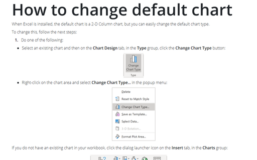
When Excel is installed, the default chart is a 2-D Column chart, but you can easily change the default chart type.
How to create one chat of split bars or small multiple bars in Excel
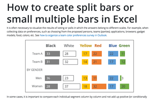
It is often necessary to visualize the results of voting or polls in which the answers belong to different scales. For example, when collecting data on preferences, such as choosing from the proposed persons, teams (parties); applications, browsers; gadget models; food, colors; etc. See how to organize a team color preferences survey in Outlook.
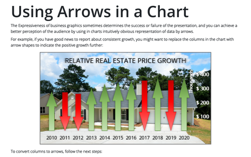
Using Arrows in a Chart
The Expressiveness of business graphics sometimes determines the success or failure of the presentation, and you can achieve a better perception of the audience by using in charts intuitively obvious representation of data by arrows.
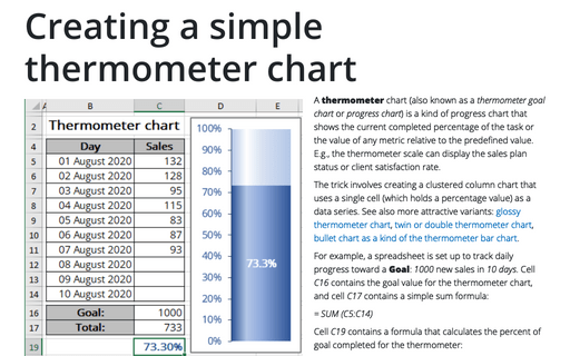
Creating a simple thermometer chart
A thermometer chart (also known as a thermometer goal chart or progress chart) is a kind of progress chart that shows the current completed percentage of the task or the value of any metric relative to the predefined value. E.g., the thermometer scale can display the sales plan status or client satisfaction rate.
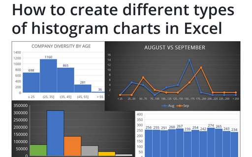
How to create different types of histogram charts in Excel
A histogram chart visualizes the distribution of continuous data. Each column in the histogram chart represents the frequency (amount) of the data within the specific range.
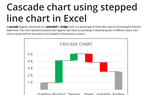
Cascade chart using stepped line chart in Excel
A cascade diagram, also known as a waterfall or bridge chart, is a special type of chart often used in accounting for financial statements. This chart represents positive and negative cash flows as ascending or descending bars of different colors. Each column except the first one starts at the endpoint of the previous column:
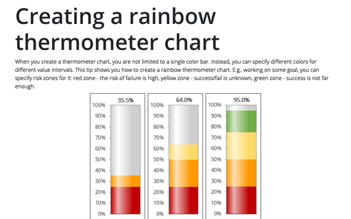
Creating a rainbow thermometer chart
When you create a thermometer chart, you are not limited to a single color bar. Instead, you can specify different colors for different value intervals. This tip shows you how to create a rainbow thermometer chart. E.g., working on some goal, you can specify risk zones for it: red zone - the risk of failure is high, yellow zone - success/fail is unknown, green zone - success is not far enough.
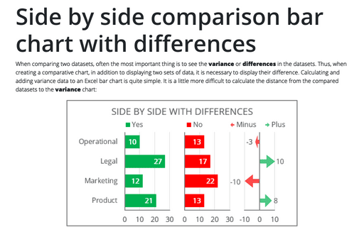
Side by side comparison bar chart with differences
When comparing two datasets, often the most important thing is to see the variance or differences in the datasets. Thus, when creating a comparative chart, in addition to displaying two sets of data, it is necessary to display their difference. Calculating and adding variance data to an Excel bar chart is quite simple. It is a little more difficult to calculate the distance from the compared datasets to the variance chart:
