Bubble and Area chart
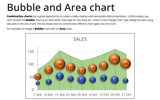
Combination charts are a great opportunity to create a really creative and memorable data presentation. Unfortunately, you can't choose the Bubble chart as an alternative chart type for line, area, etc. charts in the Change Chart Type dialog box (see Using two axes in the one chart). This tip shows how to combine two different chart types into one chart.
Bubble chart
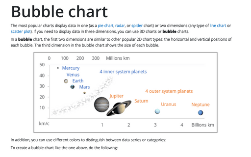
The most popular charts display data in one (as a pie chart, radar, or spider chart) or two dimensions (any type of line chart or scatter plot). If you need to display data in three dimensions, you can use 3D charts or bubble charts.
How to combine different data in one chart
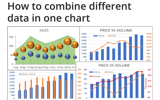
To make your data more information, you can combine different chars in many ways.
How to create a break-even chart in Excel
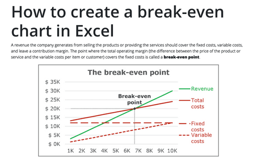
A revenue the company generates from selling the products or providing the services should cover the
fixed costs, variable costs, and leave a contribution margin. The point where the total operating
margin (the difference between the price of the product or service and the variable costs per item
or customer) covers the fixed costs is called a break-even point.
Cropping a picture to a shape
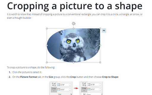
It is worth to know that, instead of cropping a picture to a conventional rectangle, you can crop it to a
circle, a triangle, an arrow, or even a thought bubble:
Trendlines and Moving Average in Excel
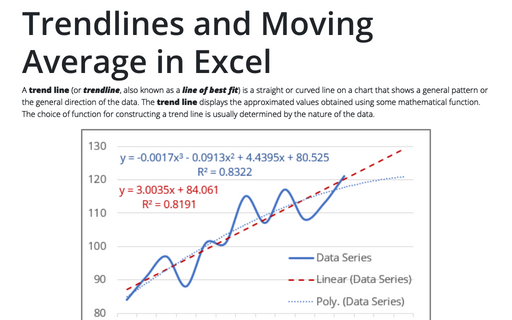
A trend line (or trendline, also known as a line of best fit) is a straight or curved line on a chart that shows a general pattern or the general direction of the data. The trend line displays the approximated values obtained using some mathematical function. The choice of function for constructing a trend line is usually determined by the nature of the data.
How to create blots for numbering
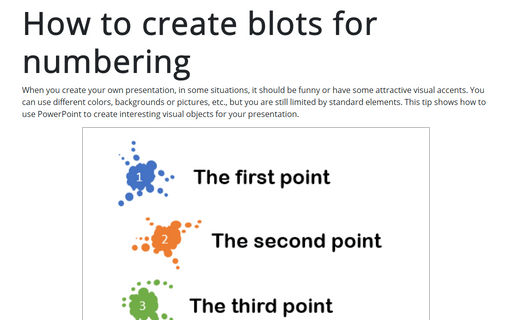
When you create your own presentation, in some situations, it should be funny or have some attractive visual accents. You can use different colors, backgrounds or pictures, etc., but you are still limited by standard elements. This tip shows how to use PowerPoint to create interesting visual objects for your presentation.
How to crop a picture to fit a shape
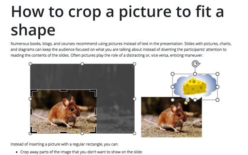
Numerous books, blogs, and courses recommend using pictures instead of text in the presentation. Slides with pictures, charts, and diagrams can keep the audience focused on what you are talking about instead of diverting the participants' attention to reading the contents of the slides. Often pictures play the role of a distracting or, vice versa, enticing maneuver.
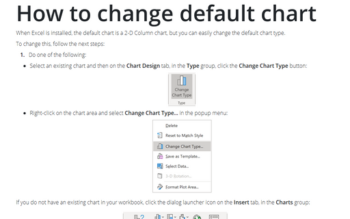
How to change default chart
When Excel is installed, the default chart is a 2-D Column chart, but you can easily change the default chart type.
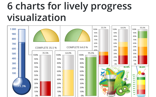
6 charts for lively progress visualization
There are several different charts in Excel that can help you to create a perfect progress illustration.
